CSS Guide
Detailed guide about CSS (Introduction to CSS, CSS Selectors, Inheritance and the cascade, CSS Box Model, CSS Positioning, Flexbox, Responsive Web Design, CSS Grid Layout, Styling with CSS, Testing and Organizing)
1. Introduction to CSS
The main task of CSS (stylesheets) is the presentation when creating web pages. CSS is used to create rules on how the content of an HTML element should be displayed. CSS supports the separation of structure and design of a document.
- HTML defines the semantics of the content
- CSS defines the presentation of the content
1.1. History of CSS
The inventors of CSS are Hakon Wium Lie and Bert Bos. CSS Level 1 Recommendation was published in 1996, the version was mainly about the design of Wch Fonts and Color. The next version, CSS Level 2, was published in 1998. Since there were many inconsistencies, because different web browsers do not implement many things correctly, this version was revised in 2002. It took until 2011 for CSS 2.1.to be released. In this version, the positioning of elements was included. The third version of CSS, has been in the works since 2000, there was no longer a single specification used, but the various features were with CSS3 aufgeilt into modules. Each module adds new capabilities and extends CSS 2.1, keeping everything backward compatible. Today, CSS no longer has a version number and consists of numerous modules. CSS3 is actually just a term for the modules added after 2.1.. However, the individual modules still have version numbers.
An overview of all modules in progress, can be found at W3C:CSS current work. All other modules can be found at W3C:CSS Snapshot 2023.
1.2. Principle of CSS application
In CSS, rules for the individual HTML elements determine the appearance. It is not important at this point to understand what is written in style.css.
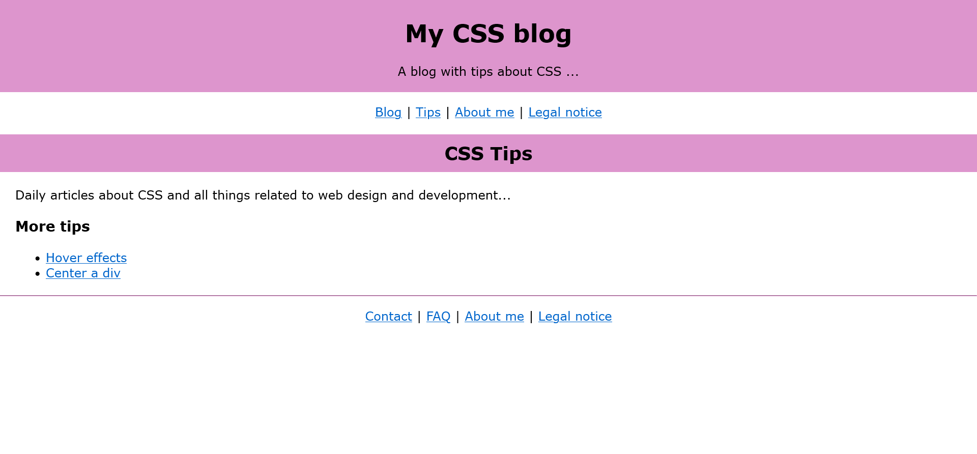
Complete Code - Examples/Part_1/...
 <header>
     <h1>My CSS blog</h1>
     <p>A blog with tips about CSS ...</p>
 </header>
 <nav>
     <p>
         <a href="#">Blog</a> | <a href="#">Tips</a> |
         <a href="#">About me</a> | <a href="#">Legal notice</a>
     </p>
 </nav>
 <main>
 <article>
     <h2>CSS Tips</h2>
     <p>Daily articles about CSS and all things related to web design and development...</p>
     <h3>More tips</h3>
     <ul>
         <li><a href="#">Hover effects</a></li>
         <li><a href="#">Center a div</a></li>
     </ul>
 </article>
 </main>
 <footer>
     <hr>
     <p>
         <a href="#">Contact</a> | <a href="#">FAQ</a> |
         <a href="#">About me</a> | <a href="#">Legal notice</a>
     </p>
 </footer>
 body {
  margin:0px;
 }

 h1 {
  font-family: "Verdana", "Geneva";
  font-size: 200%;
  text-align: center;
 }

 h2 {
  font-family: "Verdana", "Geneva";
  background: #dd95cd;
  padding: 10px;
  text-align: center;
 }

 h3 {
  font-family: "Verdana", "Geneva";
  margin-left: 20px;
 }

 header {
  background: #dd95cd;
  padding: 2px;
  text-align:center;
 }

 nav, footer { text-align: center;  }

 p { font-family: "Verdana", "Geneva"; }

 li { font-family: "Verdana", "Geneva"; }

 article p { margin: 20px; }

 article ul { margin: 20px; }

 hr { color: #dd95cd;}
1.2.1. Structure of a CSS rule
A CSS rule is defined with a selector and the declarations it contains. Selectors are an essential building block of CSS, of which there are many different types.
- Selector: Specifies the HTML element to which the CSS rule should be applied. It is possible to apply a rule to multiple HTML elements.
h1, h2, h3, p { color: red;}
This specifies that the font color is red, but only for the HTML elements h1, h2, h3 and p.
- Declaration: Declarations are used to format the selected HTML elements. The declaration consists of two parts, the property and a value.
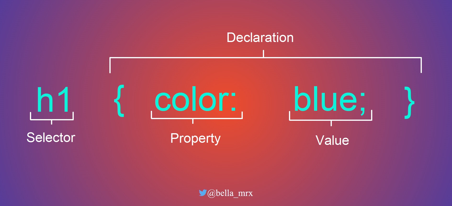
1.2.2. The declaration of a selector
The declaration inside the braces consists of at least one property and one value. E.g. with font-family the font is selected, with color the font color. The order of the statements can be arbitrary.
- Property: This specifies the CSS property (e.g. color, font, alignment) to be changed for the HTML element selected with the selector. CSS has many properties. More about that later.
- Value: This specifies the value for the CSS property used. This value depends on the property used, e.g. if the property is color, the value of a color (e.g. red) can be specified.
 h1 {
  font-family: "Arial";
  color: red;
  text-align: center;
 }
1.2.3. Use comments for CSS code
If a lot of CSS code is used, comments should be applied in the code to be able to understand what it is later. A comment in the CSS is displayed like this:
 /* creates a circle */
 .circle {
  height: 50px;
  width: 50px;
  border-radius: 50px;
 }

 /* ----------------- */
 /* header and footer */
 /* ----------------- */
 ...
1.3. Embedding CSS into HTML
There are three ways to include CSS in an HTML document:
- inline style: The CSS code is applied directly to the HTML element.
- internal style sheet: The style statements are collected in the header of the HTML document.
- external style sheet: The CSS code is created in a CSS file and linked to the HTML documen
inline style
- This method is not very advantageous, because the HTML document becomes quickly confusing, and each change must be made individually, which is very time-consuming. However, if only a single property is to be changed that only applies to this element, then this method can be used for testing or demonstration purposes.
Complete Code - Examples/Part_2/...
 <h2 style="font-family: Verdana; background: blue; padding: 2px; text-align: center;">CSS Tips</h2>
 <p style="font-family: Verdana;">Daily articles about CSS and all things related to web design and development...</p>
 <h3 style="font-family: Verdana; margin-left: 20px;">More tips</h3>
internal style sheet
- With this method, the CSS instructions are specified in the header of the HTML document between <style> ... </style> are specified. These apply to the gaze HTML document. For learning CSS it is advantageous, because you have everything in one file. But if a style is applied to multiple web pages and changed later, each page must be changed individually.
Complete Code - Examples/Part_3/...
 <head>
     <title>My CSS blog</title>
     <meta charset="UTF-8" />
     <style>
         body {
             margin: 0px;
         }

         h1 {
             font-family: "Verdana", "Geneva";
             font-size: 200%;
             text-align: center;
         }

         h2 {
         font-family: "Verdana", "Geneva";
         background: #add8e6;
         padding: 2px;
         text-align: center;
         }
     </style>
 </head>
external style sheet
- This method is best suited for large web pages. HTML and CSS are saved in separate files. This is the only way to ensure that the layout is consistent for each page of a large web project. The CSS file is included in the link element in the header.
Complete Code - Examples/Part_4/...
 <head>
     <title>My CSS blog</title>
     <meta charset="UTF-8" />
     <link rel="stylesheet" href="style.css" />
 </head>

 <body>
     <header>
         <h1>My CSS blog</h1>
         <p>A blog with tips about CSS ...</p>
     </header>
     <nav>
         <p>
             <a href="#">Blog</a> | <a href="#">Tips</a> |
             <a href="#">About me</a> | <a href="#">Legal notice</a>
         </p>
     </nav>
     <main>
         <article>
             <h2>CSS Tips</h2>
             <p>
             Daily articles about CSS and all things related to web design and development...
             </p>
             <h3>More tips</h3>
             <ul>
                 <li><a href="#">Hover effects</a></li>
                 <li><a href="#">Center a div</a></li>
             </ul>
         </article>
     </main>
     <footer>
         <hr />
         <p>
             <a href="#">Contact</a> | <a href="#">FAQ</a> |
             <a href="#">About me</a> | <a href="#">Legal notice</a>
         </p>
     </footer>
 </body>
 h1 {
     font-family: "Verdana", "Geneva";
     font-size: 200%;
     text-align: center;
 }

 h2 {
     font-family: "Verdana", "Geneva";
     background: #add8e6;
     padding: 10px;
     text-align: center;
 }

 h3 {
     font-family: "Verdana", "Geneva";
     margin-left: 20px;
 }

 header {
     background: #add8e6;
     padding: 2px;
     text-align:center;
 }

 nav, footer {
     text-align: center;
 }

 p {
     font-family: "Verdana", "Geneva";
 }

 li {
     font-family: "Verdana", "Geneva";
 }

 article p {
     margin: 20px;
 }

 article ul {
     margin: 20px;
 }
Several methods can be used at the same time, e.g. an internal and external stylesheet. Here the rule noted last gets the preference.
Complete Code - Examples/Part_5/...
 <head>
     <title>CSS Conflicts</title>
     <meta charset="UTF-8" />
     <link rel="stylesheet" href="style.css" />
     <style>
         p {
             text-align: center;
         }
     </style>
 </head>

 <body>
     <h1>A headline</h1>
     <p style="text-align: left">First paragraph text ...</p>
     <p>Second paragraph text ...</p>
 </body>
 p {
     text-align:right;
     color: grey;
 }
Using the global title attribute, alternative stylessheets can be set up within the link or style element. This can be useful during team development to compare different styles. Or for different color schemes e.g. light and dark mode.
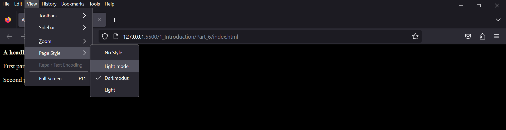 Complete Code - Examples/Part_6/...
1.3.1. Include style statements from an external CSS file with @import
The @import rule is noted in the HTML document header between <style> ... </style>. In practice, this example makes little sense, but should illustrate the use of the @import -rule. It is important that the @import rule is noted at the beginning, before which no CSS statement may stand.
Complete Code - Examples/Part_7/...
 <head>
     <title>My CSS blog</title>
     <meta charset="UTF-8">
     <style>
     @import url("style.css");
     </style>
 </head>
1.3.2. Media-specific stylesheets for specific output devices
If a stylesheet is to be specified for a particular output medium, this can be done with the media attribute in the link element.
This example demonstrates how to create a media-specific stylesheet for the screen and another for the printer:
Complete Code - Examples/Part_8/...
 <head>
     <title>My CSS blog</title>
     <meta charset="UTF-8">
     <!-- <link rel="stylesheet" type="text/css" media="screen" href="style.css">
     <link rel="stylesheet" type="text/css" media="print" href="print.css"> -->
     <style>
         @import url("style.css") screen;
         @import url("print.css") print;
     </style>
 </head>
If the output device is a screen (media="screen"), the HTML document is formatted with style.css. If the output device is a printer (media="print"), the document is formatted with print.css.
| Attribute | Explanation |
| media="all" |
all output devices |
| media="print" |
printer |
| media="screen" |
screen-oriented output devices |
There are other media types or device classes such as aural, braille, embossed, handheld, projection, speech, tty, tv these are considered obsolete since Media Queries Level 4, so their use is discouraged.
1.3.3. Media-specific stylesheets with CSS
Media-specific stylesheets (media queries) play a major role in responsive web design. Responsive web design is standard today because web pages are viewed first not only on the computer but predominantly on the smartphone. For media-specific stylesheets, logical operators have been introduced (and, not), which can be used to perform queries about various media properties, such as the usable screen width or screen orientation.
<link rel="stylesheet" media="screen and (min-width: 1080px)" href="style1080.css">
If the media has a screen and it is at least 1080 pixels wide, the CSS file style1080.css is included in the HTML document.
There are other such media properties like min-width. More about that later.
1.4. Analyze CSS in the web browser
A good learning and help tool are the development tools provided by each web browser.
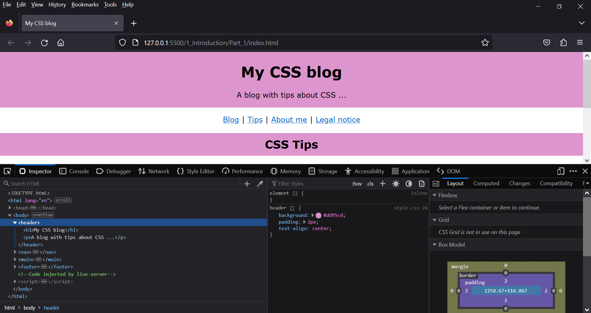
Here it is possible to examine a styled HTML element. When an element is selected e.g. header. The CSS instructions are displayed, which can then be changed there for testing purposes. This is only visual, the file remains untouched.
2. The CSS selectors
CSS offers many different selectors, which are divided into:
- Simple selectors: these include the type selector, the universal selector (*), the class selector(.class), the ID selector (#id), the attribute selector, and several pseudo-classes.
- Combinators: Combinators are two selectors concatenated with a > character (E > F; child selector), the plus sign (E + F; neighbor selector), a tilde character (E ~ F; sibling selector), or a space (E F; descendant selector).
If you want to know which selectors are implemented in the web browser and which ones can be used, you can do it here CSS- Selector- Test.
2.1. The simple selectors of CSS
2.1.1. Type selector
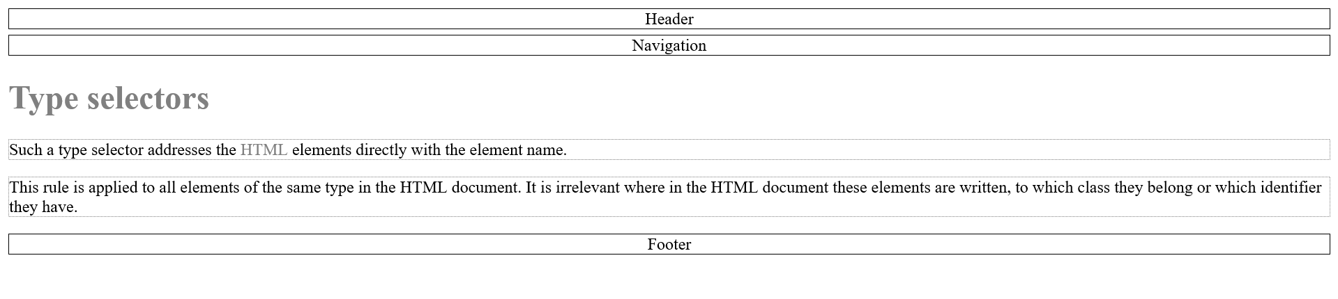
Such a type selector, also called HTML element selector, addresses the HTML elements directly with the element name.
Complete Code - Examples/Part_1/...
 <head>
     <title>Type selectors</title>
     <meta charset="UTF-8" />
     <link rel="stylesheet" href="styles/style.css" />
 </head>
 <body>
     <header>Header</header>
     <nav>Navigation</nav>
     <main>
         <h1>Type selectors</h1>
         <p>
             Such a type selector addresses the <abbr>HTML</abbr> elements directly with the element name.
         </p>
         <p>
             This rule is applied to all elements of the same type in the HTML document. It is irrelevant where in the HTML document these elements are written, to which class they belong or which identifier they have.
         </p>
     </main>
     <footer>Footer</footer>
 </body>
 /* black frame, centered text, 5 pixel distance from top */
 header, nav, footer {
     text-align:center;
     border: 1px solid black;
     margin-top: 5px;
 }

 /* gray text */
 h1, abbr {
     color: gray;
 }

 /* gray dotted frame */
 p {
     border: 1px dotted gray;
 }
2.1.2. Class selector
In an HTML document there is usually more than just, for example, a <p> element, so that individual paragraphs can also be designed differently, classes are very useful. It is possible to assign a class to each element. A class is assigned with the global HTML attribute class. In CSS the class is marked with a dot e.g. .note {...}.
<p class="note">A paragraph text</p>
 .note {
     color:red;
 }
It is also possible to use several classes at once.
Complete Code - Examples/Part_2/...
<body>
<header class="head_foot">Header</header>
<nav class="bigfont">Navigation</nav>
<main>
<h1>Class selector</h1>
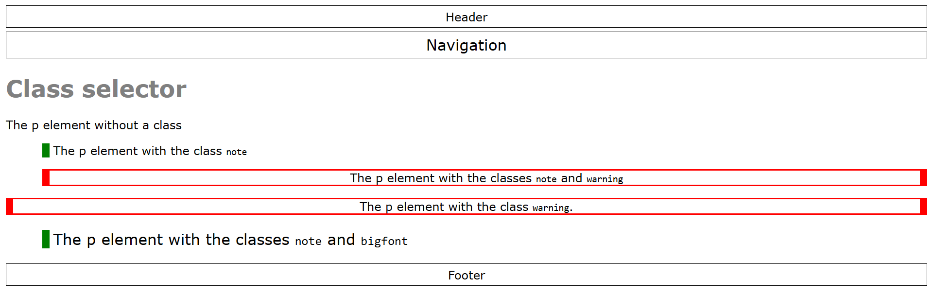
<p>The p element without a class</p>
<p class="note">The p element with the class <code>note</code></p>
<p class="note warning">
The p element with the classes <code>note</code> and <code>warning</code>
</p>
<p class="warning">The p element with the class <code>warning</code>.</p>
<p class="note bigfont">
The p element with the classes <code>note</code> and <code>bigfont</code>
</p>
</main>
<footer class="head_foot">Footer</footer>
</body>
 /* black frame, centered text, 5 pixel distance from top */
 header, nav, footer {
     text-align:center;
     border: 1px solid black;
     margin-top: 5px;
     padding: 5px;
     font-family: Verdana, Arial;
 }

 /* gray text */
 h1, abbr {
     color: gray;
     font-family: Verdana, Arial;
 }

 /* font family for p elements */
 p {
     font-family: Verdana, Arial;
 }

 /* style for a hint */
 .note {
     margin-left: 50px;
     border-left: 10px solid green;
     padding-left: 5px;
 }

 /* style for a note as a warning */
 .warning {
     border-left: 10px solid red;
     border-top: 2px solid red;
     border-right: 10px solid red;
     border-bottom: 2px solid red;
     text-align: center;
 }

 /* font size to 140%, background color to gray */
 .headfoot {
     font-size: 140%;
     background: #f5f5f5;
 }

 /* font size to 130%  */
 .bigfont {
     font-size: 130%;
 }
2.1.3. ID selector
An ID is assigned with the HTML attribute id. IDs are always unique elements in an HTML document, i.e. they may only be assigned to one element in the HTML document. Since an ID occurs only once, the id is usually preferred for div elements. In CSS the id is marked with a # e.g. #main {...}.
Complete Code - Examples/Part_3/...
 <body>
     <div id="header">Header</div>
     <div id="nav">Navigation</div>
     <div id="main">
         <h1>Class selector</h1>
         <p>The p element without a class.</p>
         <p class="note">The p element with the class <code>note</code>.</p>
         <p class="note warning">
             The p element with the classes <code>note warning</code>.
         </p>
         <p class="warning">The p element with the class <code>warning</code>.</p>
         <p class="note bigfont">
             The p element with the classes <code>note bigfont</code>.
         </p>
     </div>
     <div id="footer">Footer</div>
 </body>
 /* black frame, centered text, 5 pixel distance from top */
 #header, #nav, #footer {
     text-align:center;
     border: 1px solid black;
     margin-top: 5px;
     padding: 5px;
     font-family: Verdana, Arial;
 }

 /* Font size to 140%, background color to gray */
 #header, #footer {
     font-size: 140%;
     background: #f5f5f5;
 }

 #main {
     margin: 20px;
 }

 /* grey text */
 h1, abbr {
     color: gray;
     font-family: Verdana, Arial;
 }

 /* font family for p elements */
 p {
     font-family: Verdana, Arial;
 }

 /* paragraph text for a note */
 .note {
     margin-left: 50px;
     border-left: 10px solid green;
     padding-left: 5px;
 }

 /* paragraph text for a note as a warning */
 .warning {
     border-left: 10px solid red;
     border-top: 2px solid red;
     border-right: 10px solid red;
     border-bottom: 2px solid red;
     text-align: center;
 }

 /* font size to 130% */
 .bigfont {
     font-size: 130%;
 }
In practice, class selectors should be preferred for specific properties or groups such as notes, warnings, error messages. The ID selector should be used to note individual or unique areas of a web page. Meaningful class names and ID names should be assigned. A meaningful name should describe the function and not the formatting (e.g. .redBorder = bad name, .warning = good name). Only upper and lower case letters, numbers, hyphens and underscores may be used for the name of the selector. The name must also not start with a digit.
2.1.4. Universal selector
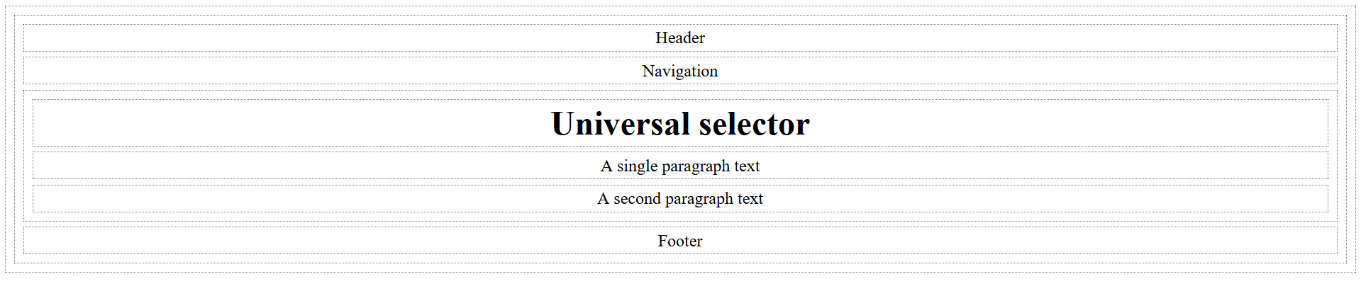
The universal selector is used to select all HTML elements in the HTML document. The universal selector is marked with the asterisk *.
Complete Code - Examples/Part_4/...
 <body>
     <header>Header</header>
     <nav>Navigation</nav>
     <main>
         <h1>Universal selector</h1>
         <p>A single paragraph text</p>
         <p>A second paragraph text</p>
     </main>
     <footer>Footer</footer>
 </body>
 /* black frame for all elements */

 * {
     margin: 5px;
     padding: 3px;
     border: 1px dotted black;
     text-align: center;
 }

 /* thicker border around the main element */
 /* main { border: 2px solid black; } */
 /* Thicker border around all HTML elements inside the main element */
 /* main * { border: 2px solid black; } */
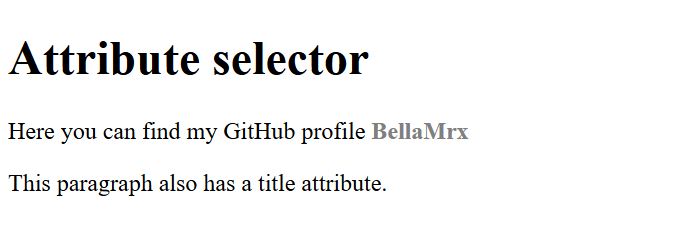
2.1.5. Attribute selector
The attribute selector is used to select HTML elements according to their HTML attributes. This is the possibility to check the presence of an attribute.
Complete Code - Examples/Part_5/...
 <h1>Attribute selector</h1>
 <p>
   Here you can find my GitHub profile
     <a href="https://github.com/BellaMrx" title="BellaMrx GitHub Profile">BellaMrx</a>
 </p>
 <p title="A paragraph with title">
   This paragraph also has a title attribute.
 </p>
 a[title] {
     text-decoration: none;
     color: gray;
     font-weight: bold;
 }
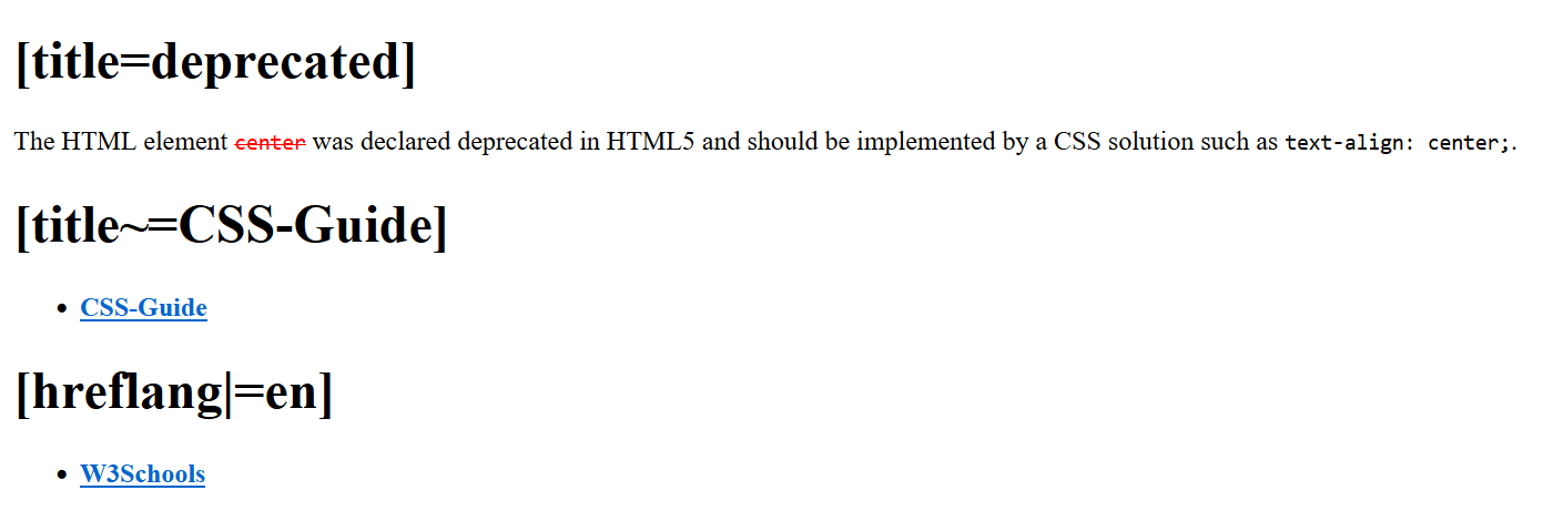
2.1.6. Attribute selector for attributes with a specific attribute value
There are 3 possibilities:
- [attributname=attributevalue]
- [attributname~=attributevalue]
- [attributname|=attributevalue]
Complete Code - Examples/Part_6/...
 <body>
     <h1>[title=deprecated]</h1>
     <p>
     The HTML element <code title="deprecated">center</code> was declared deprecated in HTML5 and should be implemented by a CSS solution such as
     <code>text-align: center;</code>.
     </p>
     <h1>[title~=CSS-Guide]</h1>
     <ul>
         <li>
             <a href="https://github.com/BellaMrx/CSS_Guide" title="GitHub Website BellaMrx CSS-Guide">CSS-Guide</a>
         </li>
     </ul>
     <h1>[hreflang|=en]</h1>
     <ul>
         <li>
             <a href="https://www.w3schools.com/css/css_attribute_selectors.asp" hreflang="en">W3Schools</a>
         </li>
     </ul>
 </body>
 /* Styling for all HTML elements where title
 has the attribute value deprecated */
 [title=deprecated] {
      color: red;
     text-decoration: line-through;
 }

 /* Styling HTML elements where title contains the word
 attribute value contains the word "CSS-Guide". */
 [title~=CSS-Guide] {
     font-weight: bold;
 }

 /* Styling HTML elements where hreflang
 begins with the attribute value en, followed by a hyphen */
 [hreflang|=en] {
     font-weight: bold;
 }
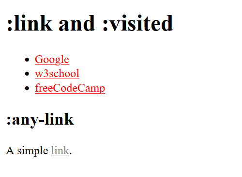
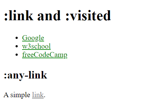
2.1.7. CSS pseudo-classes
CSS pseudo-classes are selectors for specific properties.
- Pseudo-classes for visited and non-visited hyperlinks
Complete Code - Examples/Part_7/...
 <body>
     <h1>:link and :visited</h1>
     <ul>
         <li><a href="https://www.google.com/">Google</a></li>
         <li><a href="https://www.w3schools.com/">w3school</a></li>
         <li><a href="https://www.freecodecamp.org/">freeCodeCamp</a></li>
     </ul>
     <article class="articlestyle">
         <h2>:any-link</h2>
         <p>A simple <a href="https://github.com/BellaMrx">link</a>.</p>
     </article>
 </body>
 a:link {
     color: red;
 }
 a:visited {
     color: green;
 }
 .articlestyle a:any-link {
     color: grey;
 }
 /* Chrome and Opera */
 .articlestyle a:-webkit-any-link {
     color: grey;
 }
- Pseudo classes for user interactions with mouse and keyboard
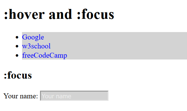
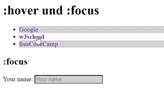
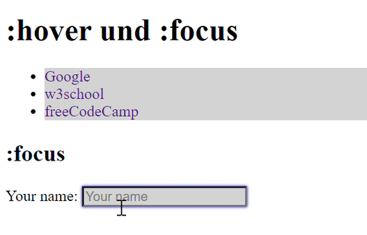
Complete Code - Examples/Part_8/...
 <body>
     <h1>:hover and :focus</h1>
     <ul>
         <li><a href="https://www.google.com/">Google</a></li>
         <li><a href="https://www.w3schools.com/">w3school</a></li>
         <li><a href="https://www.freecodecamp.org/">freeCodeCamp</a></li>
     </ul>
     <h2>:focus</h2>
     <form>
         Your name:
         <input type="text" name="name" id="name" placeholder="Your name" />
     </form>
 </body>
 input {
     background-color: lightgray;
 }
 input:focus {
     background-color: white;
 }
 input:hover {
     box-shadow: 0 0 3px blue;
 }
 input:placeholder-shown {
     color: white;
 }
 li {
     background-color: lightgray;
 }
 li:hover {
     background-color: snow;
 }
 li:active {
     background-color: gray;
 }
 a:link {
     text-decoration: none; color: blue;
 }
 a:hover {
     font-weight: bold;
 }
 a:active {
     color: red;
 }
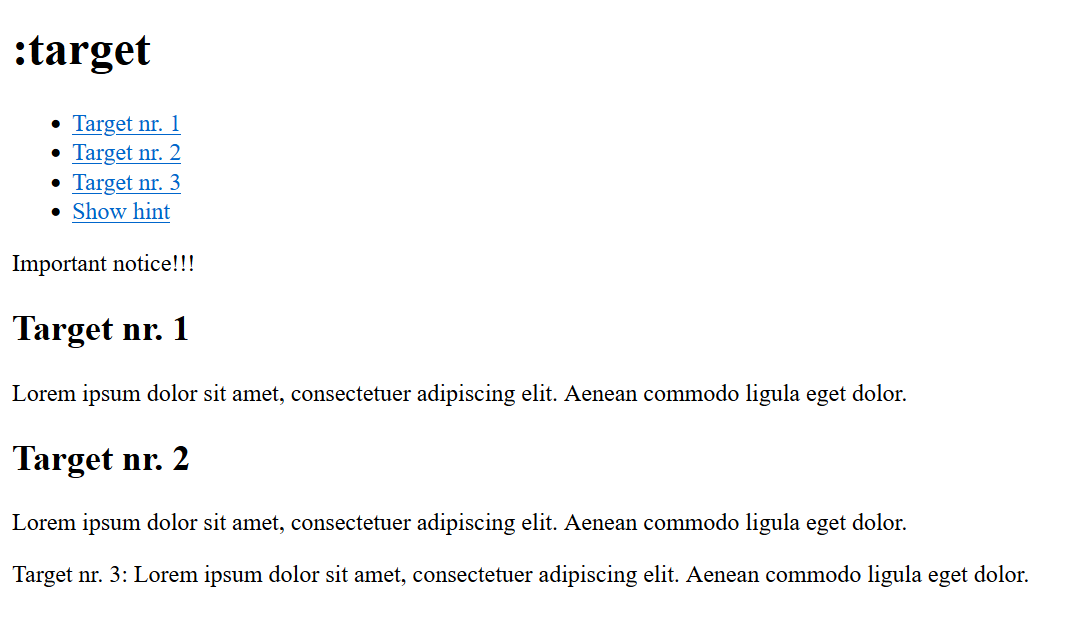
- Pseudo class for reference targets
Complete Code - Examples/Part_9/...
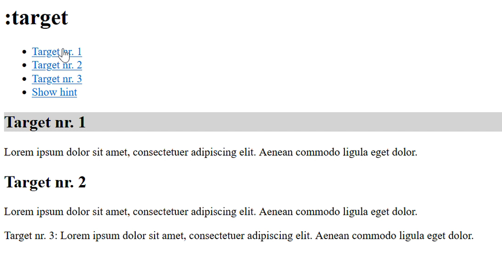
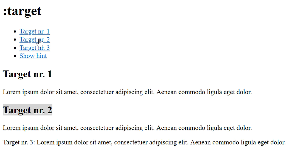
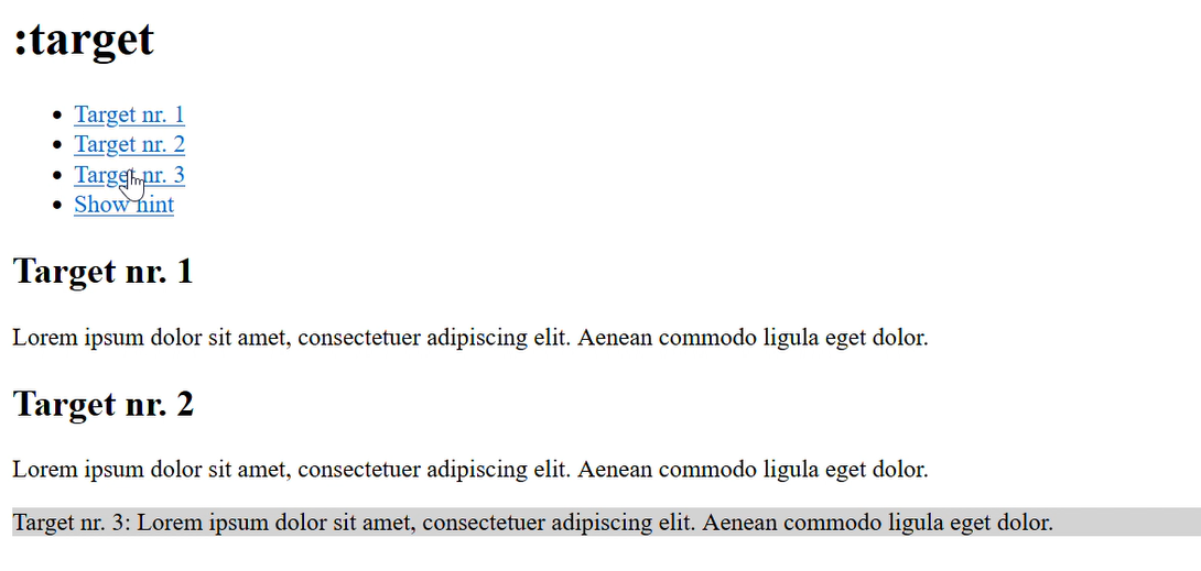
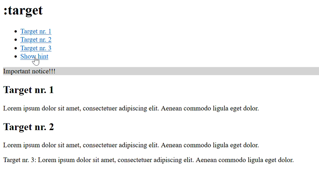
 <body>
     <h1>:target</h1>
     <ul>
         <li><a href="#target01">Target nr. 1</a></li>
         <li><a href="#target02">Target nr. 2</a></li>
         <li><a href="#target03">Target nr. 3</a></li>
         <li><a href="#fade_in">Show hint</a></li>
     </ul>
     <div id="fade_in">Important notice!!!</div>
     <h2 id="target01">Target nr. 1</h2>
     <p>
         Lorem ipsum dolor sit amet, consectetuer adipiscing elit. Aenean commodo ligula eget dolor.
     </p>
     <h2><a id="target02">Target nr. 2</a></h2>
     <p>
         Lorem ipsum dolor sit amet, consectetuer adipiscing elit. Aenean commodo ligula eget dolor.
     </p>
     <p id="target03">
         Target nr. 3: Lorem ipsum dolor sit amet, consectetuer adipiscing elit. Aenean commodo ligula eget dolor.
     </p>
 </body>
 :target {
     background: lightgrey;
 }
 div#fade_in {
     display: none;
 }
 div#fade_in:target {
     display: block;
 }
2.1.8. CSS structure pseudo-classes
Structure pseudo-classes can be used to select elements based on their position in the document structure.
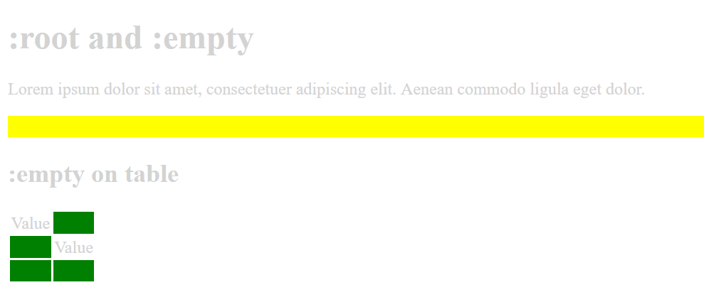
- CSS structure pseudo-classes with :root and :empty
Complete Code - Examples/Part_10/...
<body>
     <h1>:root and :empty</h1>
     <p>
         Lorem ipsum dolor sit amet, consectetuer adipiscing elit. Aenean commodo ligula eget dolor.
     </p>
     <p></p>
     <h2>:empty on table</h2>
     <table>
         <tbody>
             <tr>
                 <td>Value</td>
                 <td></td>
             </tr>
             <tr>
                 <td></td>
                 <td>Value</td>
             </tr>
             <tr>
                 <td></td>
                 <td></td>
             </tr>
         </tbody>
     </table>
 </body>
 :root {
     color: lightgrey;
 }

 :empty {
     background-color: yellow; padding: 10px;
 }

 td:empty {
     background-color: green;
 }
- Structure pseudo-classes for child elements
Complete Code - Examples/Part_11/...
<body>
     <h1>:first-child in body</h1>
     <p>
         Lorem ipsum dolor sit amet, consectetuer adipiscing elit. Aenean commodo ligula eget dolor.
     </p>
     <h2>:first-child and :last-child on table</h2>
     <table>
         <tbody>
             <tr>
                 <td>:first-child in tr</td>
                 <td>Text only</td>
                 <td>:last-child in tr</td>
             </tr>
             <tr>
                 <td>:first-child in tr</td>
                 <td>Text only</td>
                 <td>:last-child in tr</td>
             </tr>
         </tbody>
     </table>
     <ul>
         <li>This is selected by :first-child in ul.</li>
         <li>This is not selected.</li>
         <li>This is not selected.</li>
         <li>This is selected by :last-child in ul.</li>
     </ul>
     <p>This one is selected by :last-child of body.</p>
 </body>
 * {
     background-color: white;
 }

 body {
     padding: 5px;
 }

 :first-child {
     border: 2px solid black;
 }

 :last-child {
     border: 2px dotted gray;
 }
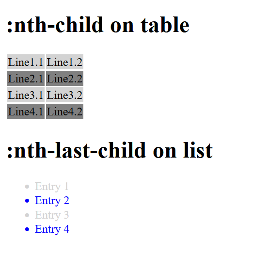
Complete Code - Examples/Part_12/...
 <body>
     <h1>:nth-child on table</h1>
     <table>
         <tbody>
             <tr>
                 <td>Line1.1</td>
                 <td>Line1.2</td>
             </tr>
             <tr>
                 <td>Line2.1</td>
                 <td>Line2.2</td>
             </tr>
             <tr>
                 <td>Line3.1</td>
                 <td>Line3.2</td>
             </tr>
             <tr>
                 <td>Line4.1</td>
                 <td>Line4.2</td>
             </tr>
         </tbody>
     </table>
     <h1>:nth-last-child on list</h1>
     <ul>
         <li>Entry 1</li>
         <li>Entry 2</li>
         <li>Entry 3</li>
         <li>Entry 4</li>
     </ul>
 </body>
 tr:nth-child(odd) {
     background: lightgray;
 }

 tr:nth-child(even) {
     background: grey;
 }

 li:nth-last-child(odd) {
     color: blue;
 }

 li:nth-last-child(even) {
     color: lightgray;
 }
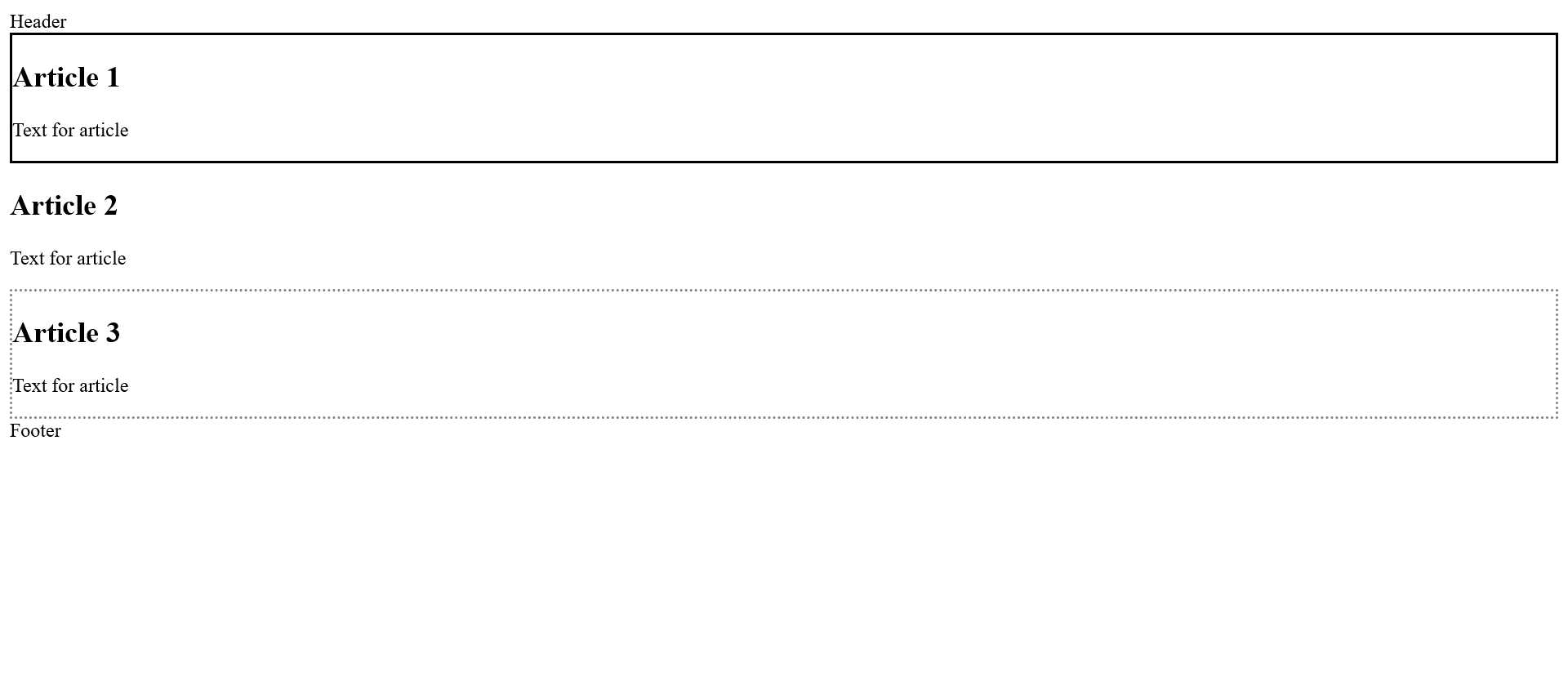
- Structure pseudo-classes for certain child elements
Complete Code - Examples/Part_13/...
 <body>
     <header>Header</header>
     <article>
         <h1>Article 1</h1>
         <p>Text for article</p>
     </article>
     <article>
         <h1>Article 2</h1>
         <p>Text for article</p>
     </article>
     <article>
         <h1>Article 3</h1>
         <p>Text for article</p>
     </article>
     <footer>Footer</footer>
 </body>
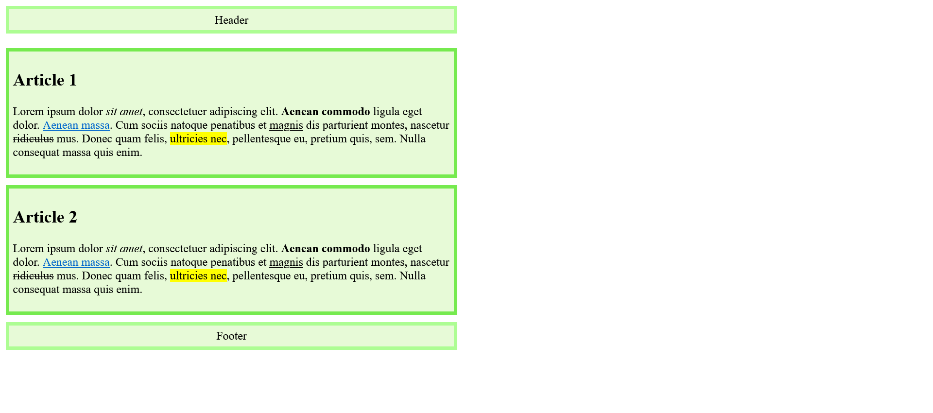
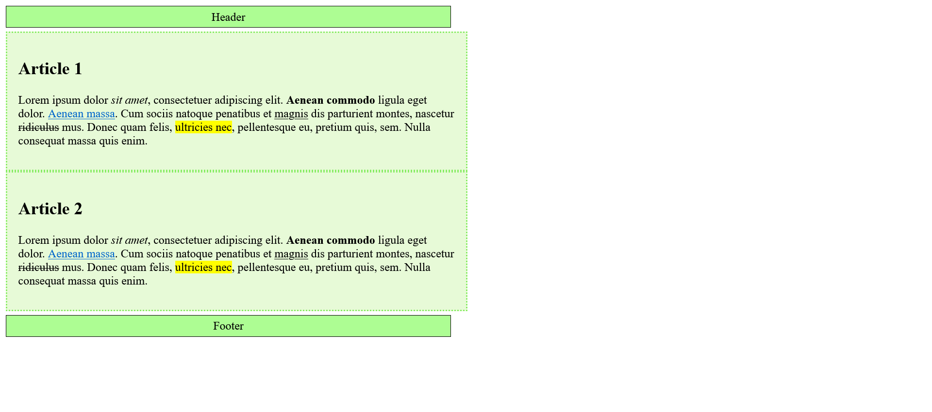
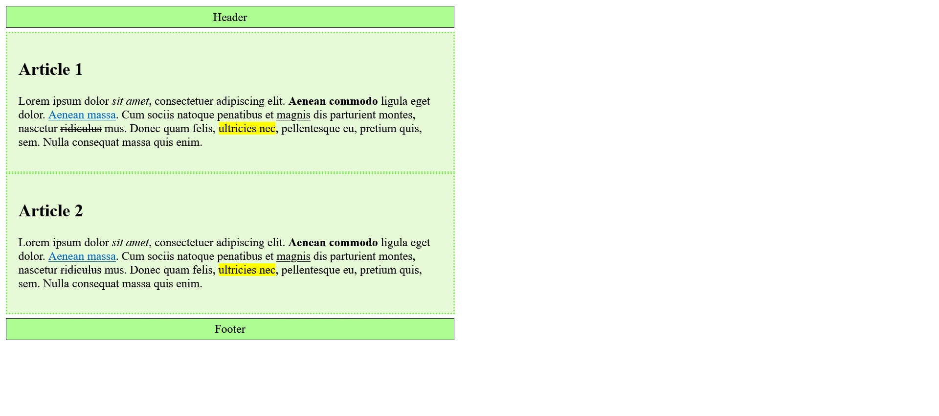
 article:first-of-type {
     border: 2px solid black;
 }

 article:last-of-type {
     border: 2px dotted gray;
 }
Complete Code - Examples/Part_13/...
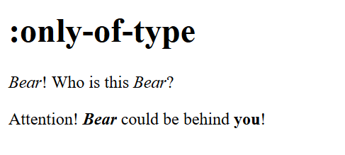
 <body>
     <h1>:only-of-type</h1>
     <p><em>Bear</em>! Who is this <em>Bear</em>?</p>
     <p>Attention! <em>Bear</em> could be behind <strong>you</strong>!</p>
 </body>
 em:only-of-type {
     font-weight: bold;
 }
- Pseudo elements, the selectors for elements that do not exist
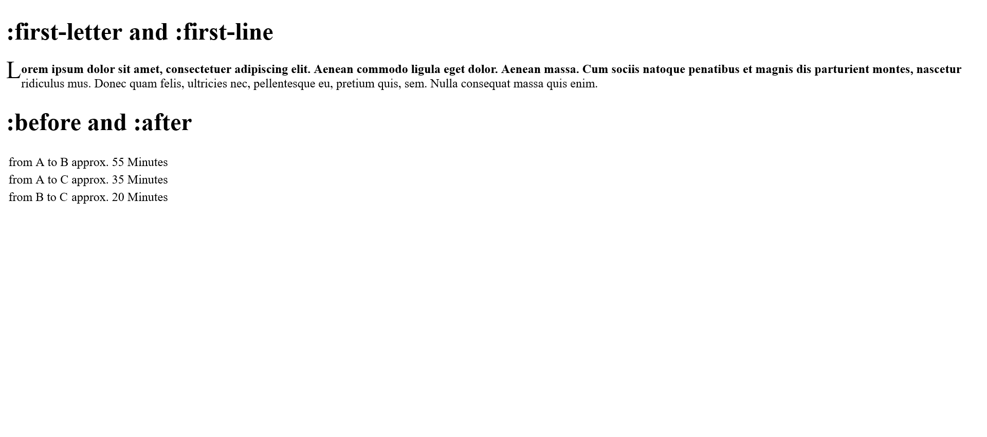
Complete Code - Examples/Part_15/...
 <body>
     <h1>:first-letter and :first-line</h1>
     <p>
         Lorem ipsum dolor sit amet, consectetuer adipiscing elit. Aenean commodo ligula eget dolor. Aenean massa. Cum sociis natoque penatibus et magnis dis parturient montes, nascetur ridiculus mus. Donec quam felis, ultricies nec, pellentesque eu, pretium quis,
         sem. Nulla consequat massa quis enim.
     </p>
     <h1>:before and :after</h1>
     <table>
         <tbody>
             <tr>
                 <td>from A to B</td>
                 <td class="time">55</td>
             </tr>
             <tr>
                 <td>from A to C</td>
                 <td class="time">35</td>
             </tr>
             <tr>
                 <td>from B to C</td>
                 <td class="time">20</td>
             </tr>
         </tbody>
     </table>
 </body>
 p::first-line {
     font-weight: bold;
 }

 p::first-letter{
     font-size: xx-large; float: left;
 }

 h1::-moz-selection {
     background-color: orange; color:red;
 }

 td.time::before {
     content: "approx. ";
 }

 td.time::after {
     content: " Minutes";
 }
2.2. Combinators
A combiner is a character between two selectors that concatenates these selectors. The first selector forms the condition and the second selector forms the target to be selected if the condition is true.
| Combinator | Designation | Meaning |
| E,F |
descendant combinator |
F is selected if it is a descendant of an E element |
| E > F |
child combinator |
F is selected only if it is a direct descendant of an E element |
| E + F |
adjacent sibling combinator |
F is only selected if it occurs directly after E (in the same parent element) |
| E ~ F |
general sibling combinator |
F is selected only if occurs after E (in the same parent element) |
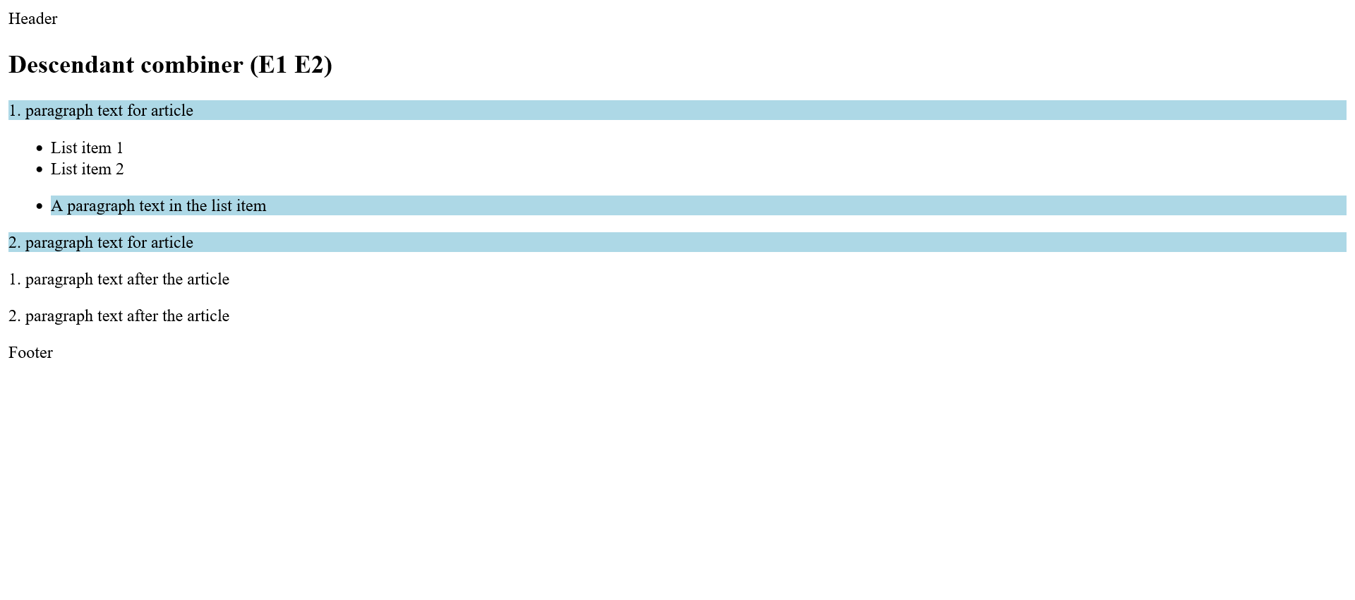
- Descendant selector (E, F)
Complete Code - Examples/Part_16/...
 <body>
     <header>Header</header>
     <article>
         <h1>Descendant combiner (E1 E2)</h1>
         <p>1. paragraph text for article</p>
         <ul>
             <li>List item 1</li>
             <li>List item 2</li>
             <li>
                 <p>A paragraph text in the list item</p>
             </li>
         </ul>
         <p>2. paragraph text for article</p>
     </article>
     <p>1. paragraph text after the article</p>
     <p>2. paragraph text after the article</p>
     <footer>Footer</footer>
 </body>
 article p {
     background: lightblue;
 }
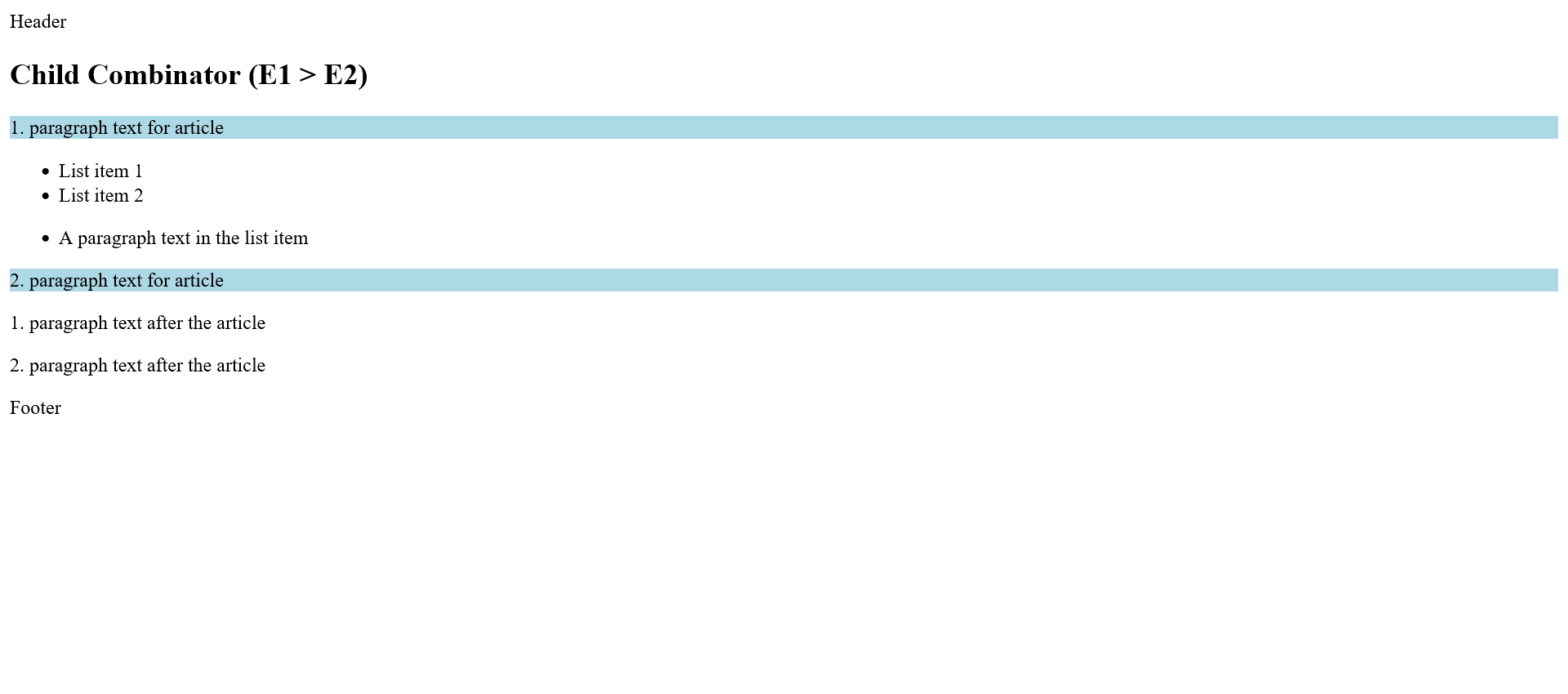
Complete Code - Examples/Part_17/...
 <body>
     <header>Header</header>
     <article>
         <h1>Child Combinator (E1 > E2)</h1>
         <p>1. paragraph text for article</p>
         <ul>
             <li>List item 1</li>
             <li>List item 2</li>
             <li>
                 <p>A paragraph text in the list item</p>
             </li>
         </ul>
         <p>2. paragraph text for article</p>
     </article>
     <p>1. paragraph text after the article</p>
     <p>2. paragraph text after the article</p>
     <footer>Footer</footer>
 </body>
 article > p {
     background: lightblue;
 }
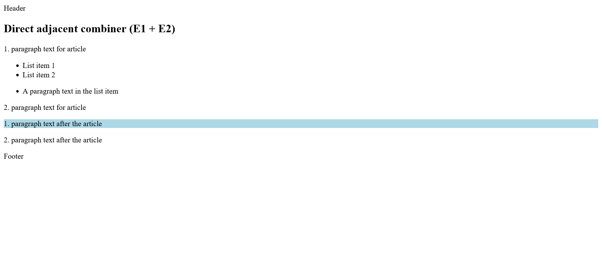
- Neighbor selector (E1 + E2)
Complete Code - Examples/Part_18/...
 <body>
     <header>Header</header>
     <article>
         <h1>Direct adjacent combiner (E1 + E2)</h1>
         <p>1. paragraph text for article</p>
         <ul>
             <li>List item 1</li>
             <li>List item 2</li>
             <li>
                 <p>A paragraph text in the list item</p>
             </li>
         </ul>
         <p>2. paragraph text for article</p>
     </article>
     <p>1. paragraph text after the article</p>
     <p>2. paragraph text after the article</p>
     <footer>Footer</footer>
 </body>
 article + p {
     background: lightblue;
 }
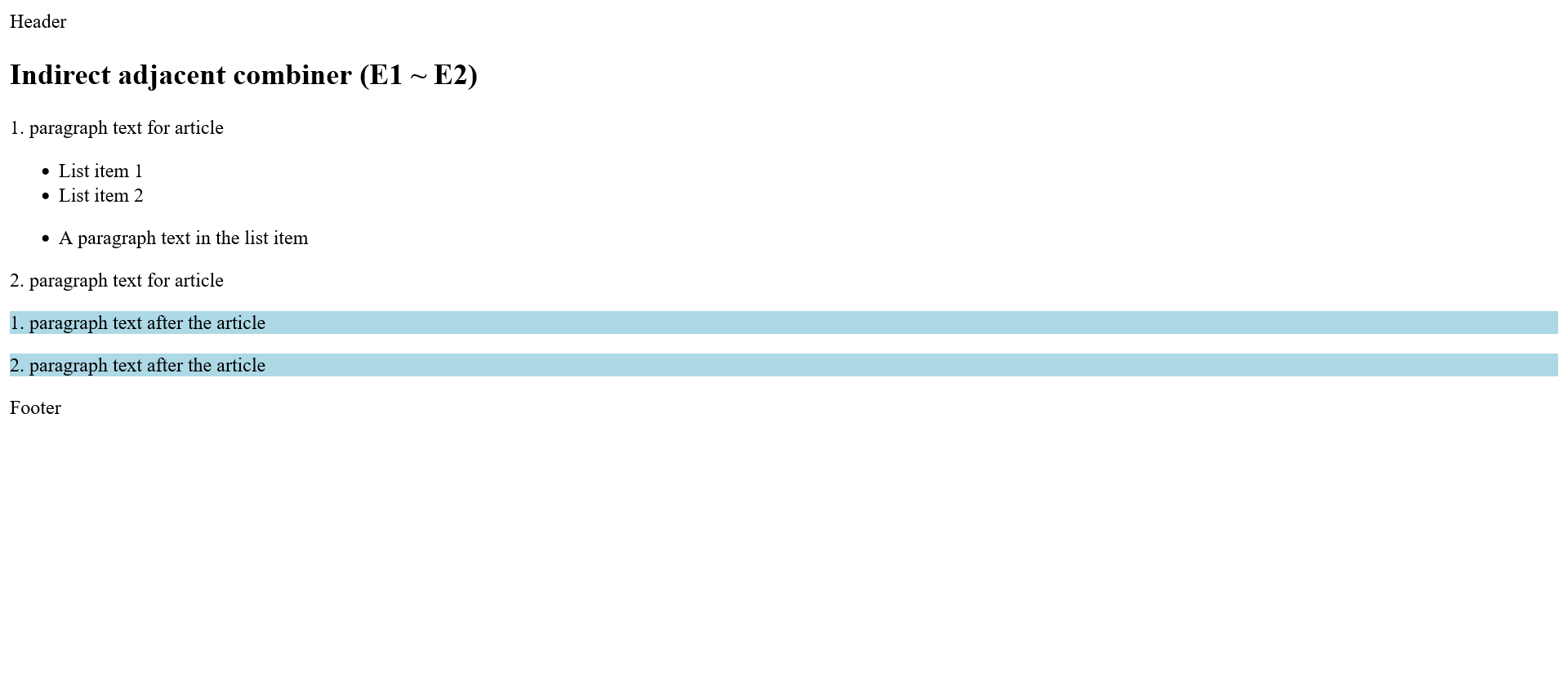
- Sibling selector (E1 ~ E2)
Complete Code - Examples/Part_19/...
 <body>
     <header>Header</header>
     <article>
         <h1>Indirect adjacent combiner (E1 ~ E2)</h1>
         <p>1. paragraph text for article</p>
         <ul>
             <li>List item 1</li>
             <li>List item 2</li>
             <li>
                 <p>A paragraph text in the list item</p>
             </li>
         </ul>
         <p>2. paragraph text for article</p>
     </article>
     <p>1. paragraph text after the article</p>
     <p>2. paragraph text after the article</p>
     <footer>Footer</footer>
 </body>
 article ~ p {
     background: lightblue;
 }
3. Inheritance and the cascade
3.1 The principle of inheritance in CSS
An important principle in CSS is inheritance. Only this makes it possible to define different CSS properties such as
colors, font and font size once in a central place instead of having to repeat them all the time. The various HTML
elements have ancestors and descendants (parent and child elements). Because of these relationships, the subsequent
child elements inherit many style properties from the higher-level parent elements.
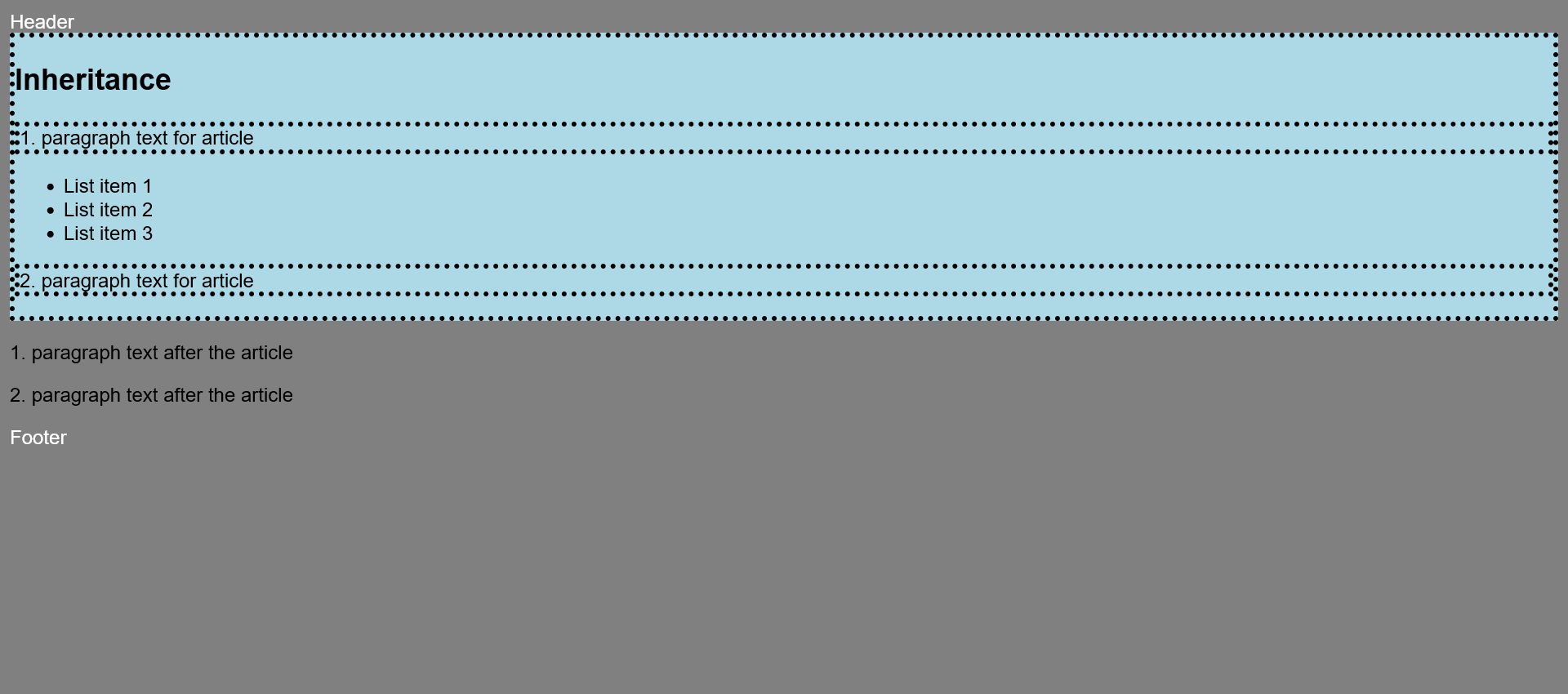
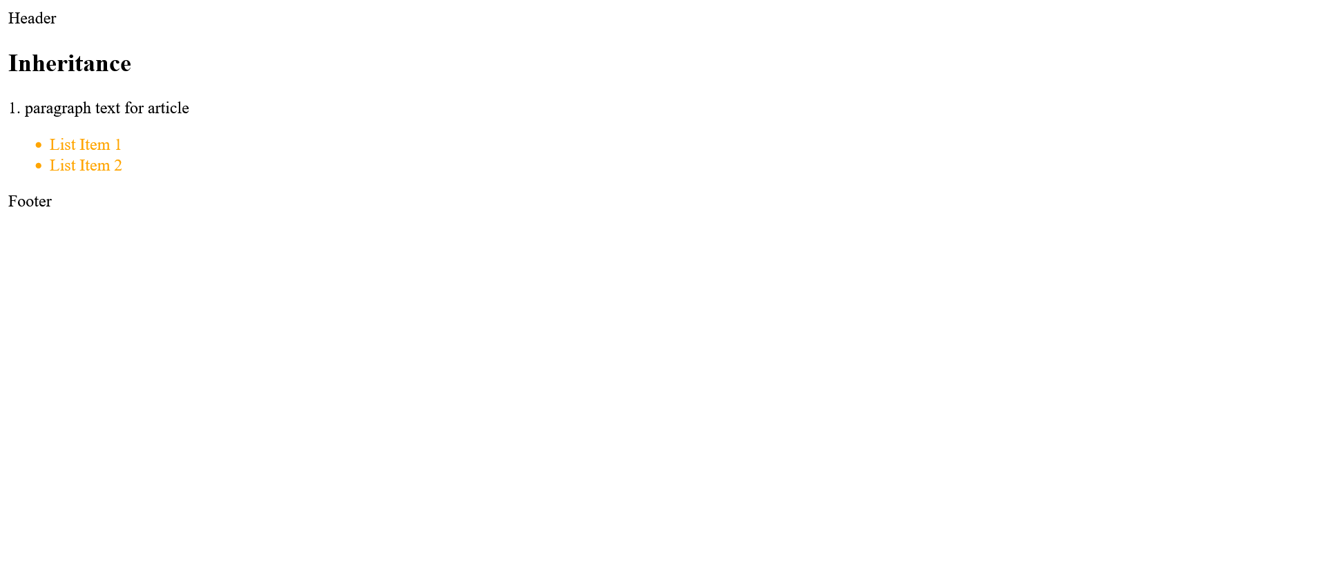
Complete Code - Examples/Part_1/...
 <body>
     <header>Header</header>
     <article>
         <h1>Inheritance</h1>
         <p>1. paragraph text for article</p>
         <ul>
             <li>List item 1</li>
             <li>List item 2</li>
             <li>List item 3</li>
         </ul>
         <p>2. paragraph text for article</p>
     </article>
     <p>1. paragraph text after the article</p>
     <p>2. paragraph text after the article</p>
     <footer>Footer</footer>
 </body>
The body element here contains a header, article, two p and a footer element as direct descendants. This makes
the body element the parent element of all these elements. Direct descendants of the article element are the
h1, p, and ul elements. These direct descendants of article are the indirect descendants of the body element.
Starting from the body element, the set CSS properties are inherited from element to element.
 body {
     background: gray;
     font-family: Arial, Verdana;
     color: white;
 }

 article {
     background: lightblue;
     color: black;
 }
If, as in this example with the article selector, a new inheritable CSS property is assigned to an element, such
as the text color here, the element specified with the selector (here article) and its descendants no longer
inherit the CSS property of the parent element. In that case, the CSS properties declared in the selector to the
descendants of an article element now become a black text color. The font-family of the body selector, on the
other hand, was not declared in the article type selector, so the font-family declared in the body selector
(here Arial) is still passed on to article and its descendants. background is not passed on to the descendants
by the article selector, but is transparent, since that is the default value in CSS.
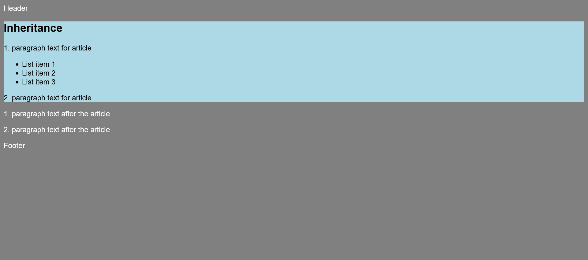
If no specific value has been assigned to a CSS property, then the web browser uses the default value set for it
when it inherits. If these inheritances did not exist, a CSS rule would have to be explicitly created for each
element. Inheritance can help write an efficient and well-organized stylesheet. For example, it is often
sufficient to specify the font and other CSS properties early in the body element.
Caution when using relative properties
Inheriting relative units such as font size with percentages or em can result in surprising changes, because some
web browsers reapply this value for each element if the font size is also defined with percentages or em for
further elements. Because it is not the value defined in the stylesheet that is passed on, but the value
calculated by the web browser.
Not everything is inherited
Not all CSS properties are passed on to the descendants. Especially CSS properties like margin,
padding, border or width would not
make much sense. The following are not inherited: background, border,
width, height, padding,
margin, position, top,
right, bottom, left,
float, clear.
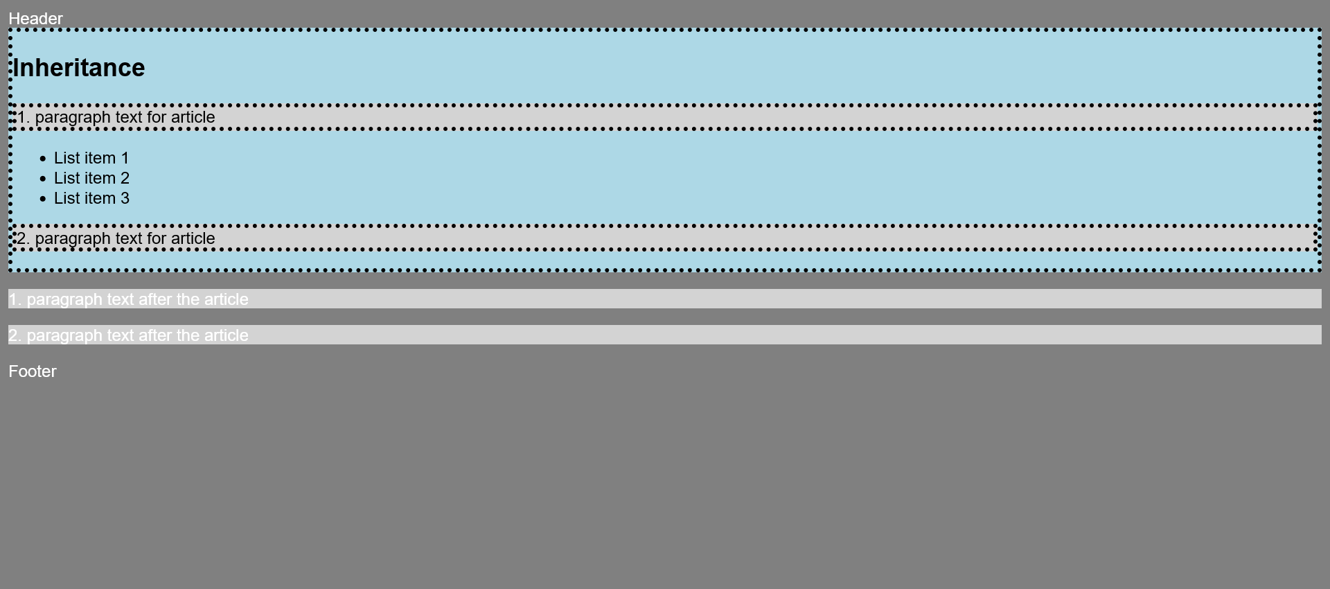
Force inheritance with inherit
Some CSS properties are not inherited, but it is possible to force that with inherit.
Complete Code - Examples/Part_2/...
 <body>
     <header>Header</header>
     <article>
         <h1>Inheritance</h1>
         <p>1. paragraph text for article</p>
         <ul>
             <li>List item 1</li>
             <li>List item 2</li>
             <li>List item 3</li>
         </ul>
         <p>2. paragraph text for article</p>
     </article>
     <p>1. paragraph text after the article</p>
     <p>2. paragraph text after the article</p>
     <footer>Footer</footer>
 </body>
 body {
     font-family: Arial, Verdana;
     color: white;
     background: gray;
 }

 article {
     border: 4px dotted black;
     background: lightblue;
     color: black;
 }

 p {
     border: inherit;
     background: lightgray;
 }
Restore the default value of a CSS property with initial
Complete Code - Examples/Part_3/...
 <body>
     <header>Header</header>
     <article>
         <h1>Inheritance</h1>
         <p>1. paragraph text for article</p>
         <ul>
             <li>List item 1</li>
             <li>List item 2</li>
             <li>List item 3</li>
         </ul>
         <p>2. paragraph text for article</p>
     </article>
     <p>1. paragraph text after the article</p>
     <p>2. paragraph text after the article</p>
     <footer>Footer</footer>
 </body>
 body {
     font-family: Arial, Verdana;
     color: white;
     background: gray;
 }

 article {
     border: 4px dotted black;
     background: lightblue;
     color: black;
 }

 p {
     border: inherit;
     background: unset;
     color: initial;
 }
With color:initial; the font color of all p elements in the HTML document is reset to the default value of the browser.
Force inheritance or restore value with unset
The unset keyword is a middle ground between inherit and initial.
When the keyword is used for a CSS property, it behaves like inherit and inherits the value for the corresponding CSS property
of the parent element. If there is no parent element with a set value for that CSS property, unset behaves like
initial and resets a CSS property to the default value provided by the CSS specification.
Force inherit or restore values for all properties
With the shorthand notation all, all CSS properties of the parent element can be inherited with inherit or reset to default with initial. unset can also be used with all.
Complete Code - Examples/Part_4/...
 <body>
     <header>Header</header>
     <article>
         <h1>Inheritance</h1>
         <p>1. paragraph text for article</p>
         <ul>
             <li>List item 1</li>
             <li>List item 2</li>
             <li>List item 3</li>
         </ul>
         <p>2. paragraph text for article</p>
     </article>
     <p>1. paragraph text after the article</p>
     <p class="p_outside">2. paragraph text after the article</p>
     <footer>Footer</footer>
 </body>
 body {
     font-family: Arial, Verdana;
     color: white;
     background: gray;
 }

 article {
     border: 4px dotted black;
     background: lightblue;
     color: black;
 }

 p {
     border: inherit;
     background: lightgray;
     color: unset;
 }

 .p_outside {
     all: initial;
     display: block;
     margin: 5px;
     color: silver;
 }
3.2. Understanding the control system of the cascade
Cascade means that a document can be formatted not only by one stylesheet, but from a multitude of stylesheets that can come from
different sources. This makes it possible for one stylesheet to build on another, saving a lot of work. Due to the multiple ways in
which stylesheet statements can be included and combined with each other, conflicts and contradictions can come up. Such a conflict
arises when the same CSS property has been assigned different values in several statements. For such cases, there is a rule system
that decides which of the conflicting or competing style statements will ultimately be applied to an element.
The origin of a stylesheet
- Browser stylesheet: The default stylesheet of the web browser is used if no CSS formatting is assigned to the HTML document. Each web
browser provides basic formatting for this purpose. Each web browser provides its own default setting, so there are usually slight
differences.
- User stylesheet: Some web browsers offer the user directly or via extensions to include own stylesheet files. When custom stylesheets
are included, the corresponding properties of the web browser are overridden.
- Author stylesheet: This is the stylesheet you created and referenced or included with the @import rule, which is usually used to override
or combine various CSS properties of the browser stylesheet and, if applicable, the user stylesheet.
Of these three sources, the browser stylesheet has the lowest priority. If a user stylesheet (medium priority) is used, the browser stylesheet is overwritten. The author
stylesheet has the highest priority and overwrites all others.
Increase the priority of a CSS property with !important
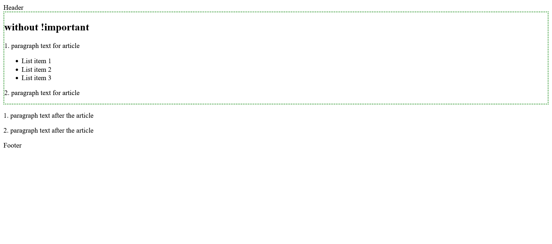
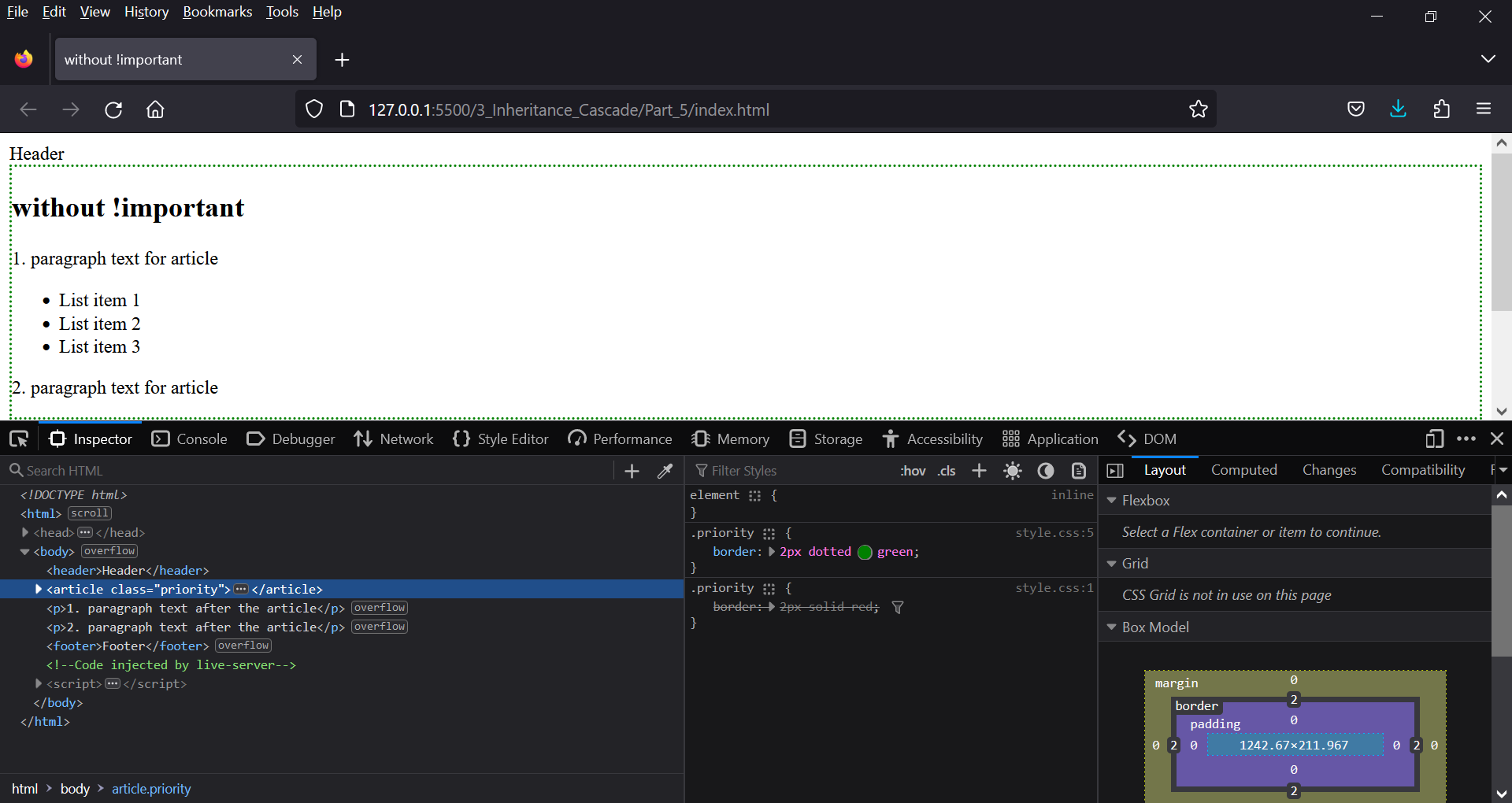
If a CSS rule or CSS property is declared multiple times in the same file, the last declared property usually becomes active.
Complete Code - Examples/Part_5/...
 <body>
     <header>Header</header>
     <article class="priority">
         <h1>without !important</h1>
         <p>1. paragraph text for article</p>
         <ul>
             <li>List item 1</li>
             <li>List item 2</li>
             <li>List item 3</li>
         </ul>
         <p>2. paragraph text for article</p>
     </article>
     <p>1. paragraph text after the article</p>
     <p>2. paragraph text after the article</p>
     <footer>Footer</footer>
 </body>
 .priority {
     border: 2px solid red;
 }

 .priority {
     border: 2px dotted green;
 }
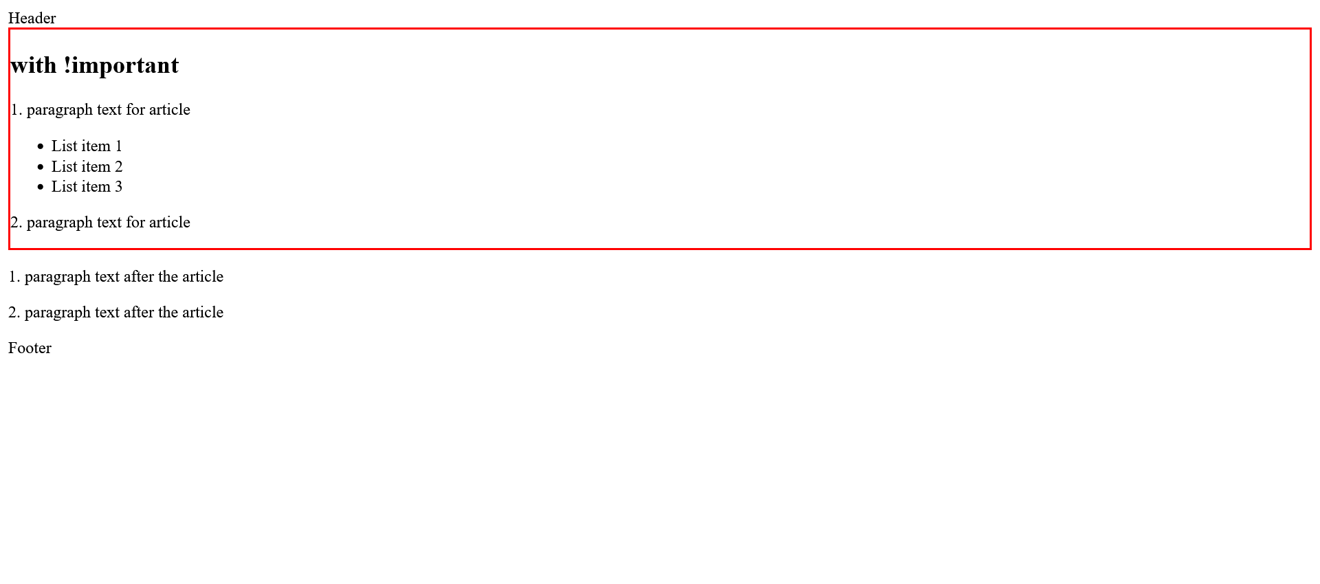
The CSS keyword !important can be used to increase the priority so that the property cannot be overridden by the following specifications.
Complete Code - Examples/Part_6/...
 <body>
     <header>Header</header>
     <article class="priority">
         <h1>with !important</h1>
         <p>1. paragraph text for article</p>
         <ul>
             <li>List item 1</li>
             <li>List item 2</li>
             <li>List item 3</li>
         </ul>
         <p>2. paragraph text for article</p>
     </article>
     <p>1. paragraph text after the article</p>
     <p>2. paragraph text after the article</p>
     <footer>Footer</footer>
 </body>
 .priority {
     border: 2px solid red !important;
 }

 .priority {
     border: 2px dotted green;
 }
Sorting by weighting of the selectors
This sorting is used when there are equivalent specifications within a stylesheet. Here, a value is calculated for each selector that
indicates the weighting of the selector. This value is called specificity. This specificity is expressed as a numerical value, and the
higher this numerical value is, the more important the selector is, and it overwrites a competing selector with a lower value.
from highest weight(A) to lowest weight(D):
- A = style attributes
- B = ID
- C = class, pseudo-class, attributes,
- D = pseudo elements
Universal selectors with * get no weighting and behave neutrally, as do combinatorial characters >,+,~ and the space between two selectors.
Complete Code - Examples/Part_7/...
 <body>
     <header>Header</header>
     <article>
         <h1>Inheritance</h1>
         <p>1. paragraph text for article</p>
         <ul id="index">
             <li class="aclass">List Item 1</li>
             <li class="aclass">List Item 2</li>
         </ul>
     </article>
     <footer>Footer</footer>
 </body>
 .aclass {
     color: green;
 }

 #index li.aclass {
     color: orange;
 }

 li {
     color: red;
 }

 li.aclass {
     color: blue;
 }

 body article ul li {
     color: yellow;
 }

 #index li {
     color: gray;
 }
Analyzing the cascade in the browser
Many web browsers offer developer tools that are a great help. There you can easily see which CSS properties were inherited from
the web browser (USER AGENT STYLESHEET) and which were inherited from other elements (INHERITED FROM). Crossed out elements were
overwritten by another element.
3.3. Pass values to CSS properties
Only the most common types will be discussed here. More information about CSS values can be found at w3.
The different units of measurement in CSS
The specifications of numerical values, e.g. font sizes, heights and widths or distances, are noted directly after the value. In CSS, there are many units of measurement that can be used either as
relative or absolute specifications. For the number 0, the unit of measurement does not have to be specified.
 font-size: 14pt;
 margin: 1em;
 width: 100%;
 border: 3px ...;
The numeric values in CSS can be integers or floating point numbers. The comma is represented by a dot in CSS. e.g. font-size: 1.2em;.
Some values in CSS do not require units of measurement, e.g. z-index: 1; or opacity: 0.5;. Negative
values can also be used as long as it makes sense e.g. z-index: -2; , but negative values cannot be used for length specifications
like height or width.
| unit of measurement | CSS name | specification | description |
| pixel |
px |
absolute, relative |
The display of pixels depends on the pixel density of the output device. At a high screen resolution, the pixels become smaller, which is why the display
appears smaller. Pixels are thus a relative unit of measurement on display devices and an absolute unit of measurement in relation to the content. |
| point |
pt |
absolute |
This is a typographic unit of measure, and 1 point is equal to 1/72 inch e.g. font-size: 12pt; |
| pica |
pc |
absolute |
Pica is a typographic unit of measurement, one pica is 1/6 inch and therefore equals 12 points e.g font-size: 1pc; or 12pt |
| centimeter |
cm |
absolute |
A centimeter is the hundredth part of a meter and corresponds to 10 mm e.g. margin: 1.2cm; |
| millimeter |
mm |
absolute |
A millimeter is one thousandth of a meter e.g. padding: 3mm; |
| inch |
in |
absolute |
1 inch equals 2.54 cm e.g. margin-top: 1in; |
| square width |
em |
relative |
An em stands for the font size of the element. If em is used for the font size itself, then this value refers to the font size of the parent element e.g. font-size: 1.3em; |
| x-height |
ex |
relative |
An ex represents the height of the lowercase x of the font used in this element. Again, if ex is used for the font size, then this height refers to the value of x in the parent element. |
| percent |
% |
relative |
The percentage is very flexible. It depends on the CSS property whether this value refers to the element's own size, to that of the parent element, or to a general context. |
| root em |
rem |
relative |
The rem initially behaves in the same way as em, except that the rem value is based on the root element and not on the font size of the respective parent element. In HTML the root element is the body or html element e.g. font-size: 1.2.rem; |
| viewport width |
vw |
relative |
1vw corresponds to 1% or the hundredth part of the width of the display area. Thus, 100vw is equal to the complete width of the display area. This unit of measurement can be used to adjust the font size to the display area of the device or the size of the browser window. |
| viewport height |
vh |
relative |
1vh corresponds to 1% or the hundredth part of the height of the display area. Therefore, 100vh is equal to the entire height of the display area. This unit of measurement can be used to adjust the font size to the display area of the device or the size of the browser window. |
Strings and keywords as value for CSS properties
CSS makes a strict distinction between keywords and strings.
Strings are placed between single or double quotes in CSS:
- content: " meter";
- content: '$ ';
The keywords in CSS are not marked separately:
- color: white;
- width: auto;
- display: inline-block;
Use color in CSS
An important design element in CSS are colors. There are several ways to specify color values in CSS. None of these different color specifications have advantages or disadvantages when displayed on the web page.
use a name as color value
From the beginning it was possible in CSS to note color values directly with names.
 section {
     background-color: gray;
     color: blue;
 }
A list of all color values, can be found at 147Colors.
Classic hexadecimal notation for the color specification
This notation is still one of the most commonly used for color values. The specification starts with the character #, followed by the color parts for red, green and blue in a range from 00(for 0) to FF(for 255). The general notation is #RRGGBB.
 section {
     background-color: #0000FF;      /* blue */
     color: #FFFFFF;     /* white */
 }
There is also a shorthand notation for hexadecimal values.
 section {
     background-color: #000000;      /* black */
     color: #FFFFFF;     /* white */
 }
The same but in shorthand:
 section {
     background-color: #000;      /* black */
     color: #FFF;     /* white */
 }
Mix colors yourself with red, green and blue
An RGB color mixture can be defined with CSS function rgb(red, green, blue). The specifications for red, green and blue can be made either with percentage values (0-100%) or with decimal numbers (0-255).
-
decimal numbers
 section {
     background-color: rgb(0, 0, 255);      /* blue */
     color: rgb(255, 255, 255);      /* white */
 }
-
percent
 section {
     background-color: rgb(0%, 0%, 100%);      /* blue */
     color: rgb(100%, 100%, 100%);      /* white */
 }
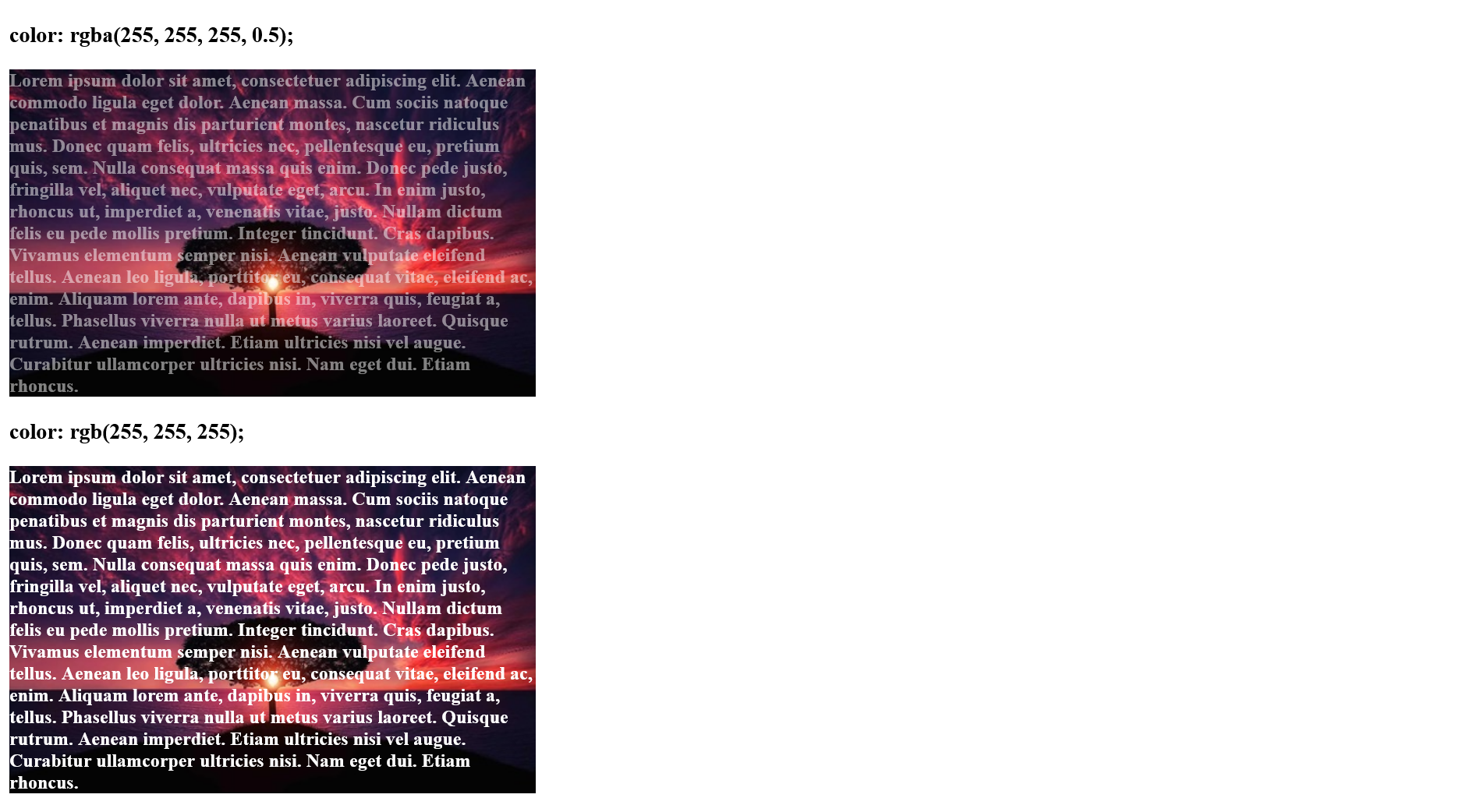
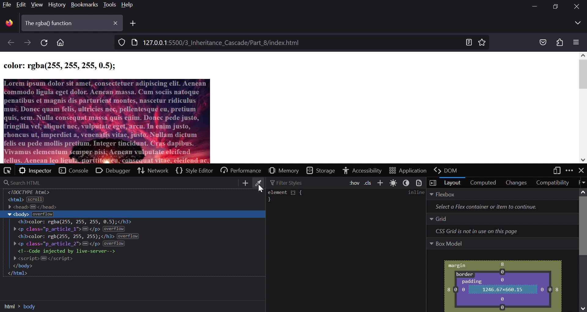
RBG mix with transparency
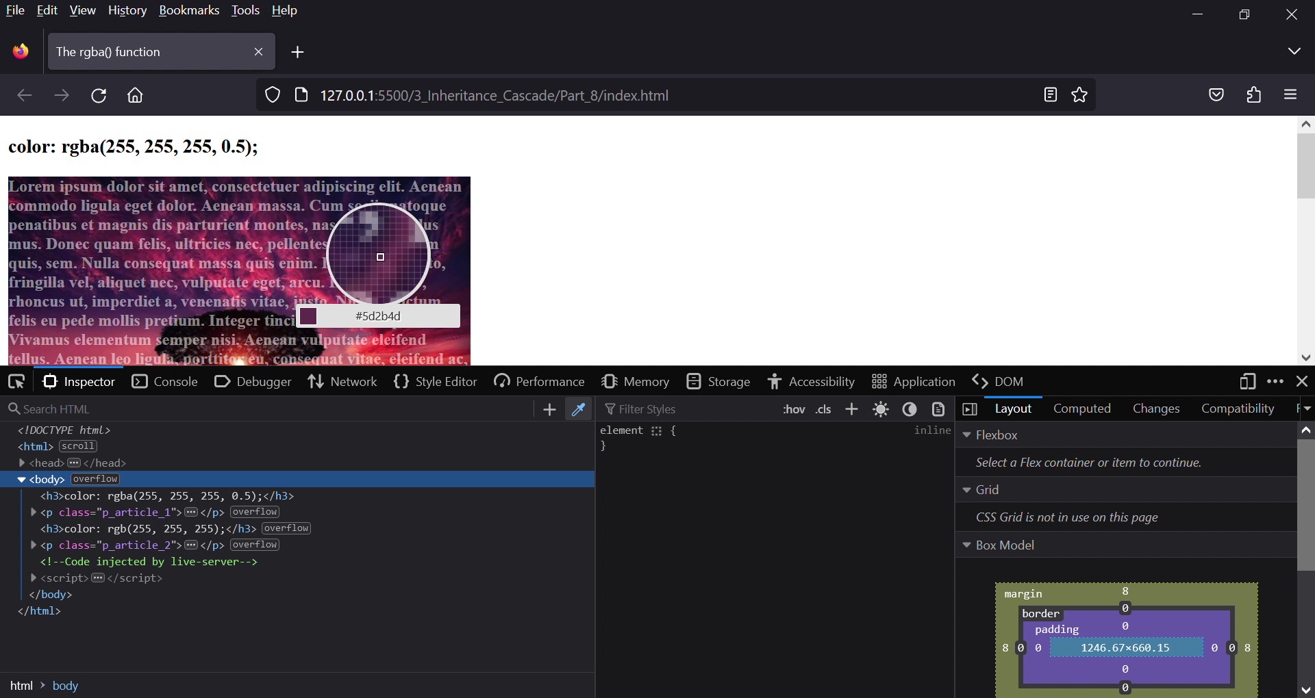
Another function is rgba(), this has been extended by only one value, the alpha value for transparency. This value can be used to specify the transparency of the color. The value 0.0 means complete transparency,
and the value 1.0 stands for complete opacity and thus corresponds to the function rgb().
 section {
     color: rgba(255, 255, 255, 0.3)
 }
Complete Code - Examples/Part_8/...
 <body>
     <h3>color: rgba(255, 255, 255, 0.5);</h3>
     <p class="p_article_1">Lorem ipsum dolor sit amet, consectetuer adipiscing elit...</p>
     <h3>color: rgb(255, 255, 255);</h3>
     <p class="p_article_2">Lorem ipsum dolor sit amet, consectetuer adipiscing elit...</p>
 </body>
 .p_article_1 {
     background-image:url('../images/sunsetTree.jpg');
     background-repeat: no-repeat;
     font-weight: bolder;
     width: 450px;
     color: rgba(255, 255, 255, 0.5);
 }

 .p_article_2 {
     background-image:url('../images/sunsetTree.jpg');
     background-repeat: no-repeat;
     font-weight: bolder;
     width: 450px;
     color: rgb(255, 255, 255);
 }
HSL Mix - mix colors with hue, saturation and lightness
Starting at Level 3, CSS offers an HSL blend of hue, saturation, and lightness. Many web designers find it more intuitive or easier to remember to specify the hue
with an integer value from 0 to 360. It's like a color wheel from 0 to 359 degrees, where the value 0 or 360 represents red, 120 represents green, and 240
represents blue. The values of saturation and lightness are expressed as percentages. The more the value of saturation is reduced from 100% to 0%, the more the hue
becomes a gray. The normal brightness, on the other hand, is indicated with the value 50%. A lightness of 100% is white and a lightness of 0% is black.
 .p_article {
     background-color: hsl(240, 100%, 50%);      /* blue */
     color: hsl(0, 100%, 100%);      /* white font color */
 }
As with the RGB blends, there is still an HSL blend with hsla(hue, saturation, lightness, opacity), where the opacity can be specified as a fourth parameter from
0 (completely transparent) to 1 (no transparency).
If you want to find out which color is used on a page, the browsers offer help. Firefox for example has a color picker:
Google Chrome offers the extension ColorZilla (which is also available for Firefox). And for Microsft Edge I would use ColorFish Color Picker (if I would use it).
The browsers offer many help options, it is recommended to be familiar with the brwosers.
Angle measures in CSS
In CSS there are also some angle measures that can be used to define a rotation. If a negative value is used, the rotation is counterclockwise.
| Unit of Measurement | CSS Name | Description |
| degrees |
deg |
angle in degrees; 360 degrees corresponds to a complete circle e.g. tarnsform: rotate(90deg); |
| Gon |
grad |
angle in Gon; a complete circle corresponds to 400 Gon. 100 Gon = 90 degree e.g. tarnsform: rotate( 100grad); |
| Gon |
rad |
angle in ground measure; a complete circle corresponds to 2 Pi e.g. tarnsform: rotate(5.5rad); |
| full angle |
turn |
A full angle is a circle rotation (0.25turn corresponds to a 90 degree rotation) e.g. tarnsform: rotate(0.25turn); |
Shorthand in CSS
margin: is used for an outer border or distance between the current element and its parent or neighboring element.
 section {
     margin: 20px;
 }
is the shorthand notation of:
 section {
     margin-top: 20px;
     margin-right: 20px;
     margin-bottom: 20px;
     margin-left: 20px;
 }
also possible:
 section {
     margin: 20px 10px 20px 5px;     /* margin-top, margin-right, margin-bottom, margin-left */
 }
The only important thing about this notation is that the order is clockwise (top = 12 o'clock).
If the values of left and right are equal, is also possible:
 section {
     margin: 20px 10px 5px;     /* margin-top, margin-right and -left, margin-bottom */
 }
 section {
     margin: 20px 10px;     /* margin-top and -bottom, margin-right and -left */
 }
also possible:
 section {
     margin: 20px;     /* margin-top, margin-bottom, margin -left */
     margin-right: 0;
 }
Besides margin, there are other CSS properties that I will discuss here later.
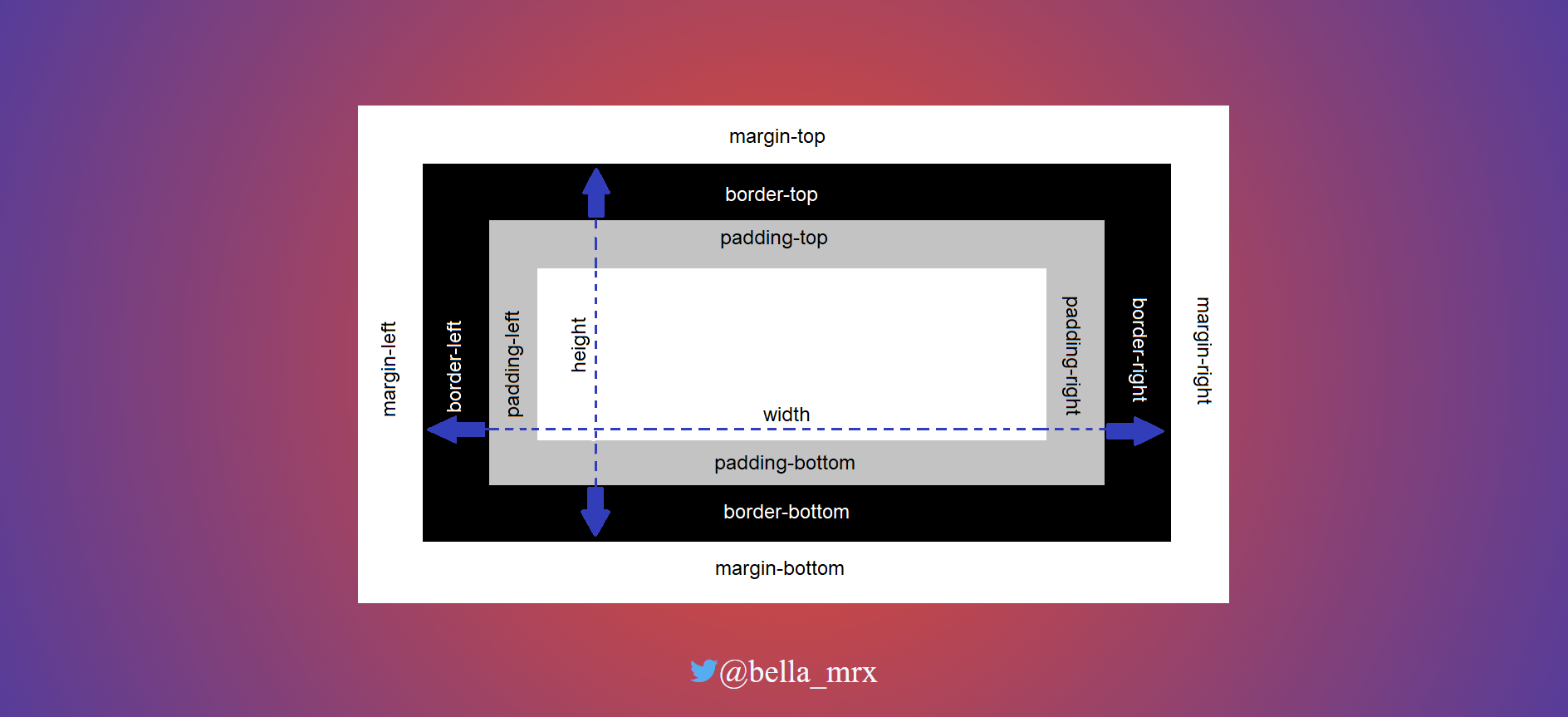
4. The box model of CSS
In CSS, the box model serves as the basis for positioning elements and creating a layout.
4.1. The classic box model
The box model includes:
- the actual content of text and images, which is specified with width and height
- padding, which creates space between the content and the border of an element
- the border
- margin, this creates space around an element, outside of paddings and borders
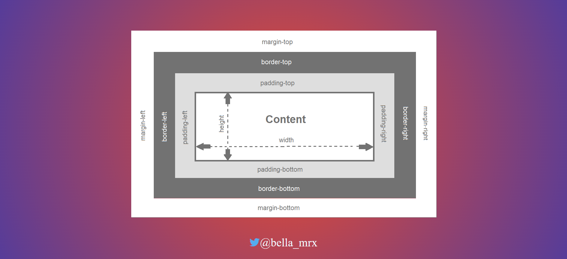
width and height
The actual content area with the space for text and images can be specified with the CSS properties width and height. If no value is specified, the HTML element is as wide and high as the surrounding element.
Complete Code - Examples/Part_1/...
 <h1>width and height</h1>
 <article class="article_01">
     <h2 class="h_2">Article 1 (width: 300px)</h2>
     <p>
         Lorem <abbr>ipsum</abbr> dolor <em>sit amet</em>, consectetuer adipiscing elit. <strong>Aenean commodo</strong> ligula eget dolor.
         <a href="#">Aenean massa</a>. Cum sociis natoque penatibus et
         <ins>magnis</ins> dis parturient montes, nascetur
         <del>ridiculus</del> mus. Donec quam felis, <mark>ultricies nec</mark>, pellentesque eu, pretium quis, sem. Nulla consequat massa quis enim.
     </p>
 </article>
 <article class="article_02">
     <h2 class="h_2">Article 2 (width: 600px)</h2>
     <p>
         Lorem <abbr>ipsum</abbr> dolor <em>sit amet</em>, consectetuer adipiscing elit. <strong>Aenean commodo</strong> ligula eget dolor.
         <a href="#">Aenean massa</a>. Cum sociis natoque penatibus et
         <ins>magnis</ins> dis parturient montes, nascetur
         <del>ridiculus</del> mus. Donec quam felis, <mark>ultricies nec</mark>, pellentesque eu, pretium quis, sem. Nulla consequat massa quis enim.
     </p>
 </article>
 .article_01 {
     width: 300px; background: #e7fad7;
 }

 .article_02 {
     width: 600px; background: #e7fad7;
 }

 .h_2 {
     background: #adfd93;
 }
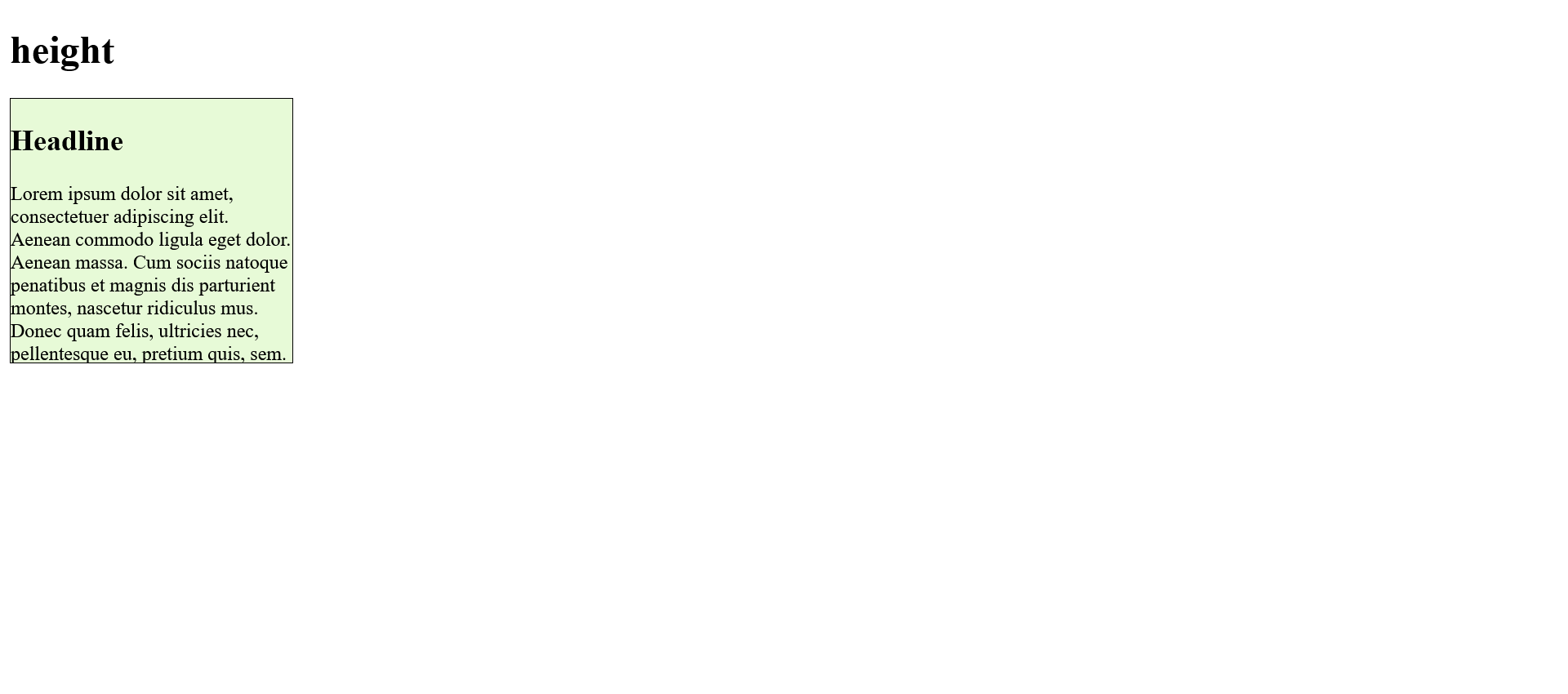
Note that the height specification is only an initial value. If the content of the encompassing element is greater than the specified height, the content will still be displayed and will overflow the box.
Complete Code - Examples/Part_2/...
 <h1>height</h1>
 <article class="article_01">
     <h2>Headline</h2>
     <p>
         Lorem ipsum dolor sit amet, consectetuer adipiscing elit. Aenean commodo ligula eget dolor. Aenean massa. Cum sociis natoque penatibus et magnis dis parturient montes, nascetur ridiculus mus. Donec quam felis, ultricies nec, pellentesque eu, pretium quis,
         sem. Nulla consequat massa quis enim. Donec pede justo, fringilla vel, aliquet nec, vulputate eget, arcu. In enim justo, rhoncus ut, imperdiet a, venenatis vitae, justo.
     </p>
 </article>
 .article_01 {
     width: 230px;
     height: 215px;
     background-color: #e7fad7;
     border: black 1px solid;
     /* overflow: hidden; */
 }
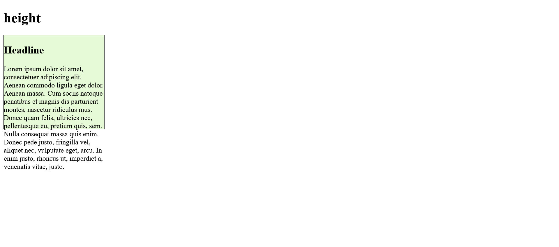
If overflowing is to be prevented, this is possible with the CSS property overflow: hidden;, with which, however, the oversized content is no longer displayed.
In practice, fixed values for width and height are rarely defined. Responsive web design tends to use properties such as min-width or min-height or max-height to allow flexible limits suitable for the device or screen width.
padding
The CSS property padding alone sets all four sides clockwise, which is the shorthand notation:
 section {
     padding: 20px;
 }
is the shorthand notation of:
 section {
     padding-top: 20px;
     padding-right: 20px;
     padding-bottom: 20px;
     padding-left: 20px;
 }
The shorthand notation with padding works the same as with margin.
border
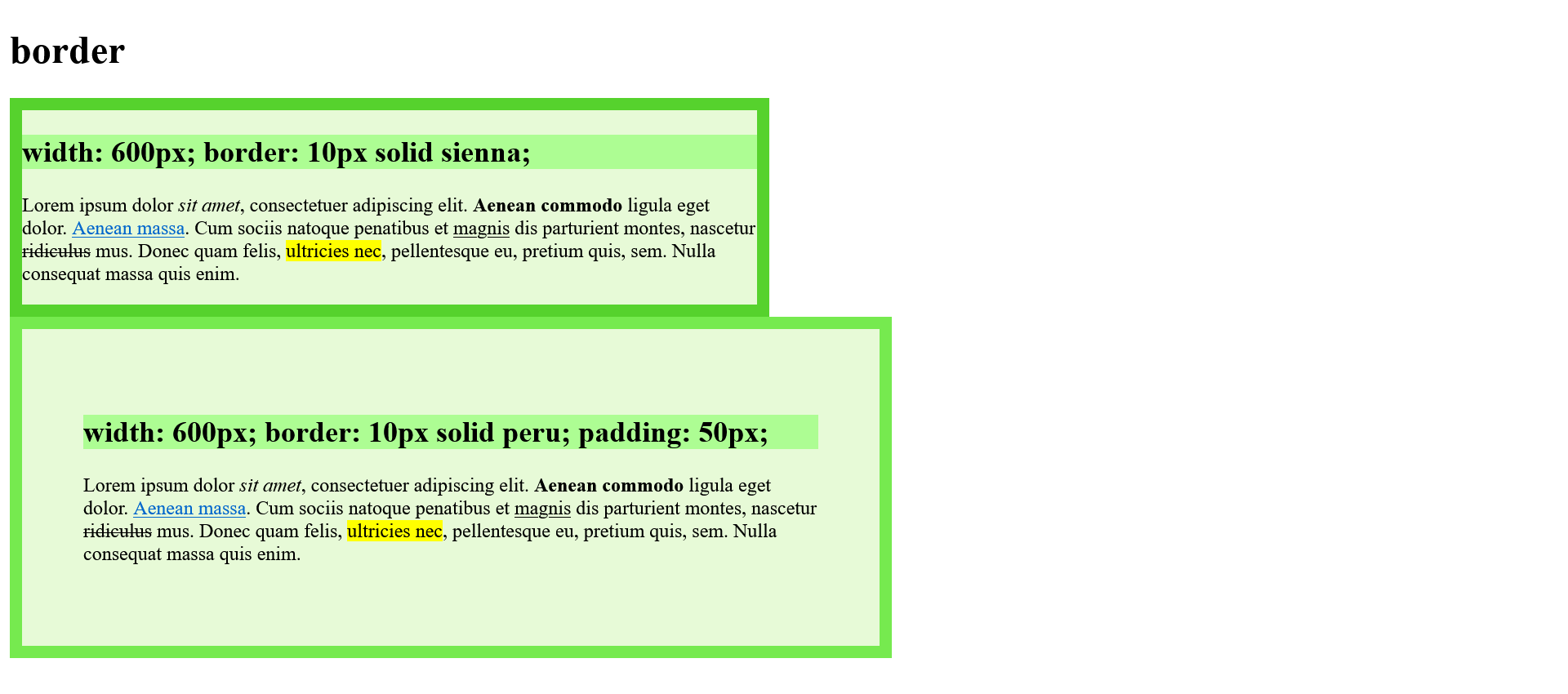
The border wraps around the inner space (padding) and has its own CSS properties for thickness, line style, and color. Again, as with margin and padding, all four sides can be adjusted separately.
Complete Code - Examples/Part_3/...
 <h1>border</h1>
 <article class="article01">
     <h2 class="h_2">width: 600px; border: 10px solid sienna;</h2>
     <p>
         Lorem <abbr>ipsum</abbr> dolor <em>sit amet</em>, consectetuer adipiscing elit. <strong>Aenean commodo</strong> ligula eget dolor.
         <a href="#">Aenean massa</a>. Cum sociis natoque penatibus et
         <ins>magnis</ins> dis parturient montes, nascetur
         <del>ridiculus</del> mus. Donec quam felis, <mark>ultricies nec</mark>, pellentesque eu, pretium quis, sem. Nulla consequat massa quis enim.
     </p>
 </article>
 <article class="article02">
     <h2 class="h_2">width: 600px; border: 10px solid peru; padding: 50px;</h2>
     <p>
         Lorem <abbr>ipsum</abbr> dolor <em>sit amet</em>, consectetuer adipiscing elit. <strong>Aenean commodo</strong> ligula eget dolor.
         <a href="#">Aenean massa</a>. Cum sociis natoque penatibus et
         <ins>magnis</ins> dis parturient montes, nascetur
         <del>ridiculus</del> mus. Donec quam felis, <mark>ultricies nec</mark>, pellentesque eu, pretium quis, sem. Nulla consequat massa quis enim.
     </p>
 </article>
 .article01 {
     width: 600px;
     border: 10px solid #56d22d;
     background-color: #e7fad7;
 }

 .article02 {
     width: 600px;
     padding: 50px;
     border: 10px solid #76ea4f;
     background-color: #e7fad7;
 }

 .h_2 {
     background-color: #adfd93;
 }
margin
The outer spacing of the box model is called margin. The outer margin has no color, is completely transparent and therefore takes on the background color of the surrounding element. Negative values are also allowed for margin. How these affect margin depends on whether the elements are static, positioned or floated.
Complete Code - Examples/Part_4/...
 <header class="headfoot">Header</header>
 <article class="article01">
     <h2>margin: 10px 0px;</h2>
     <p>
         Lorem <abbr>ipsum</abbr> dolor <em>sit amet</em>, consectetuer adipiscing elit. <strong>Aenean commodo</strong> ligula eget dolor.
         <a href="#">Aenean massa</a>. Cum sociis natoque penatibus et
         <ins>magnis</ins> dis parturient montes, nascetur
         <del>ridiculus</del> mus. Donec quam felis, <mark>ultricies nec</mark>, pellentesque eu, pretium quis, sem. Nulla consequat massa quis enim.
     </p>
 </article>
 <footer class="headfoot">Footer</footer>
 .article01 {
     width: 600px;
     padding: 5px;
     border: 5px solid #76ea4f;
     background-color: #e7fad7;
     margin: 10px 0px;
 }

 .headfoot {
     width: 600px;
     padding: 5px;
     border: 5px solid #76ea4f;
     background-color: #adfd93;
     text-align: center;
 }
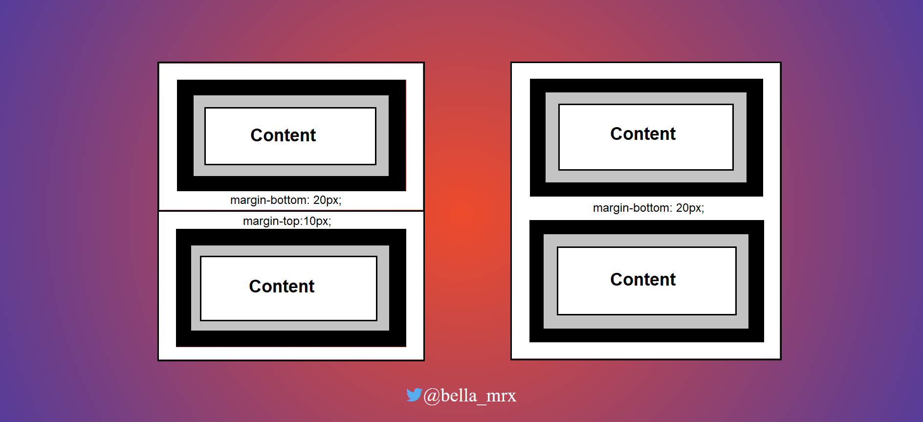
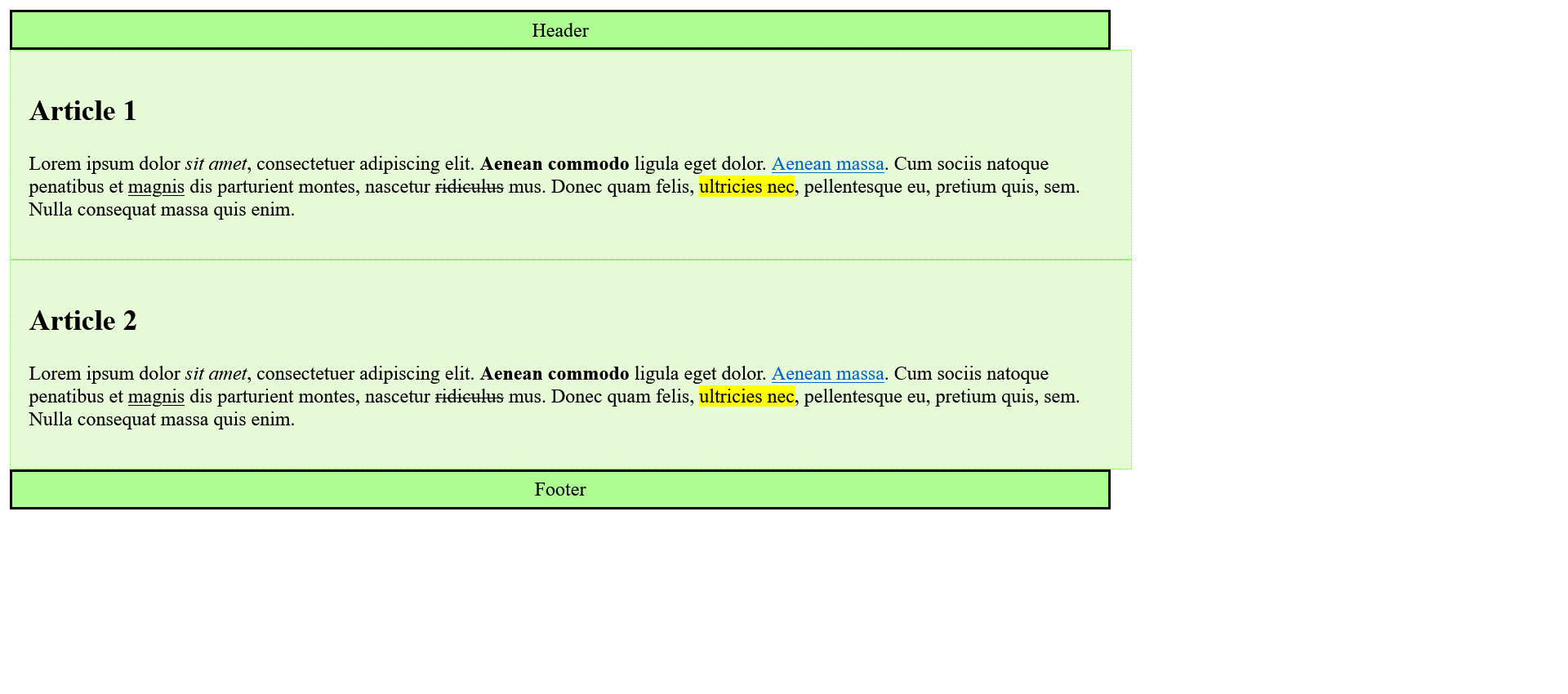
Collapsing Margins
For the vertical margins of two boxes placed one above the other, the values are not added together, but only the larger of the two margins is used. The smaller value is ignored. Horizontal distances do not collapse. If they touch, they are added together normally.
Complete Code - Examples/Part_5/...
 <header class="headfoot">Header</header>
 <article class="article01">
     <h2>Article 1</h2>
     <p>
         Lorem <abbr>ipsum</abbr> dolor <em>sit amet</em>, consectetuer adipiscing elit. <strong>Aenean commodo</strong> ligula eget dolor.
         <a href="#">Aenean massa</a>. Cum sociis natoque penatibus et
         <ins>magnis</ins> dis parturient montes, nascetur
         <del>ridiculus</del> mus. Donec quam felis, <mark>ultricies nec</mark>, pellentesque eu, pretium quis, sem. Nulla consequat massa quis enim.
     </p>
 </article>
 <article class="article01">
     <h2>Article 2</h2>
     <p>
         Lorem <abbr>ipsum</abbr> dolor <em>sit amet</em>, consectetuer adipiscing elit. <strong>Aenean commodo</strong> ligula eget dolor.
         <a href="#">Aenean massa</a>. Cum sociis natoque penatibus et
         <ins>magnis</ins> dis parturient montes, nascetur
         <del>ridiculus</del> mus. Donec quam felis, <mark>ultricies nec</mark>, pellentesque eu, pretium quis, sem. Nulla consequat massa quis enim.
     </p>
 </article>
 <footer class="headfoot">Footer</footer>
 .headfoot {
     width: 600px;
     padding: 5px;
     border: 5px solid #adfd93;
     background-color: #e7fad7;
     margin-bottom: 20px;
     text-align: center;
 }

 .article01 {
     width: 600px;
     padding: 5px;
     border: 5px solid #76ea4f;
     background-color: #e7fad7;
     margin: 10px 0px;
 }


 /* h1, h2, p {
     margin-top: 0;
 } */
The collapsing is intentional and serves to keep the spacing even for texts that consist of multiple paragraphs. It rules:
- If both values are the same, only one is used.
- If the values are different, the larger value is used.
Calculating the total width and height of a box
It is possible to calculate the total width or total height of a box.
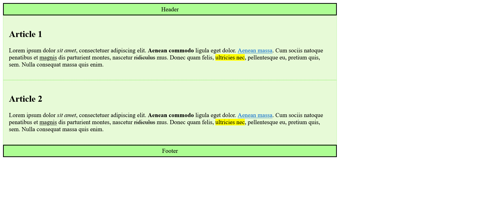
Complete Code - Examples/Part_6/...
 <header class="headfoot">Header</header>
 <article class="article01">
     <h2>Article 1</h2>
     <p>
         Lorem <abbr>ipsum</abbr> dolor <em>sit amet</em>, consectetuer adipiscing elit. <strong>Aenean commodo</strong> ligula eget dolor.
         <a href="#">Aenean massa</a>. Cum sociis natoque penatibus et
         <ins>magnis</ins> dis parturient montes, nascetur
         <del>ridiculus</del> mus. Donec quam felis, <mark>ultricies nec</mark>, pellentesque eu, pretium quis, sem. Nulla consequat massa quis enim.
     </p>
 </article>
 <article class="article01">
     <h2>Article 2</h2>
     <p>
         Lorem <abbr>ipsum</abbr> dolor <em>sit amet</em>, consectetuer adipiscing elit. <strong>Aenean commodo</strong> ligula eget dolor.
         <a href="#">Aenean massa</a>. Cum sociis natoque penatibus et
         <ins>magnis</ins> dis parturient montes, nascetur
         <del>ridiculus</del> mus. Donec quam felis, <mark>ultricies nec</mark>, pellentesque eu, pretium quis, sem. Nulla consequat massa quis enim.
     </p>
 </article>
 <footer class="headfoot">Footer</footer>
 .headfoot {
     width: 600px;
     padding: 5px;
     border: 1px solid black;
     background-color: #adfd93;
     margin: 5px 0px;
     text-align: center;
 }

 .article01 {
     width: 600px;
     padding: 15px;
     border: 2px dotted #76ea4f;
     background-color: #e7fad7;
 }
The total width of a box is calculated by adding width, padding-right, padding-left, border-right-width, border-left-width, margin-right and margin-left together.
Calculation for this example:
| CSS Property | .headfoot | .article |
| width |
600 Pixel |
600 Pixel |
| + padding-right |
5 Pixel |
15 Pixel |
| + padding-left |
15 Pixel |
5 Pixel |
| + border-right-width |
1 Pixel |
2 Pixel |
| + border-left-width |
1 Pixel |
2 Pixel |
| + margin-right |
0 |
0 |
| + margin-left |
0 |
0 |
| total width |
612 Pixel |
634 Pixel |
Thus the difference of the total width is exactly 22 pixels. Here you have to decide for yourself where to add or remove these 22 pixels.
Example:
Complete Code - Examples/Part_7/...
 <header class="headfoot">Header</header>
 <article class="article01">
     <h2>Article 1</h2>
     <p>
         Lorem <abbr>ipsum</abbr> dolor <em>sit amet</em>, consectetuer adipiscing elit. <strong>Aenean commodo</strong> ligula eget dolor.
         <a href="#">Aenean massa</a>. Cum sociis natoque penatibus et
         <ins>magnis</ins> dis parturient montes, nascetur
         <del>ridiculus</del> mus. Donec quam felis, <mark>ultricies nec</mark>, pellentesque eu, pretium quis, sem. Nulla consequat massa quis enim.
     </p>
 </article>
 <article class="article01">
     <h2>Article 2</h2>
     <p>
         Lorem <abbr>ipsum</abbr> dolor <em>sit amet</em>, consectetuer adipiscing elit. <strong>Aenean commodo</strong> ligula eget dolor.
         <a href="#">Aenean massa</a>. Cum sociis natoque penatibus et
         <ins>magnis</ins> dis parturient montes, nascetur
         <del>ridiculus</del> mus. Donec quam felis, <mark>ultricies nec</mark>, pellentesque eu, pretium quis, sem. Nulla consequat massa quis enim.
     </p>
 </article>
 <footer class="headfoot">Footer</footer>
 .headfoot {
     width: 600px;
     padding: 5px;
     border: 1px solid black;
     background-color: #adfd93;
     margin: 5px 0px;
     text-align: center;
 }

 .article01 {
     width: 578px;
     padding: 15px;
     border: 2px dotted #76ea4f;
     background-color: #e7fad7;
 }
4.2. The newer alternative box model of CSS
The classic box model can be complicated, since the width specification determines the width of the content area and in the end padding, border and margin must also be taken into account for the total width. As long as the specification is only in pixels, a uniform layout is possible with awkward arithmetic.
It becomes more complicated when different units are used for width, padding, border or margin. The problem was solved by using an inner <div> inside the corresponding column for padding, border and margin.
With the alternative box model border-box, the width and height are no longer specified only for the content area, but these specifications also sensibly take into account the inner spacing and the frame.
Box model border-box
Use box model box-sizing
To use the alternative box model, the CSS property box-sizing must be assigned the value border-box = box-sizing: border-box;.
Values that can be used for box-sizing:
- content-box: This corresponds to the behavior of the classic box model, where the width and height values correspond to the content of the element in the box.
- border-box: With this specification the value for width and height corresponds to the value of border-left to border-right or border-top to border-bottom. Changing padding and border does not change the width or height of the element.
- inherit: With this option the value of the parent element is inherited.
Classic box model:
Complete Code - Examples/Part_8/...
 <header class="headfoot">Header</header>
 <article class="article01">
     <h2>Article 1</h2>
     <p>
         Lorem <abbr>ipsum</abbr> dolor <em>sit amet</em>, consectetuer adipiscing elit. <strong>Aenean commodo</strong> ligula eget dolor.
         <a href="#">Aenean massa</a>. Cum sociis natoque penatibus et
         <ins>magnis</ins> dis parturient montes, nascetur
         <del>ridiculus</del> mus. Donec quam felis, <mark>ultricies nec</mark>, pellentesque eu, pretium quis, sem. Nulla consequat massa quis enim.
     </p>
 </article>
 <article class="article01">
     <h2>Article 2</h2>
     <p>
         Lorem <abbr>ipsum</abbr> dolor <em>sit amet</em>, consectetuer adipiscing elit. <strong>Aenean commodo</strong> ligula eget dolor.
         <a href="#">Aenean massa</a>. Cum sociis natoque penatibus et
         <ins>magnis</ins> dis parturient montes, nascetur
         <del>ridiculus</del> mus. Donec quam felis, <mark>ultricies nec</mark>, pellentesque eu, pretium quis, sem. Nulla consequat massa quis enim.
     </p>
 </article>
 <footer class="headfoot">Footer</footer>
 .headfoot {
     width: 70%;
     padding: 5px;
     border: 2px solid black;
     background-color: #adfd93;
     text-align: center;
 }

 .article01 {
     width: 70%;
     padding: 15px;
     border: 1px dotted #76ea4f;
     background-color: #e7fad7;
 }
alternative Box model:
Complete Code - Examples/Part_9/...
 <header class="headfoot">Header</header>
   <article class="article01">
     <h1>Article 1</h1>
     <p>Lorem <abbr>ipsum</abbr> dolor <em>sit amet</em>, consectetuer adipiscing elit. <strong>Aenean commodo</strong> ligula eget dolor. <a href="#">Aenean massa</a>. Cum sociis natoque penatibus et <ins>magnis</ins> dis parturient montes, nascetur <del>ridiculus</del> mus. Donec quam felis, <mark>ultricies nec</mark>, pellentesque eu, pretium quis, sem. Nulla consequat massa quis enim.</p>
   </article>
   <article class="article01">
     <h1>Article 2</h1>
     <p>Lorem <abbr>ipsum</abbr> dolor <em>sit amet</em>, consectetuer adipiscing elit. <strong>Aenean commodo</strong> ligula eget dolor. <a href="#">Aenean massa</a>. Cum sociis natoque penatibus et <ins>magnis</ins> dis parturient montes, nascetur <del>ridiculus</del> mus. Donec quam felis, <mark>ultricies nec</mark>, pellentesque eu, pretium quis, sem. Nulla consequat massa quis enim.</p>
   </article>
 <footer class="headfoot">Footer</footer>
 * {
     box-sizing: border-box;
 }

 .headfoot {
     width: 70%;
     padding: 5px;
     border: 2px solid black;
     background-color: #adfd93;
     text-align: center;
 }

 .article01 {
     width: 70%;
     padding: 15px;
     border: 1px dotted #76ea4f;
     background-color: #e7fad7;
 }
The box model with box-sizing can simplify CSS life considerably. Especially if percentages are used for the width and pixel values for padding or border, i.e. different units are mixed. For example, if a column is defined with 30% width, it is with box-sizing: border-box; no matter what values and units are used for padding or border, it remains at 30% for the total width of the column.
The interactive box model diagram, can be helpful to understand it better: angular interactive box-model diagram.
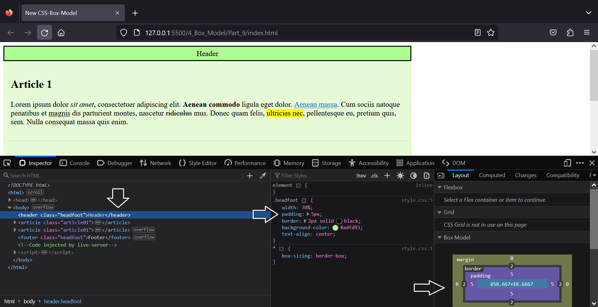
Analyzing the box model in the browser
The browsers also offer developer tools to analyze and visualize the box model in the browser. There it is also possible to change the values for testing and see how it directly affects the web page.
The box model for inline elements
In HTML, everything consists of rectangular boxes. This also applies to inline elements like <em>, <strong> and <a>. However, it is not possible to specify the height or width for inline elements. Here the content determines the height and width. There are also differences in margin, padding and border for the -top and -bottom versions, these have no effect.
4.3. Design boxes
Add and style a border with the border property
A border can be added for each element, customizing the border color, stroke width and type.
With the shorthand, all four sides can be designed at once:
border: 2px solid black;
this means:
 border-color: black;
 border-width: 2px;
 border-style: solid;
It is possible to specify two, three or four values for border-style or border-color. For example, if :
border-color: green red;
This means that the upper and lower frames are displayed in green and the right and left frames are displayed in red.
or:
border-color: green red blue yellow;
This means the upper frame is green, the left one is red, the lower one is blue and the right one is yellow, (always in clockwise direction starting from the top).
With the properties border-top, border-left, border-bottom and border-right, all four sides can be designed individually.
 border-top: green 2px dotted;
 border-left: red 4px dashed;
 border-bottom: blue 6px solid;
 border-right: yellow 8px inset;
or only ones:
border-top: green 2px dotted;
This means that only the upper border is displayed.
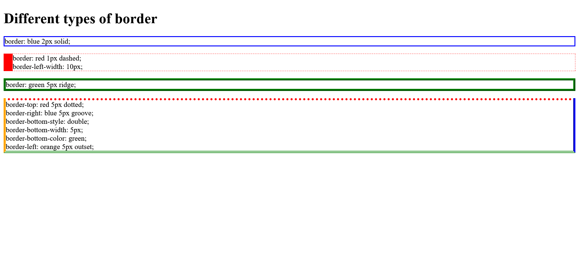
Different border styles:
| Value | Description |
| none |
Default value. Specifies no border. |
| hidden |
The same as "none", except in border conflict resolution for table elements. |
| dotted |
Specifies a dotted border. |
| dashed |
Specifies a dashed border. |
| solid |
Specifies a solid border. |
| double |
Specifies a double border. |
| groove |
Specifies a 3D grooved border. The effect depends on the border-color value. |
| ridge |
Specifies a 3D ridged border. The effect depends on the border-color value. |
| inset |
Specifies a 3D inset border. The effect depends on the border-color value. |
| outset |
Specifies a 3D outset border. The effect depends on the border-color value. |
| initial |
Sets this property to its default value. |
| inherit |
Inherits this property from its parent element. |
Complete Code - Examples/Part_10/...
 <body>
     <h1>Different types of border</h1>
     <p class="border01">border: blue 2px solid;</p>
     <p class="border02">
         border: red 1px dashed;<br /> border-left-width: 10px;
     </p>
     <p class="border03">border: green 5px ridge;</p>
     <p class="border04">
         border-top: red 5px dotted;<br /> border-right: blue 5px groove;<br /> border-bottom-style: double;<br /> border-bottom-width: 5px;<br /> border-bottom-color: green;<br /> border-left: orange 5px outset;
     </p>
 </body>
 * {
     box-sizing: border-box;
 }

 .border01 {
     border: blue 2px solid;
 }

 .border02 {
     border: red 1px dashed;
     border-left-width: 20px;
 }

 .border03 {
     border: green 5px ridge;
 }

 .border04 {
     border-top: red 5px dotted;
     border-right: blue 5px groove;
     border-bottom-style: double;
     border-bottom-width: 5px;
     border-bottom-color: green;
     border-left: orange 5px outset;
 }
Create a decorative border with border-image
With border-image a graphic can be used as a border. A pixel graphic or an SVG graphic is used for this purpose.
Complete Code - Examples/Part_11/...
 <body>
     <h1>Decorative border for boxes</h1>
     <p class="border">
         <code>.border {<br />
          width: 500px;<br />
          padding: 10px;<br />
          border: 25px solid transparent;<br />
          border-image:url('../images/myborder.png') 50 50 50 50 round;<br />
         }</code>
     </p>
 </body>
 .border {
     width: 500px;
     padding: 10px;
     border: 25px solid transparent;
     border-image: url("../images/myborder.png") 50 50 50 50 round;
 }
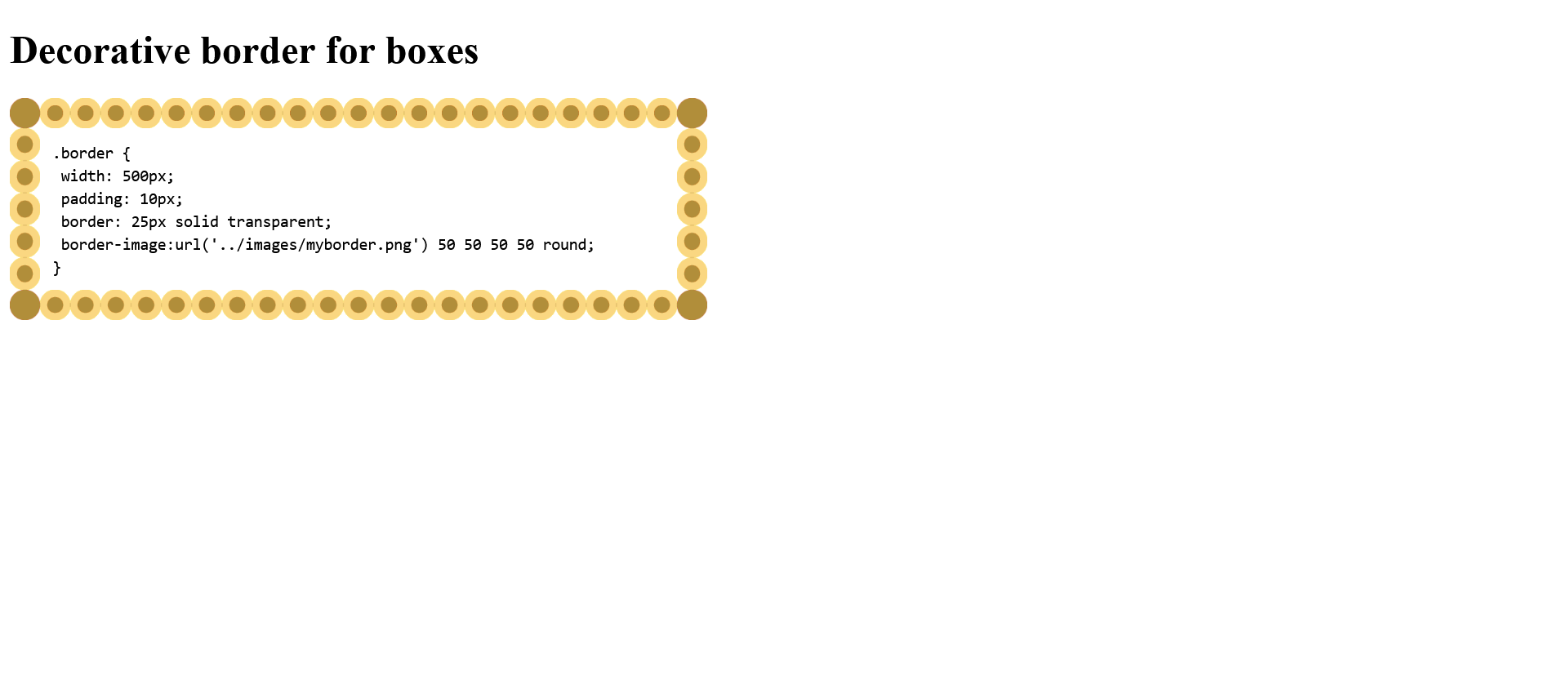
border-image is a summary property of border-image-source, border-image-slice, border-image-width and border-image-repeat.
Set background color with background-color
The background color is specified with background-color. Only with background it is also possible but this is only a summary of CSS properties, so the shorthand.
Complete Code - Examples/Part_12/...
 <h1>Background color of boxes</h1>
 <p class="border">
     <code>.border {<br />
      background-color: lightblue;<br />
      width: 85%;<br />
      padding: 5px;<br />
      border: darkblue 7px ridge;<br />
   }</code>
 </p>
 .border {
     background-color: lightgreen;
     width: 85%;
     padding: 5px;
     border: darkgreen 7px ridge;
 }
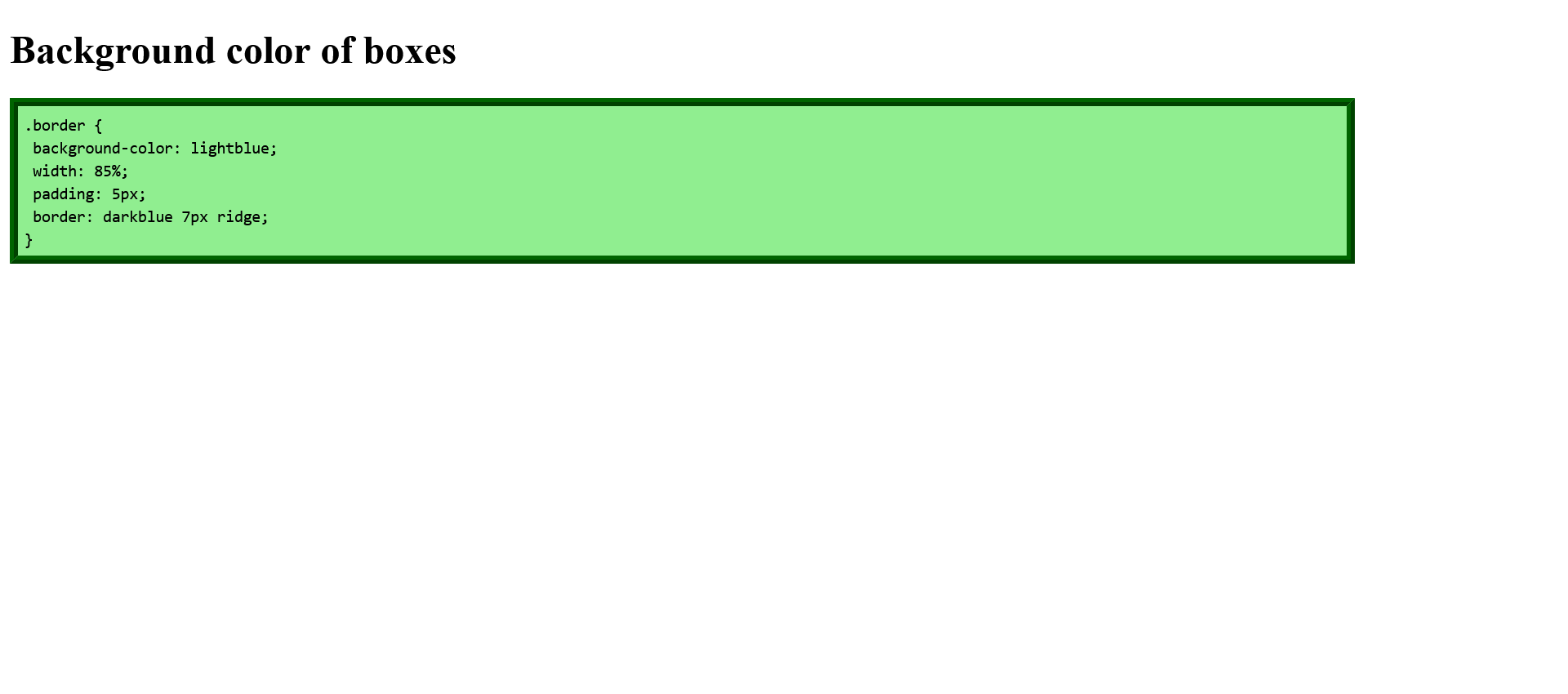
Use background graphics
Since background is only a shorthand notation of several CSS properties for the background, the following properties are combined with the shorthand notation:
- background-color: background color of the element
- background-image: image as background of the element
- background-position: position of the background image
- background-repeat: repeat background image along the vertical or horizontal axis
- background-attachment: Here you can specify whether the background is scrollable or fixed.
Images, logos or graphics should still be added with the HTML element <img>. But for decoration or design a background graphic can be added with CSS.
A background graphic can be added with the shorthand background or with background-image.
Complete Code - Examples/Part_13/...
 <header class="headfoot">Header</header>
 <article class="article01">
     <h1>Add background pattern</h1>
     <p>
         <code>.article01 {<br />
        width: 85%;<br />
        background-image: url('../images/pattern.png');<br />
        border-left: grey 1px dotted;<br />
        border-right: grey 1px dotted;<br />
        padding: 10px;<br />
        background-color: #c4c4c4;<br />
       }</code>
   </p>
 </article>
 <footer class="headfoot">Footer</footer>
 .headfoot {
     width: 85%;
     border: gray 1px dotted;
     padding: 10px;
     background-color: limegreen;
     color: white;
     text-align: center;
 }

 .article01 {
     width: 85%;
     background-image: url("../images/pattern.png");
     border-left: gray 1px dotted;
     border-right: gray 1px dotted;
     padding: 10px;
     background-color: #c4c4c4;
 }
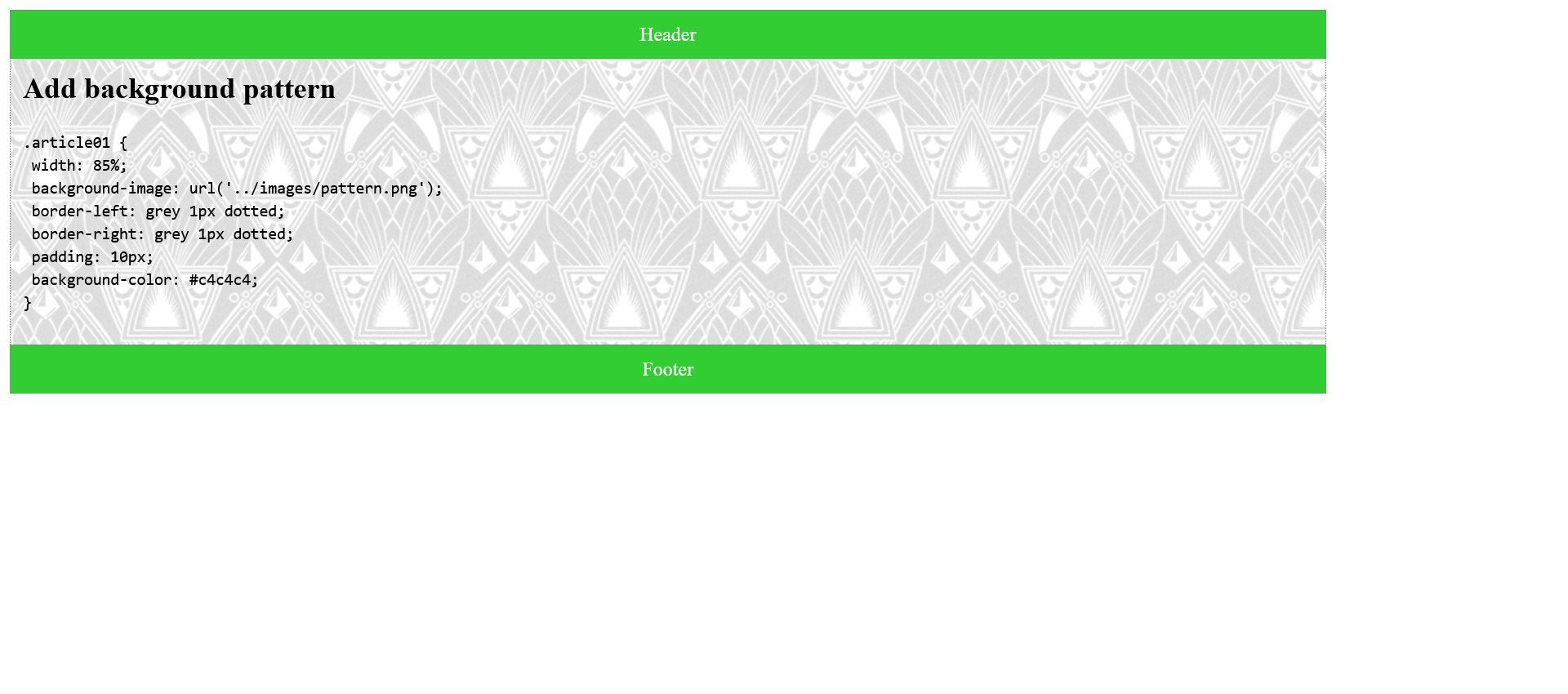
As you can see in this example, the background graphic is overlaid on the background color. The additional specification of a background color is useful (should match the color of the background graphic), if the graphic cannot be loaded.
You can also find the background patterns at DinPattern.
Repeat background graphic
The background graphic is repeated vertically and horizontally as many times as space is available if no special specifications are made.
This example shows a background image without background-repeat, to the bottom it works fine but to the right it doesn't look optimal.
 .article01 {
     width: 85%;
     background-image: url("../images/gradient.jpg");

     border-left: gray 1px dotted;
     border-right: gray 1px dotted;
     padding: 10px;
     background-color: #e8f3ea;
 }
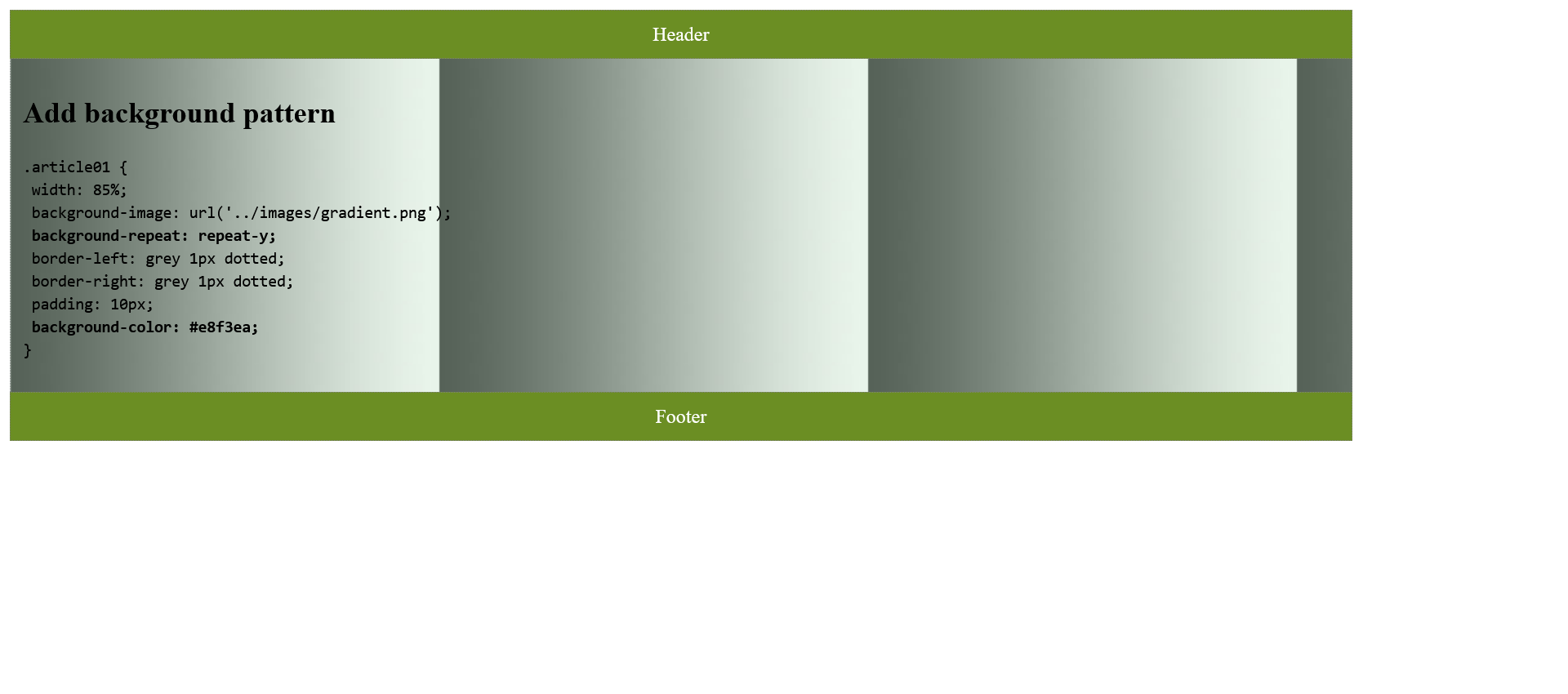
Tiling of the background image can be restricted to the vertical direction by background-repeat, it would also work without but only if the graphic has the appropriate dimensions. For tiling in vertical direction the CSS property background-repeat must be assigned the value repeat-y.
Complete Code - Examples/Part_14/...
 <header class="headfoot">Header</header>
 <article class="article01">
     <h1>Add background pattern</h1>
     <p>
         <code>.article01 {<br />
        width: 85%;<br />
        background-image: url('../images/gradient.png');<br />
        <b>background-repeat: repeat-y;</b><br />
        border-left: grey 1px dotted;<br />
        border-right: grey 1px dotted;<br />
        padding: 10px;<br />
        <b>background-color: #e8f3ea;</b><br />
       }</code>
   </p>
 </article>
 <footer class="headfoot">Footer</footer>
 .headfoot {
     width: 85%;
     border: gray 1px dotted;
     padding: 10px;
     background-color: limegreen;
     color: white;
     text-align: center;
 }

 .article01 {
     width: 85%;
     background-image: url("../images/pattern.png");
     background-repeat: repeat-y;
     border-left: gray 1px dotted;
     border-right: gray 1px dotted;
     padding: 10px;
     background-color: #c4c4c4;
 }
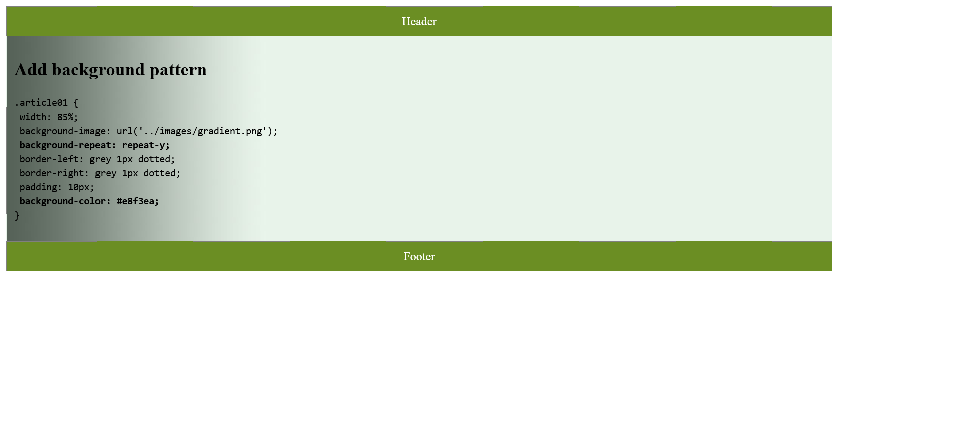
In total, there are three ways to tile a background graphic with the CSS background-repeat property:
- background-repeat: repeat-y;: vertical tiling (y-axis)
- background-repeat: repeat-x;: horizontal tiling (x-axis)
- background-repeat: no-repeat;: no tiles at all
Position and fix background graphic
The background-position CSS property is used to position the background graphic in the HTML element. top, right, bottom, left or center can be used as positions.
Complete Code - Examples/Part_15/...
 <header class="headfoot">Header</header>
   <article class="article01">
     <h1>Add background pattern</h1>
     <p><code>.article01 {<br>
      width: 85%;<br>
      background-image: url('../images/pattern.png');<br>
      background-repeat: repeat-y;<br>
      <b>background-position: right top;</b><br>
      border-left: grey 1px dotted;<br>
      border-right: grey 1px dotted;<br>
      padding: 10px;<br>
      background-color: #e8f3ea;<br>
   }</code>
 </p>
   </article>
 <footer class="headfoot">Footer</footer>
 .article01 {
     width: 85%;
     background-image: url('../images/pattern.png');
     background-repeat: repeat-y;
     background-position: right top;
     border-left: gray 1px dotted;
     border-right: gray 1px dotted;
     padding: 10px;
     background-color: #e8f3ea;
 }
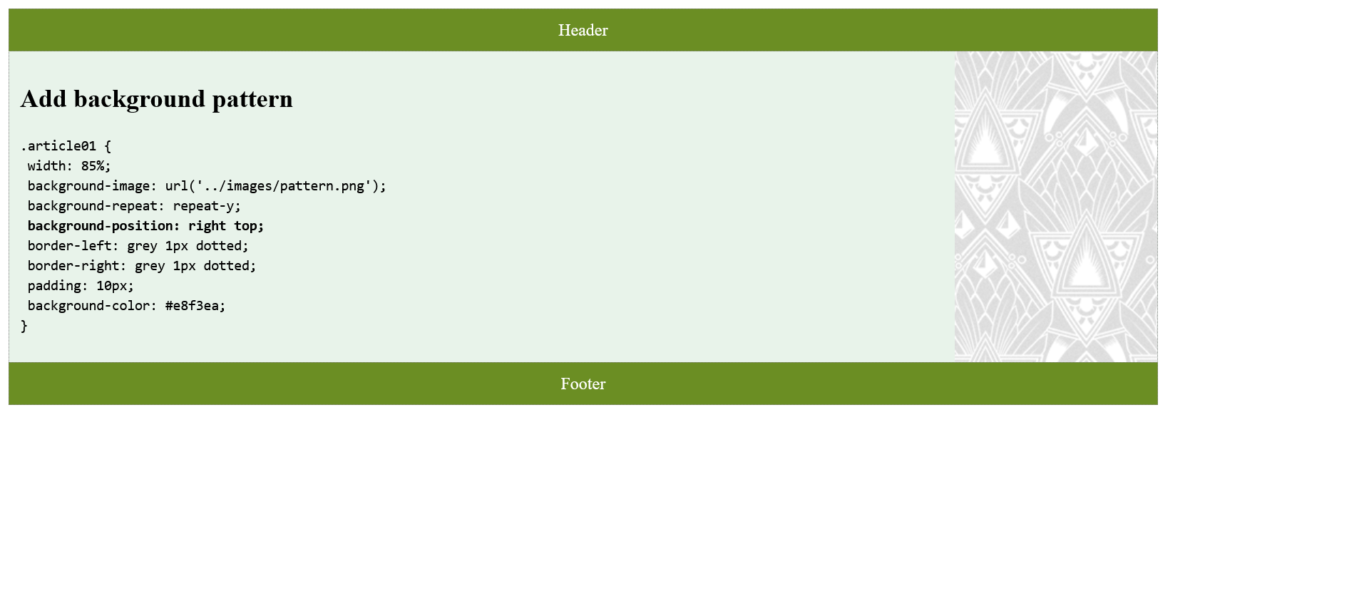
The CSS property background-attachment is used to fix a background graphic on the display area. When scrolling, the graphic remains inside the HTML element, this property is rarely used. The default value is scroll, which scrolls the background graphic along with the element as usual.
Complete Code - Examples/Part_16/...
 <header class="headfoot">Header</header>
   <article class="article01">
     <h1>Add background pattern</h1>
     <p><code>.article01 {<br>
      width: 85%;<br>
 	 height: 1800px;<br>
      background-image: url('../images/pattern.png');<br>
      <b>background-attachment: fixed;</b><br>
      border-left: grey 1px dotted;<br>
      border-right: grey 1px dotted;<br>
      padding: 10px;<br>
      background-color: #e8f3ea;<br>
   }</code>
 </p>
   </article>
 <footer class="headfoot">Footer</footer>
 .article01 {
     width: 85%;
     height: 1800px;
     background-image: url('../images/pattern.png');
     background-attachment: fixed;
     border-left: gray 1px dotted;
     border-right: gray 1px dotted;
     padding: 10px;
     background-color: #e8f3ea;
 }
Stack multiple background graphics
Stacking multiple background images can be implemented in CSS as follows:
Complete Code - Examples/Part_17/...
 <header class="headfoot">Header</header>
 <article class="article01">
     <h1>Stack background images</h1>
     <p>
         New with CSS3 and already supported by all current browsers is the stacking of multiple background images. In this example, this was used to add an ornament to all four corners of the article element.
     </p>
 </article>
 <footer class="headfoot">Footer</footer>
 .article01 {
     width: 750px;
     padding: 20px 50px;
     margin: 10px 0px;
     background: url('../images/top-left.jpg') top left no-repeat,
                 url('../images/top-right.jpg') top right no-repeat,
                 url('../images/bottom-right.jpg') bottom right no-repeat,
                 url('../images/bottom-left.jpg') bottom left no-repeat,
                 white;
 }
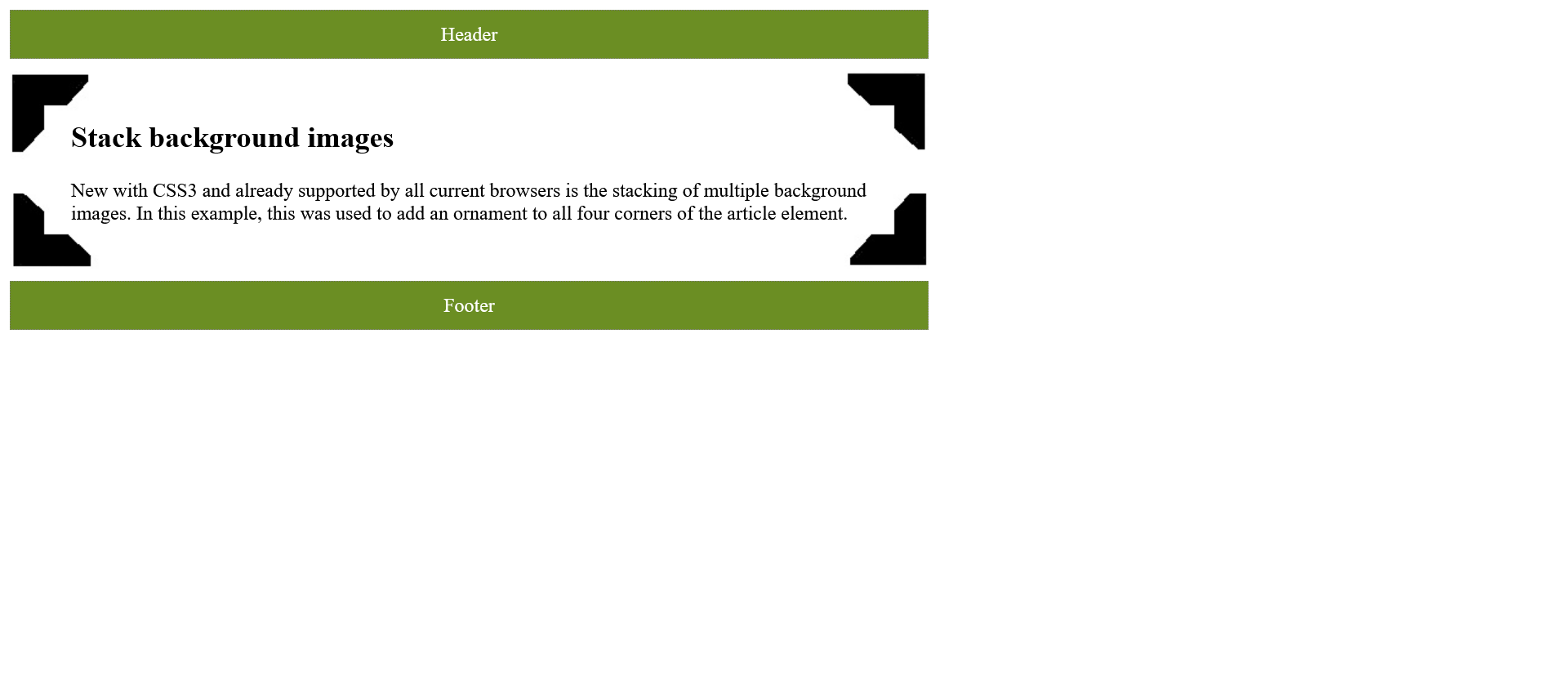
Set the size of the background image
The CSS property background-size can be used to specify the size of the background graphic. The specification can be made in pixels or percent. A specification in percent is relative to the height and width of the parent element in which the background image is to be displayed.
Complete Code - Examples/Part_18/...
 <header class="headfoot">Header</header>
 <article class="article01">
     <h1>background-size</h1>
     <pre>.article01 {
             width: 750px;
             padding: 20px 50px;
             background: white url('../images/pattern.png') left no-repeat;
             <b>background-size: 100% 100%;</b>
    }</pre>
 </article>
 <footer class="headfoot">Footer</footer>
 .headfoot {
     width: 750px;
     border: gray 1px dotted;
     padding: 10px;
     background-color: olivedrab;
     color: white;
     text-align: center;
 }

 .article01 {
     width: 750px;
     padding: 20px 50px;
     background: white url("../images/pattern.png") left no-repeat;
     background-size: 100% 100%;
 }
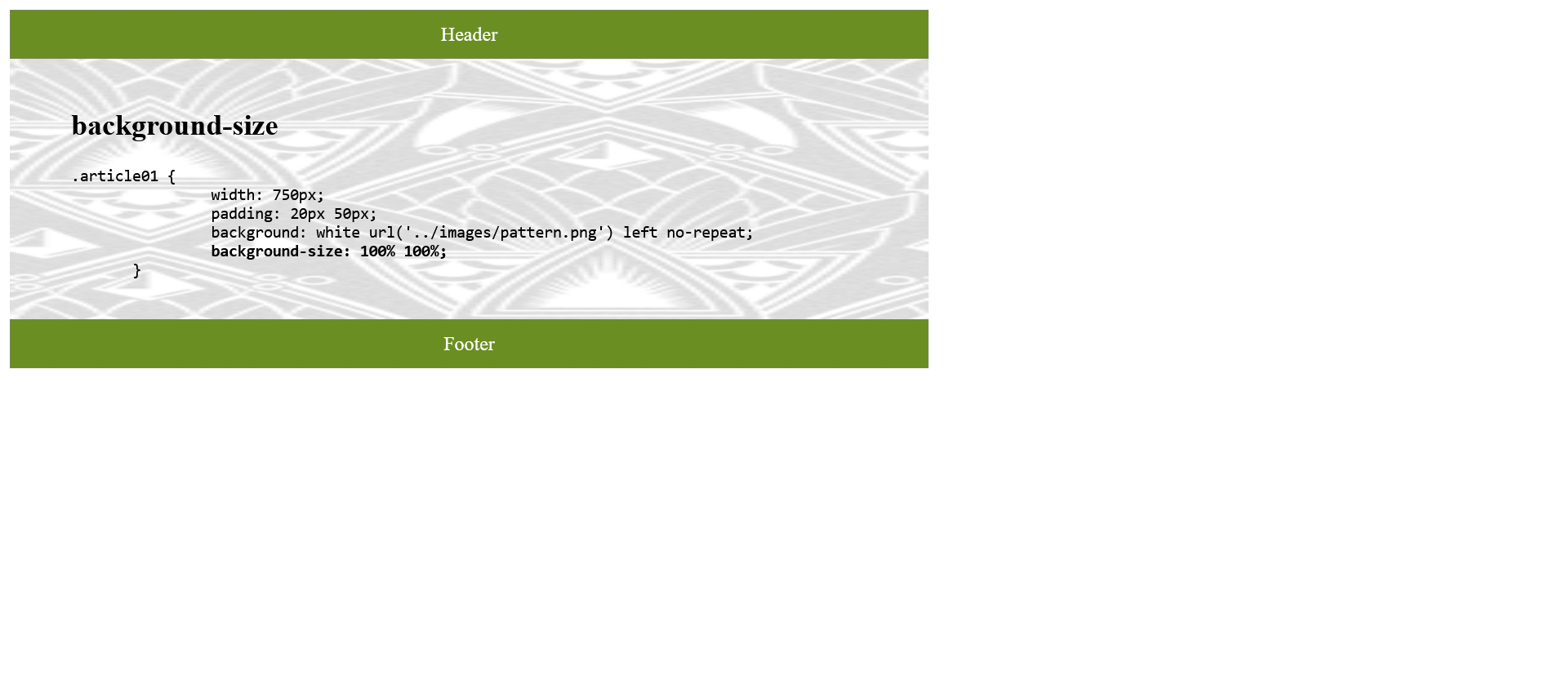
That scaling up or stretching pixel graphics is not necessarily optimal, because of the display. There are two more options contain and cover which can be used for background-size.
- background-size: contain;: This will always display the background image completely in the box. So even if it does not fill the whole area.
- background-size: cover;: This will always cover the entire area of the box with the image. Even if the image is not completely visible.
Viewing the box model in the third dimension:3D CSS Box Model
Make the boxes transparent
There are three ways to create transparent boxes. Either with opacity or RGBA or HSLA colors, as already described in the previous section. The difference between opacity and the RGBA or HSLA colors is that with opacity the transparency applies to all elements within the box.
Complete Code - Examples/Part_19/...
 <header class="headfoot">Header</header>
 <article class="article01">
     <h1>background-size</h1>
     <pre>.article01 {
             width: 750px;
             padding: 20px 50px;
             background: white url('../images/pattern.png') left no-repeat;
             <b>background-size: 100% 100%;</b>
    }</pre>
 </article>
 <footer class="headfoot">Footer</footer>
 .article_01 {
     width: 90%;
     padding: 10px;
     background-color: white;
     border: black 1px dotted;
     opacity: 0.5;
 }

 .article_02 {
     width: 90%;
     padding: 10px;
     background-color: white;
     border: black 1px dotted;
     background-color: rgba(255, 255, 255, 0.5);
 }
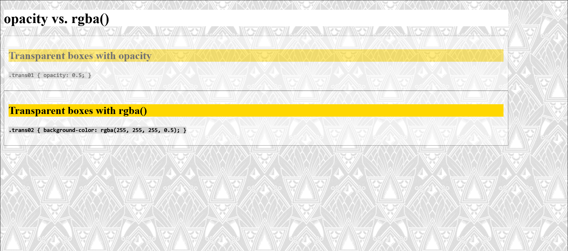
The CSS property opacity is more useful for graphics and images, because there the transparency does not work with RGBA or HSLA colors. For boxes with text, RGBA or HSLA colors should be used.
Add a color gradient
A linear gradient is created with the CSS function linear-gradient() and assigned to the background (or background-image) property.
background: linear-gradient(white, orange);
- This displays a linear color gradient from white to orange and from top to bottom (default setting).
To direct the gradient in a different direction, the keyword to, followed by the direction bottom (top to bottom), top (bottom to top), right (left to right) or left (right to left) must be specified.
background: linear-gradient(to right, white, orange);
- This displays a linear gradient from white to orange, but this time with a gradient from left to right.
It is also possible to specify the position of the color break.
background: linear-gradient(to right, white 0%, orange 100%);
It is also possible to repeat a gradient:
background: repeating-linear-gradient(40deg, white, white 25px, orange 25px, orange 50px);
Diagonal directions can be displayed with to right bottom (top left to bottom right) and to left top (bottom right to top left).
Complete Code - Examples/Part_20/...
 <header class="headfoot">Linear color gradients (start)</header>
 <article class="trans01 my_article">
     <p><code>background: linear-gradient(white, orange);</code></p>
 </article>
 <article class="trans02 my_article">
     <p><code>background: linear-gradient(to right, white, orange);</code></p>
 </article>
 <article class="trans03 my_article">
     <p>
         <code>background: linear-gradient(to right, white 30%, orange 70%);</code
     >
   </p>
 </article>
 <article class="trans04 my_article">
   <p>
     <code
       >background: linear-gradient(to right, white 50%, orange 50%);</code
     >
   </p>
 </article>
 <article class="trans05 my_article">
   <p>
     <code
       > background: linear-gradient(to left, white 50%, orange 50%);<br />
        background-size: 50px 100px;</code
     >
   </p>
 </article>
 <article class="trans06 my_article">
   <p>
     <code
       >background: repeating-linear-gradient(40deg, white, white 25px,
       orange 25px, orange 50px);</code
     >
   </p>
 </article>
 <footer class="headfoot">Linear color gradients (end)</footer>
 .trans01 {
     background: linear-gradient(white, orange);
 }

 .trans02 {
     background: linear-gradient(to right, white, orange);
 }

 .trans03 {
     background: linear-gradient(to right, white 30%, orange 70%);
 }

 .trans04 {
     background: linear-gradient(to right, white 50%, orange 50%);
 }

 .trans05 {
     background: linear-gradient(to left, white 50%, orange 50%);
     background-size: 50px 100px;
 }

 .trans06 {
     background: repeating-linear-gradient(40deg, white, white 25px, orange 25px, orange 50px);
 }
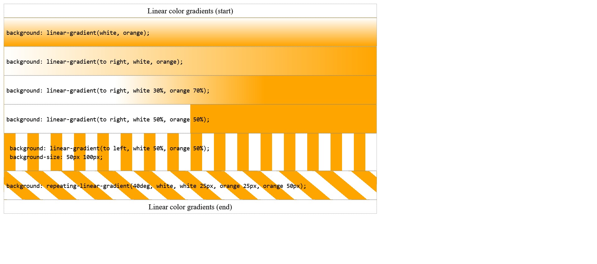
In addition to the linear color gradients, there are also the radial color gradients, these are displayed with radial-gradient().
Complete Code - Examples/Part_21/...
 <header class="headfoot">Radial color gradients (start)</header>
   <article class="trans01 my_article">
     <p><code>background: radial-gradient(white, orange);</code></p>
   </article>
   <article class="trans02 my_article">
     <p><code>background: radial-gradient( white 30%, orange 70%);</code></p>
   </article>
   <article class="trans03 my_article">
     <p><code>background: repeating-radial-gradient(white, white 10px, orange 10px, orange 20px);</code></p>
   </article>
   <article class="trans04 my_article">
     <p><code>background: repeating-radial-gradient(circle, white, white 10px, orange 10px, orange 20px);</code></p>
   </article>
 <footer class="headfoot">Radial color gradients (end)</footer>
 .trans01 {
     background: radial-gradient(white, orange);
 }

 .trans02 {
     background: radial-gradient( white 30%, orange 70%);
 }

 .trans03 {
     background: repeating-radial-gradient(white, white 10px, orange 10px, orange 20px);
 }

 .trans04 {
     background: repeating-radial-gradient(circle, white, white 10px, orange 10px, orange 20px);
 }
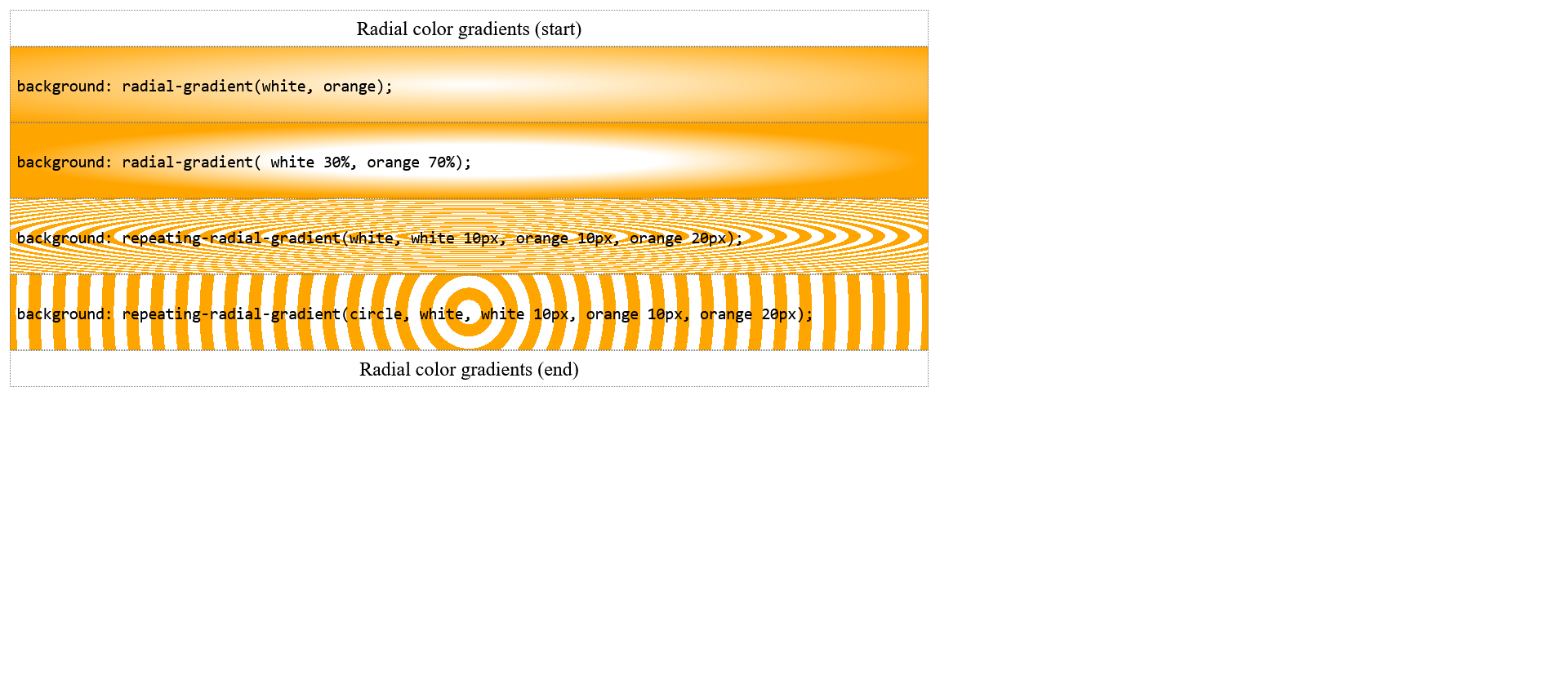
Multiple colors can also be used for the gradient:
Complete Code - Examples/Part_22/...
 <header class="headfoot">Multicolor color gradients (start)</header>
   <article class="trans01 my_article">
     <p><code>background: linear-gradient(to left, purple, blue, green, yellow, red, purple); </code></p>
   </article>
   <article class="trans02 my_article">
     <p><code>background: radial-gradient( purple, blue, green, yellow, red, purple); </code></p>
   </article>
 <footer class="headfoot">Multicolor color gradients (end)</footer>
 .trans01 {
     background: linear-gradient(to left, purple, blue, green, yellow, red, purple);
 }

 .trans02 {
     background: radial-gradient( purple, blue, green, yellow, red, purple);
 }
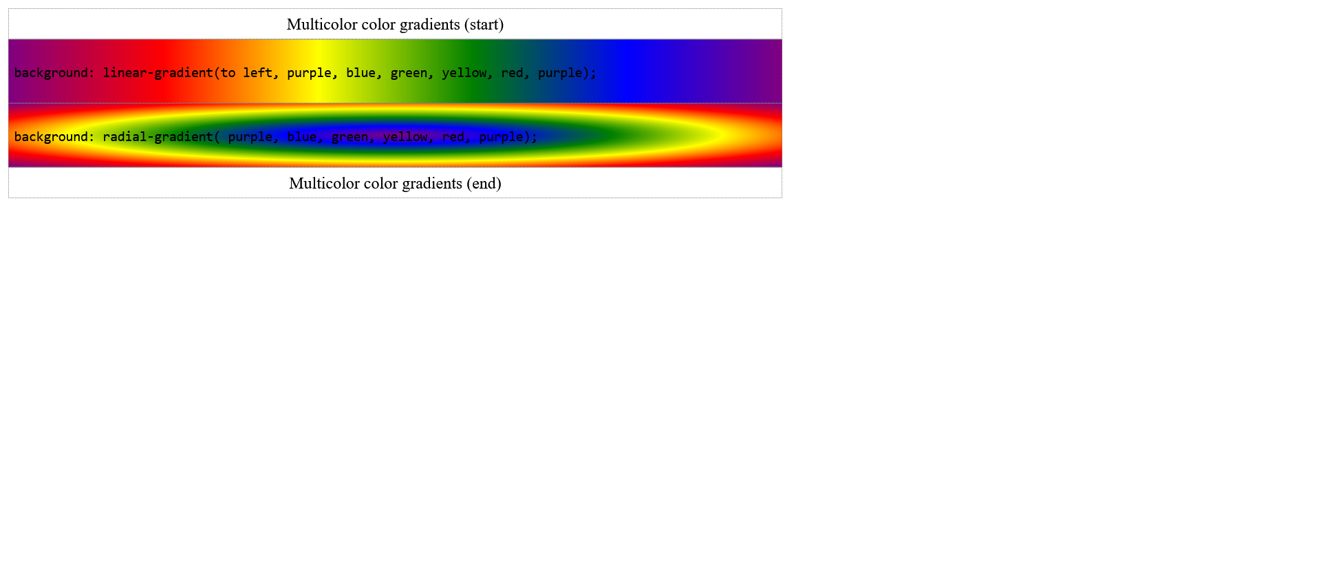
Create gradients with online tools: Ultimate CSS Gradient Generator
Add a drop shadow with the box-shadow property
With the CSS property box-shadow it is possible to create a shadow. The simplest specification is as follows:
box-shadow: 4px 4px gray;
- This creates a shadow around the element, with a horizontal and vertical offset of 4 pixels each. The first value is used for the horizontal offset (offset-x) and the second value for the vertical offset (offset-y). A positive value moves the shadow of the horizontal offset to the right and the vertical offset down. The opposite happens with negative values.
For a soft shadow, a third value is needed to define the blurriness of the shadow. The higher the value, the softer the shadow (default value = 0).
box-shadow: 4px 4px 4px gray;
To determine a radius or the spread of the shadow, a fourth value is needed. The last value defines the color of the shadow. This can also be a at the beginning.
box-shadow: 4px 4px 4px 4px gray;
It is also possible to represent an inner shadow with inset.
box-shadow: inset -4px -4px 4px 4px gray;
Complete Code - Examples/Part_23/...
 <h1>Add shadows</h1>
 <pre class="shadow01 my_pre">box-shadow: 4px 4px gray;</pre>
 <pre class="shadow02 my_pre">box-shadow: 4px 4px 4px gray;</pre>
 <pre class="shadow03 my_pre">box-shadow: 4px 4px 4px 4px gray;</pre>
 <pre class="shadow04 my_pre">box-shadow: inset -4px -4px 4px 4px gray;</pre>
 <img class="my_img" src="images/picture.jpg" alt="Whale in clouds">
 .shadow01 {
     box-shadow:4px 4px gray;
 }

 .shadow02 {
     box-shadow:4px 4px 4px gray;
 }

 .shadow03 {
     box-shadow:4px 4px 4px 4px gray;
 }

 .shadow04 {
     box-shadow:inset -4px -4px 4px 4px gray;
 }

 .my_img {
     border: black 2px solid;
     box-shadow: 6px 6px 6px gray;
 }
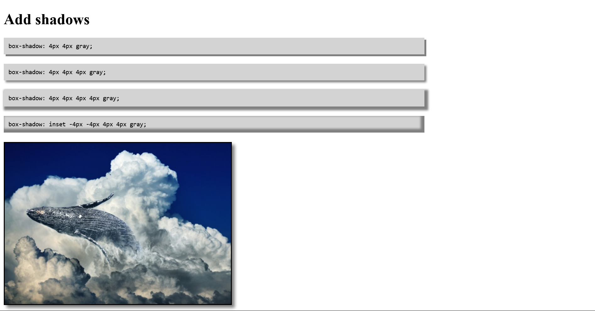
Designing round corners
To create round corners the CSS property border-radius can be used. This property can be used independently from border. There is no need to use a frame to round the corners.
border-radius: 10px;
is the short form of:
 border-top-right-radius: 10px;
 border-top-left-radius: 10px;
 border-bottom-right-radius: 10px;
 border-bottom-left-radius: 10px;
It is also possible to enter multiple values:
border-radius: 20px 10px;
- Here the upper left corner and the lower right corner get a radius of 20 pixels and the upper right corner and the lower left corner get a radius of 10 pixels.
Complete Code - Examples/Part_24/...
 <header class="head">Header</header>
 <article class="article01">
     <h1>Round corners</h1>
     <p>
         Lorem ipsum dolor sit amet, consectetuer adipiscing elit. Aenean commodo ligula eget dolor. Aenean massa. Cum sociis natoque penatibus et magnis dis parturient montes, nascetur ridiculus mus.
     </p>
 </article>
 <footer class="foot">Footer</footer>
 .head {
     width: 85%;
     border: gray 1px solid;
     padding: 10px;
     background-color: white;
     text-align: center;
     border-top-left-radius: 10px;
     border-top-right-radius: 10px;
     box-shadow: 2px 2px 2px gray;
 }

 .article01 {
     width: 85%;
     padding: 20px 50px;
     margin: 10px 0px;
     border: gray 1px solid;
     border-radius: 20px;
     box-shadow: 2px 2px 2px gray;
 }

 .foot {
     width: 85%;
     border: gray 1px solid;
     padding: 10px;
     background-color: white;
     text-align: center;
     border-radius: 0px 0px 10px 10px;
     box-shadow: 2px 2px 2px gray;
 }
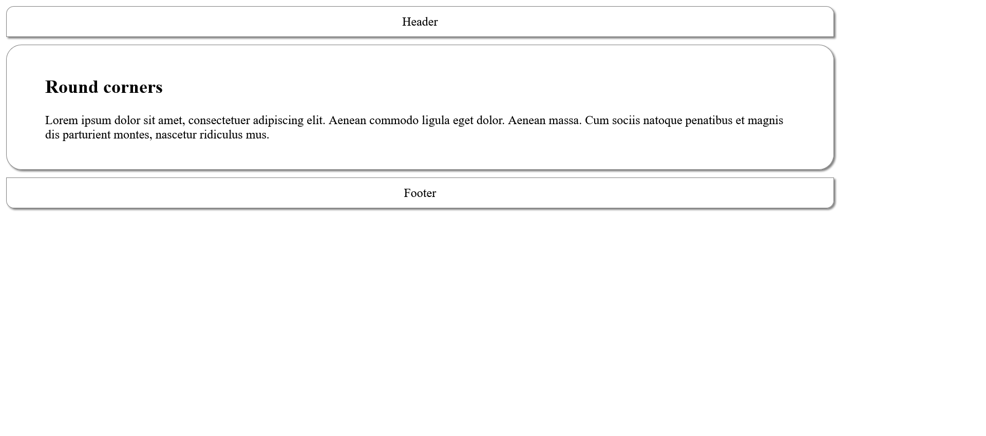
Round corners can also be used for images.
Complete Code - Examples/Part_25/...
 <h1>Round corners</h1>
 <img class="img_radius" src="images/picture.jpg" alt="Whale in clouds" />
 <img class="img_ellipse" src="images/picture.jpg" alt="The same picture again" />
 .img_radius {
     border-radius: 25px;
     box-shadow: 2px 2px 2px gray;
 }

 .img_ellipse {
     border-radius: 50%;
     box-shadow: 2px 2px 2px gray;
 }

There is also the possibility to specify different values for the horizontal and vertical raduis. To do this, both values are separated with a /. The result is corners with elliptical corners with roundings.
Complete Code - Examples/Part_26/...
 <header class="head">
     border-radius: 10px 20px 30px 40px / 5px 10px 5px 10px;
 </header>
 <article class="article01">
     <h1>Elliptical roundings</h1>
     <p>
         Lorem ipsum dolor sit amet, consectetuer adipiscing elit. Aenean commodo ligula eget dolor. Aenean massa. Cum sociis natoque penatibus et magnis dis parturient montes, nascetur ridiculus mus.
     </p>
 </article>
 <footer class="foot">border-radius: 5px 10px / 20px;</footer>
 .head {
     width: 85%;
     border: gray 1px solid;
     padding: 10px;
     background-color: white;
     text-align: center;
     border-radius: 10px 20px 30px 40px / 5px 10px 5px 10px;
     box-shadow: 2px 2px 2px gray;
 }

 .article01 {
     width: 85%;
     padding: 20px 50px;
     margin: 10px 0px;
     border: gray 1px solid;
     border-radius: 80% / 20%;
     box-shadow: 2px 2px 2px gray;
 }

 .foot {
     width: 85%;
     border: gray 1px solid;
     padding: 10px;
     background-color: white;
     text-align: center;
     border-radius: 5px 10px / 20px;
     box-shadow: 2px 2px 2px gray;
 }
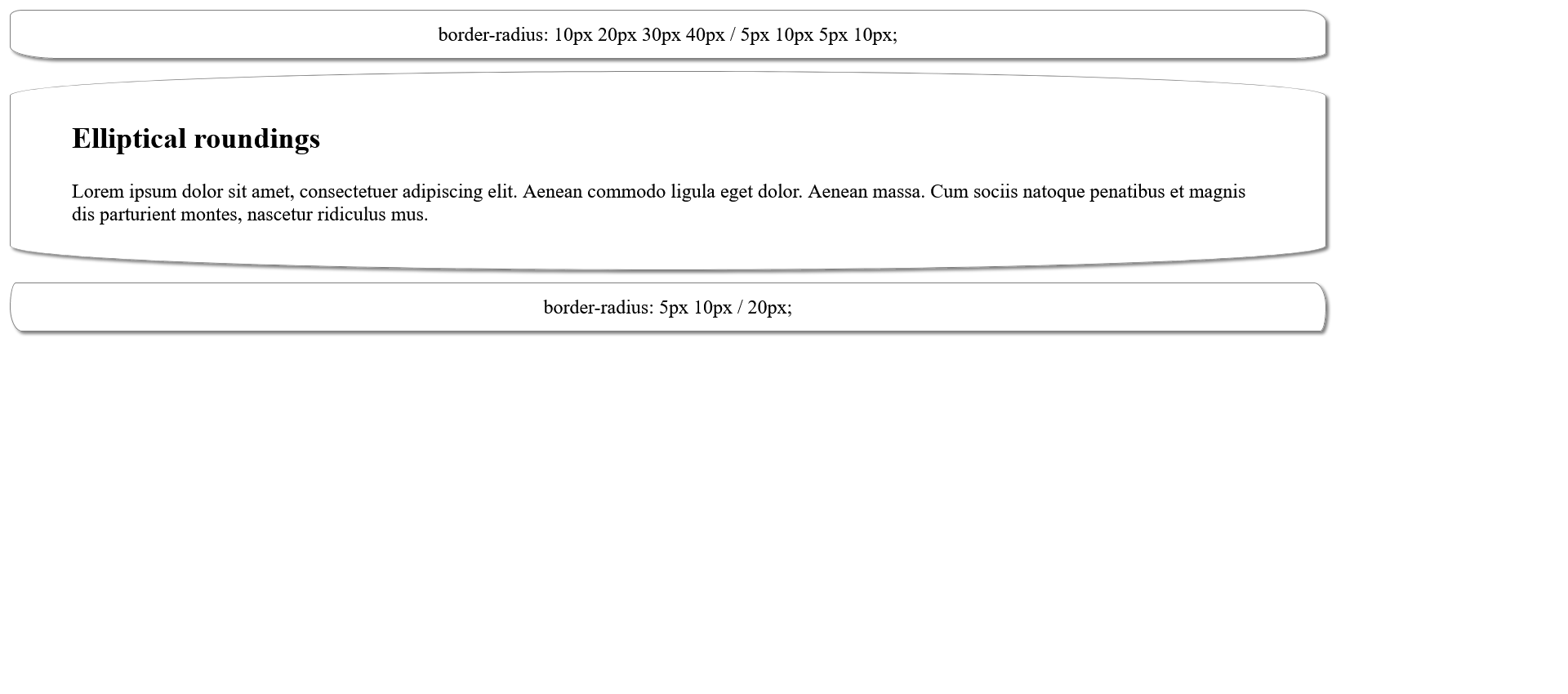
4.4. CSS Vendor Prefixes
Vendor prefix can be used to (experimentally) use CSS properties that are still in draft or beta state. When the corresponding CSS module is in the final version and the web browser fully supports the property, the prefix can be removed. However, it is recommended to keep it so that even older web browsers can display everything accurately.
Most common vendor prefixes:
| Abbreviation | Producer |
| -webkit- |
Chrome, Safari, Edge |
| -moz- |
Mozilla Firefox |
| -o- |
Opera |
Complete Code - Examples/Part_27/...
 <header class="headfoot">Header</header>
 <article class="article01">
     <h1>Article 1</h1>
     <p>
         Lorem <abbr>ipsum</abbr> dolor <em>sit amet</em>, consectetuer adipiscing elit. <strong>Aenean commodo</strong> ligula eget dolor.
         <a href="#">Aenean massa</a>. Cum sociis natoque penatibus et
         <ins>magnis</ins> dis parturient montes, nascetur
         <del>ridiculus</del> mus. Donec quam felis, <mark>ultricies nec</mark>, pellentesque eu, pretium quis, sem. Nulla consequat massa quis enim.
     </p>
 </article>
 <article class="article01">
     <h1>Article 2</h1>
     <p>
         Lorem <abbr>ipsum</abbr> dolor <em>sit amet</em>, consectetuer adipiscing elit. <strong>Aenean commodo</strong> ligula eget dolor.
         <a href="#">Aenean massa</a>. Cum sociis natoque penatibus et
         <ins>magnis</ins> dis parturient montes, nascetur
         <del>ridiculus</del> mus. Donec quam felis, <mark>ultricies nec</mark>, pellentesque eu, pretium quis, sem. Nulla consequat massa quis enim.
     </p>
 </article>
 <footer class="headfoot">Footer</footer>
 h1 {
     -webkit-text-emphasis: filled double-circle green;
     -moz-text-emphasis: filled double-circle green;
     text-emphasis: filled double-circle green;
 }
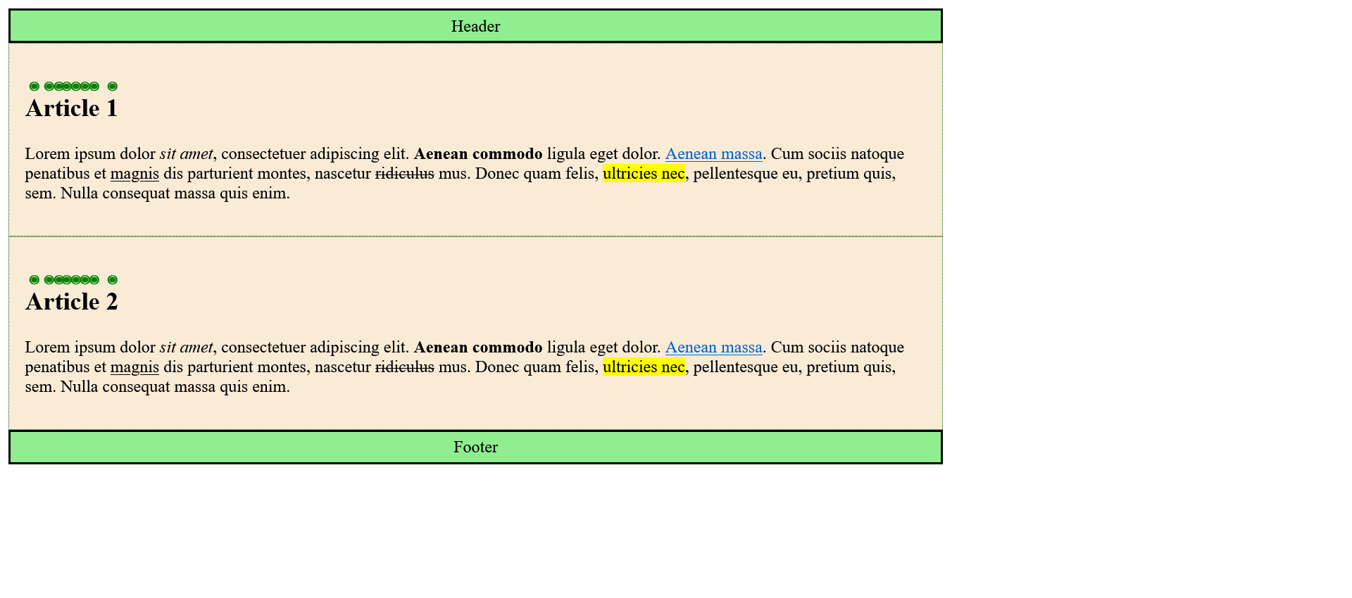
Each WebDev is responsible for compliance with the standard, which means that a browser-specific CSS property noted with a vendor prefix can be changed again or even deleted altogether.
A good overview, to the current versions can be found hereCan I use?.
5. CSS positioning
The HTML elements are usually displayed one after the other in the order in which they were noted in the HTML code. However, you are not limited to this static positioning and can be influenced with CSS.
5.1. Positioning with the CSS property position
How and where an element is positioned and what is to happen to the elements following it is determined with the position property. There are four possible methods for positioning elements:
position: static;
This is the default setting for all elements, and it is used when the CSS property position has not been noted at all. So the elements are displayed side by side as usual.
Complete Code - Examples/Part_1/...
 <header class="foothead">Header</header>
 <article class="article01">
     <h1>Article 1</h1>
     <p>Lorem ipsum dolor sit amet, consectetuer adipiscing elit. Aenean commodo ligula eget dolor. Aenean massa. </p>
 </article>
 <article class="article02">
     <h1>Article 2</h1>
     <p>Lorem ipsum dolor sit amet, consectetuer adipiscing elit. Aenean commodo ligula eget dolor. Aenean massa. </p>
 </article>
 <article>
     <p>Lorem ipsum dolor sit amet, consectetuer adipiscing elit. Aenean commodo ligula eget dolor. Aenean massa. Cum sociis natoque penatibus et magnis dis parturient montes, nascetur ridiculus mus. Donec quam felis, ultricies nec, pellentesque eu, pretium
         quis, sem. Nulla consequat massa quis enim. Donec pede justo, fringilla vel, aliquet nec, vulputate eget, arcu. In enim justo, rhoncus ut, imperdiet a, venenatis vitae, justo. Nullam dictum felis eu pede mollis pretium. Integer tincidunt.
         Cras dapibus. Vivamus elementum semper nisi. Aenean vulputate eleifend tellus. Aenean leo ligula, porttitor eu, consequat vitae, eleifend ac, enim. Aliquam lorem ante, dapibus in, viverra quis, feugiat a, tellus. Phasellus viverra nulla ut
         metus varius laoreet. Quisque rutrum. Aenean imperdiet. Etiam ultricies nisi vel augue. Curabitur ullamcorper ultricies nisi. Nam eget dui. Etiam rhoncus. Maecenas tempus, tellus eget. Lorem ipsum dolor sit amet, consectetuer adipiscing elit.
         Aenean commodo ligula eget dolor. Aenean massa. Cum sociis natoque penatibus et magnis dis parturient montes, nascetur ridiculus mus. Donec quam felis, ultricies nec, pellentesque eu, pretium quis, sem. Nulla consequat massa quis enim. Donec
         pede justo, fringilla vel, aliquet nec, vulputate eget, arcu. In enim justo, rhoncus ut, imperdiet a, venenatis vitae, justo. Nullam dictum felis eu pede mollis pretium. Integer tincidunt. Cras dapibus. Vivamus elementum semper nisi. Aenean
         vulputate eleifend tellus. Aenean leo ligula, porttitor eu, consequat vitae, eleifend ac, enim. Aliquam lorem ante, dapibus in, viverra quis, feugiat a, tellus. Phasellus viverra nulla ut metus varius laoreet. Quisque rutrum. Aenean imperdiet.
         Etiam ultricies nisi vel augue. Curabitur ullamcorper ultricies nisi. Nam eget dui. Etiam rhoncus. Maecenas tempus, tellus eget </p>
 </article>
 <footer class="foothead">Footer</footer>
 .article01 {
     position: static;
     width: 300px;
     padding: 10px;
     border: 1px solid black;
     background-color: #adfd93;
 }

 .article02 {
     position: static;
     width: 300px;
     padding: 10px;
     border: 1px solid black;
     background-color: #e7fad7;
 }
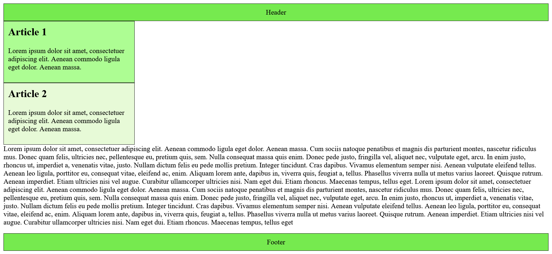
position: relative;
This places an element relative to the current position with the CSS property top, bottom, left and right and the corresponding value specifications. The other elements are not affected.
Complete Code - Examples/Part_2/...
 <header class="foothead">Header</header>
   <article class="article01">
     <h1>Article  1</h1>
     <p>Lorem ipsum dolor sit amet, consectetuer adipiscing elit. Aenean commodo ligula eget dolor. Aenean massa. </p>
   </article>
   <article class="article02">
     <h1>Article  2</h1>
     <p>Lorem ipsum dolor sit amet, consectetuer adipiscing elit. Aenean commodo ligula eget dolor. Aenean massa. </p>
   </article>
   <article>
     <p>Lorem ipsum dolor sit amet, consectetuer adipiscing elit. Aenean commodo ligula eget dolor. Aenean massa. Cum sociis natoque penatibus et magnis dis parturient montes, nascetur ridiculus mus. Donec quam felis, ultricies nec, pellentesque eu, pretium quis, sem. Nulla consequat massa quis enim. Donec pede justo, fringilla vel, aliquet nec, vulputate eget, arcu. In enim justo, rhoncus ut, imperdiet a, venenatis vitae, justo. Nullam dictum felis eu pede mollis pretium. Integer tincidunt. Cras dapibus. Vivamus elementum semper nisi. Aenean vulputate eleifend tellus. Aenean leo ligula, porttitor eu, consequat vitae, eleifend ac, enim. Aliquam lorem ante, dapibus in, viverra quis, feugiat a, tellus. Phasellus viverra nulla ut metus varius laoreet. Quisque rutrum. Aenean imperdiet. Etiam ultricies nisi vel augue. Curabitur ullamcorper ultricies nisi. Nam eget dui. Etiam rhoncus. Maecenas tempus, tellus eget. Lorem ipsum dolor sit amet, consectetuer adipiscing elit. Aenean commodo ligula eget dolor. Aenean massa. Cum sociis natoque penatibus et magnis dis parturient montes, nascetur ridiculus mus. Donec quam felis, ultricies nec, pellentesque eu, pretium quis, sem. Nulla consequat massa quis enim. Donec pede justo, fringilla vel, aliquet nec, vulputate eget, arcu. In enim justo, rhoncus ut, imperdiet a, venenatis vitae, justo. Nullam dictum felis eu pede mollis pretium. Integer tincidunt. Cras dapibus. Vivamus elementum semper nisi. Aenean vulputate eleifend tellus. Aenean leo ligula, porttitor eu, consequat vitae, eleifend ac, enim. Aliquam lorem ante, dapibus in, viverra quis, feugiat a, tellus. Phasellus viverra nulla ut metus varius laoreet. Quisque rutrum. Aenean imperdiet. Etiam ultricies nisi vel augue. Curabitur ullamcorper ultricies nisi. Nam eget dui. Etiam rhoncus. Maecenas tempus, tellus eget </p>
   </article>
<footer class="foothead">Footer</footer>
 .article01 {
     position: static;
     width: 300px;
     padding: 10px;
     border: 1px solid black;
     background-color: #adfd93;
 }

 .article02 {
     position: relative;
     top: -75px;
     left: 100px;
     width: 300px;
     padding: 10px;
     border: 1px solid black;
     background-color: #e7fad7;
 }
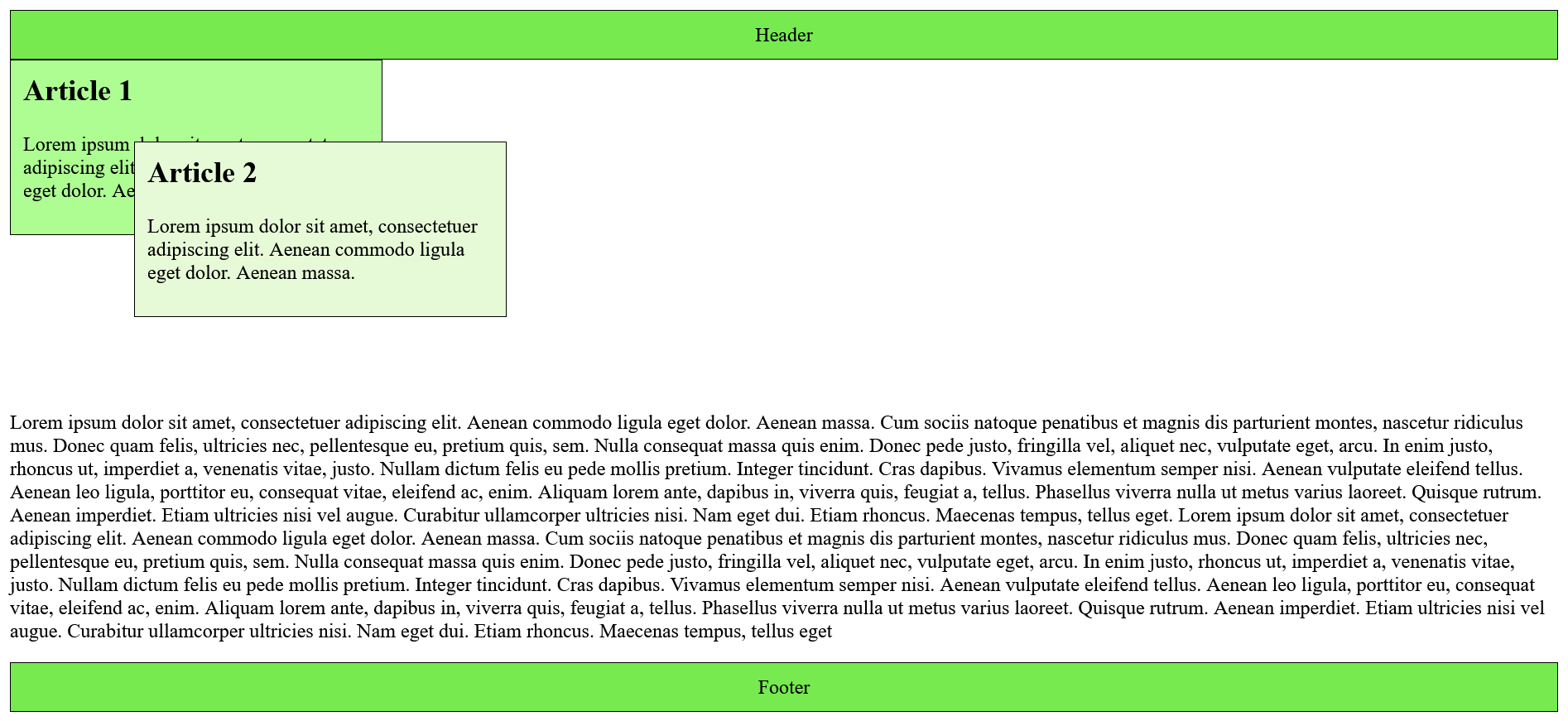
position: absolute;
This drags the element out of the document flow. With the CSS properties top, bottom, left and right the element can be placed absolutely in the nearest parent element. Regardless of where the element was noted in the HTML document. All other elements will now act as if the absolutely moved element no longer belongs to the document flow and any gap thus created will be filled with the following element.
Complete Code - Examples/Part_3/...
 <header class="foothead">Header</header>
   <article class="article01">
     <h1>Article 1</h1>
     <p>Lorem ipsum dolor sit amet, consectetuer adipiscing elit. Aenean commodo ligula eget dolor. Aenean massa. </p>
   </article>
   <article class="article02">
     <h1>Article 2</h1>
     <p>Lorem ipsum dolor sit amet, consectetuer adipiscing elit. Aenean commodo ligula eget dolor. Aenean massa. </p>
   </article>
   <p>Lorem ipsum dolor sit amet, consectetuer adipiscing elit. Aenean commodo ligula eget dolor. Aenean massa. Cum sociis natoque penatibus et magnis dis parturient montes, nascetur ridiculus mus. Donec quam felis, ultricies nec, pellentesque eu, pretium quis, sem. Nulla consequat massa quis enim. Donec pede justo, fringilla vel, aliquet nec, vulputate eget, arcu. In enim justo, rhoncus ut, imperdiet a, venenatis vitae, justo. Nullam dictum felis eu pede mollis pretium. Integer tincidunt. Cras dapibus. Vivamus elementum semper nisi. Aenean vulputate eleifend tellus. Aenean leo ligula, porttitor eu, consequat vitae, eleifend ac, enim. Aliquam lorem ante, dapibus in, viverra quis, feugiat a, tellus. Phasellus viverra nulla ut metus varius laoreet. Quisque rutrum. Aenean imperdiet. Etiam ultricies nisi vel augue. Curabitur ullamcorper ultricies nisi. Nam eget dui. Etiam rhoncus. Maecenas tempus, tellus eget. Lorem ipsum dolor sit amet, consectetuer adipiscing elit. Aenean commodo ligula eget dolor. Aenean massa. Cum sociis natoque penatibus et magnis dis parturient montes, nascetur ridiculus mus. Donec quam felis, ultricies nec, pellentesque eu, pretium quis, sem. Nulla consequat massa quis enim. Donec pede justo, fringilla vel, aliquet nec, vulputate eget, arcu. In enim justo, rhoncus ut, imperdiet a, venenatis vitae, justo. Nullam dictum felis eu pede mollis pretium. Integer tincidunt. Cras dapibus. Vivamus elementum semper nisi. Aenean vulputate eleifend tellus. Aenean leo ligula, porttitor eu, consequat vitae, eleifend ac, enim. Aliquam lorem ante, dapibus in, viverra quis, feugiat a, tellus. Phasellus viverra nulla ut metus varius laoreet. Quisque rutrum. Aenean imperdiet. Etiam ultricies nisi vel augue. Curabitur ullamcorper ultricies nisi. Nam eget dui. Etiam rhoncus. Maecenas tempus, tellus eget </p>
 <footer class="foothead">Footer</footer>
 .article01 {
     position: static;
     width: 300px;
     padding: 10px;
     border: 1px solid black;
     background-color: #adfd93;
 }

 .article02 {
     position: absolute;
     top: 0;
     left: 100px;
     width: 300px;
     padding: 10px;
     border: 1px solid black;
     background-color: #e7fad7;
 }
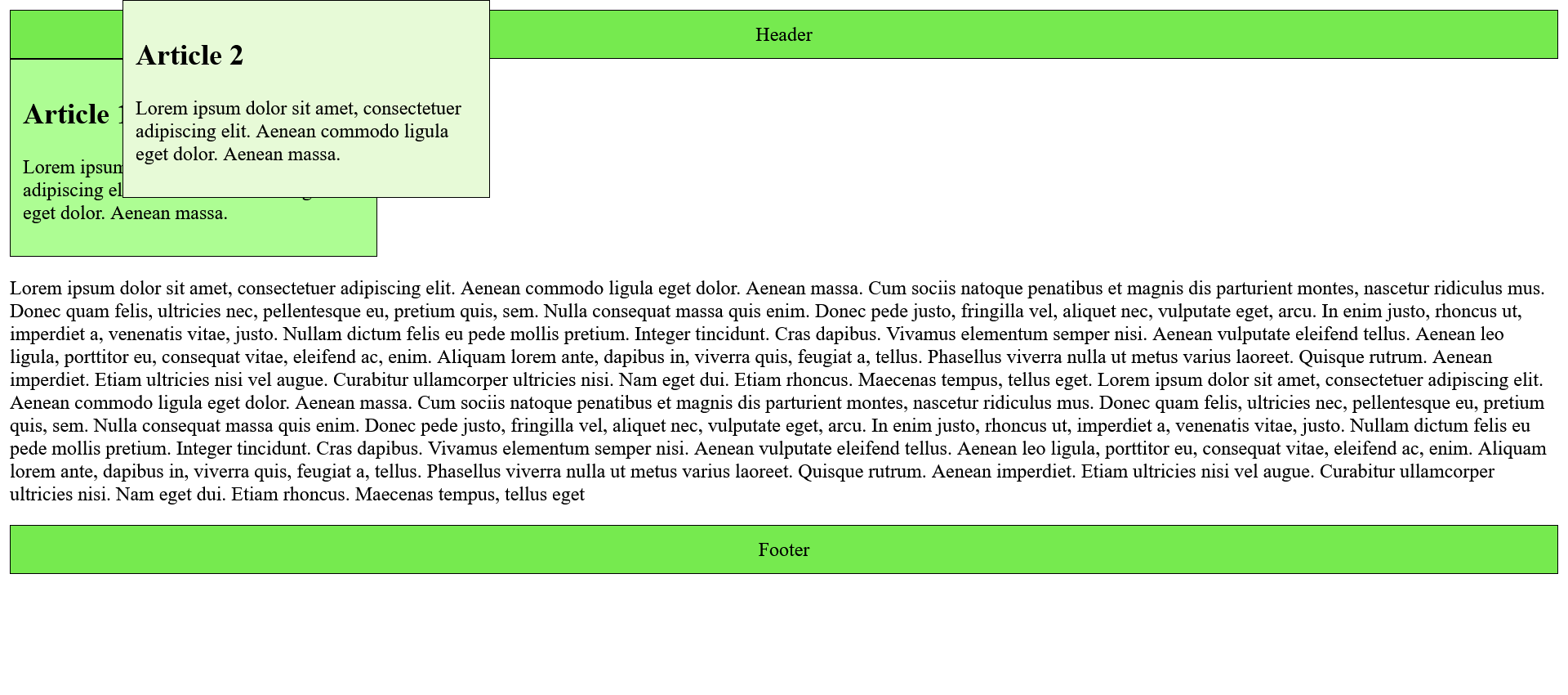
Note: If the width of a block is not specified and the positioning position: absolute; is used, this absolutely positioned element will only be displayed as wide as the inline value.
In practice, absolute and relative positioning are often combined.
Complete Code - Examples/Part_4/...
 <body>
     <figure>
         <img src="./images/whale.jpg" alt="Whale in clouds" width="400">
         <figcaption>Whale in clouds</figcaption>
     </figure>
 </body>
 figure {
     position: relative;
     width: 400px;
     box-shadow: 4px 6px 22px 1px rgba(0, 0, 0, 0.75);
 }

 figcaption {
     position: absolute;
     left: 0;
     top: 0;
     width: 100%;
     text-align: center;
     color: white;
     background: rgba(28, 90, 100, 0.7);
     padding: 0.75rem;
 }

 figure img {
     display: block;
 }
position: absolute;
The fixed positioning behaves at first like the absolute positioning, however with the clear difference that this fixed position is measured absolutely to the left upper edge of the web browser window. This means that a fixed element does not move when the web browser window is scrolled.
Complete Code - Examples/Part_5/...
 <header class="foothead">Header</header>
 <article class="article01">
     <h1>Article 1</h1>
     <p>Lorem ipsum dolor sit amet, consectetuer adipiscing elit. Aenean commodo ligula eget dolor. Aenean massa. </p>
 </article>
 <article class="article02">
     <h1>Article 2</h1>
     <p>Lorem ipsum dolor sit amet, consectetuer adipiscing elit. Aenean commodo ligula eget dolor. Aenean massa. </p>
 </article>
 <p>Lorem ipsum dolor sit amet, consectetuer adipiscing elit. Aenean ... </p>
 <p>Lorem ipsum dolor sit amet, consectetuer adipiscing elit. Aenean ... </p>
 <p>Lorem ipsum dolor sit amet, consectetuer adipiscing elit. Aenean ... </p>
 <p>Lorem ipsum dolor sit amet, consectetuer adipiscing elit. Aenean ... </p>
 <footer class="foothead">Footer</footer>
 .article01 {
     position: static;
     width: 300px;
     padding: 10px;
     border: 1px solid black;
     background-color: #adfd93;
 }

 .article02 {
     position: fixed;
     top: 0;
     left: 100px;
     width: 300px;
     padding: 10px;
     border: 1px solid black;
     background-color: #e7fad7;
 }
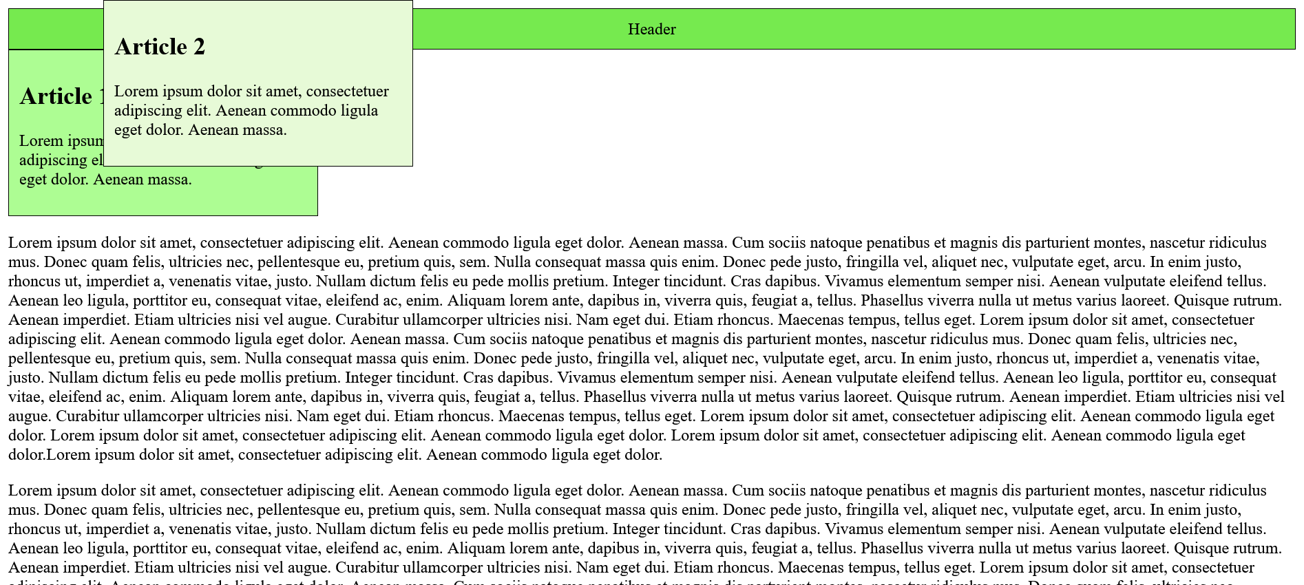
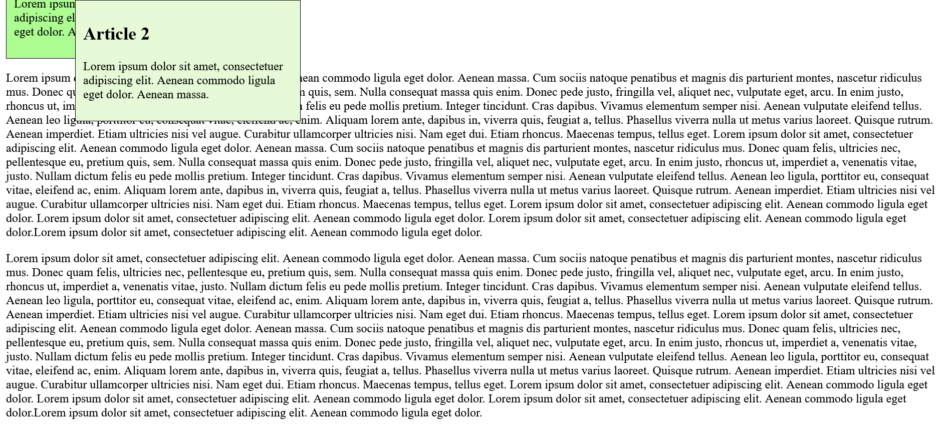
In practice, a fixed positioning is suitable e.g. for navigation areas, a fixed header or footer or a fixed link to the top of the page, which is always present at the same position.
Complete Code - Examples/Part_6/...
 <h1 id="start">Top of the page</h1>
 <a href="#start" class="up">Up</a>
 <p>Lorem ipsum dolor sit amet, consectetuer adipiscing elit. Aenean ...</p>
 <p>Lorem ipsum dolor sit amet, consectetuer adipiscing elit. Aenean ...</p>
 <p>Lorem ipsum dolor sit amet, consectetuer adipiscing elit. Aenean ...</p>
 <p>Lorem ipsum dolor sit amet, consectetuer adipiscing elit. Aenean ... </p>
 <p>Lorem ipsum dolor sit amet, consectetuer adipiscing elit. Aenean ... </p>
 <p>Lorem ipsum dolor sit amet, consectetuer adipiscing elit. Aenean ... </p>
 .up {
     position: fixed;
     bottom: 20px;
     right: 20px;
     padding: 15px;
     border: 4px solid #76ea4f;
     background-color: #adfd93;
     color: black;
 }
position: sticky;
This function is a hybrid of relative and fixed positioning. This element initially behaves as with relative positioning until a certain boundary such as the top or bottom of the screen has been reached, where the element then sticks, and behaves as with fixed positioning.
Complete Code - Examples/Part_7/...
 <header class="foothead">Header</header>
 <article class="article01">
     <h1 class="sticky_h1">Article 1</h1>
     <p>Lorem ipsum dolor sit amet, consectetuer adipiscing elit. Aenean ...</p>
     <p>Lorem ipsum dolor sit amet, consectetuer adipiscing elit. Aenean ... </p>
     <p>Lorem ipsum dolor sit amet, consectetuer adipiscing elit. Aenean ... </p>
     <p>Lorem ipsum dolor sit amet, consectetuer adipiscing elit. Aenean ... </p>
     <p>Lorem ipsum dolor sit amet, consectetuer adipiscing elit. Aenean ... </p>

 </article>
 <article class="article02">
     <h1 class="sticky_h1">Article 2</h1>
     <p>Lorem ipsum dolor sit amet, consectetuer adipiscing elit. Aenean ... </p>
     <p>Lorem ipsum dolor sit amet, consectetuer adipiscing elit. Aenean ... </p>
     <p>Lorem ipsum dolor sit amet, consectetuer adipiscing elit. Aenean ...</p>
     <p>Lorem ipsum dolor sit amet, consectetuer adipiscing elit. Aenean ... </p>
     <p>Lorem ipsum dolor sit amet, consectetuer adipiscing elit. Aenean ... </p>
     <p>Lorem ipsum dolor sit amet, consectetuer adipiscing elit. Aenean ... </p>
     <p>Lorem ipsum dolor sit amet, consectetuer adipiscing elit. Aenean ... </p>

 </article>
 <footer class="foothead">Footer</footer>
 .article01 {
     position: static;
     width: 100%;
     padding: 10px;
     border: 1px solid black;
     background-color: #adfd93;
 }

 .article02 {
     position: static;
     width: 100%;
     padding: 10px;
     border: 1px solid black;
     background-color: #e7fad7;
 }

 .sticky_h1 {
     position: -webkit-sticky;
     position: sticky;
     top: -1px;
     width: 100%;
     background-color: black;
     color: white;
 }
Placement of elements with top, right, bottom and left
These four properties are additionally used for the CSS property position. This specifies whether an absolutely
or relatively positioned element starts at the top, right, bottom and/or left. In a normal positioning with position: static;,
specifications with the CSS properties top, right, bottom
and left have no effect. Units for top, right,
bottom and left are px, %
or em. Only one of the properties top or bottom
should be used, as well as left and right. The default value of all four CSS
properties is auto.
5.2. Stacking with z-index
By default, the relative, absolute, and fixed elements are stacked in the order they were noted in the document flow of the HTML document. The last element noted is on top. This behavior can be changed with the CSS property z-index. The z-axis is the third dimension on which the elements are stacked.
The use of the CSS property z-index is simple. The higher the noted value of z-index, the higher up the element is in the stack. Thus, the element with the highest z-index value is at the top and the element with the lowest z-index
value is at the bottom. If the z-index values are equal, the element that was last noted in the document flow is at the top.
Negative values can also be used for the z-index. Of course, it still applies here that elements with positive values are arranged above the elements with negative values.
Complete Code - Examples/Part_8/...
 <header class="foothead">Header</header>
   <article class="article01">
     <h1>Article 1</h1>
     <p>Lorem ipsum dolor sit amet, consectetuer adipiscing elit. Aenean commodo ligula eget dolor. Aenean massa. </p>
   </article>
   <article class="article02">
     <h1>Article 2</h1>
     <p>Lorem ipsum dolor sit amet, consectetuer adipiscing elit. Aenean commodo ligula eget dolor. Aenean massa. </p>
   </article>
   <p>Lorem ipsum dolor sit amet, consectetuer adipiscing elit. Aenean ... </p>
 <footer class="foothead">Footer</footer>
 .article01 {
     position: relative;
     width: 300px;
     padding: 10px;
     border: 1px solid black;
     background-color: #adfd93;
     z-index: 2;
 }

 .article02 {
     position: relative;
     top: -75px;
     left: 100px;
     width: 300px;
     padding: 10px;
     border: 1px solid black;
     background-color: #e7fad7;
     z-index: 1;
 }
5.3. Floating boxes with float
With float an element is taken out of the usual document flow and placed at the right or left margin. The following elements without float flow around this floated element. In practice, people tend to use flexboxes or the grid layout for the layout of websites today.
Complete Code - Examples/Part_9/...
 <h1>A report</h1>
 <figure>
     <img src="images/picture.jpg" alt="Placeholder">
     <figcaption>A picture</figcaption>
 </figure>
 <p>Lorem ipsum dolor sit amet, consectetuer adipiscing elit. Aenean ... </p>

 <p>Lorem ipsum dolor sit amet, consectetuer adipiscing elit. Aenean ... </p>
 <p>Lorem ipsum dolor sit amet, consectetuer adipiscing elit. Aenean ... </p>
 figure {
     float: left;
     margin: 0 0 0 1rem;
 }
In addition to left and right, the values none (default) and inherit can also be used for float. none indicates that the element should not be floated. With inherit, on the other hand, the element takes over the float value of the parent element in which it resides.
Floating elements works only horizontally. The elements can only flow around to the left or to the right.
Only the text around the image flows, but not the padding, border, margin and background properties. These remain behind the floated image.
Stop flowing around
The flowing around can be stopped with the CSS property clear. The CSS property clear can be passed the values left, right, both or none. A clear:left; ends a float:left; and both ends left and right. none is the default value, and the elements can thus flow again.
Complete Code - Examples/Part_10/...
 <h1>A report</h1>
 <figure>
     <img src="images/picture.jpg" alt="Placeholder">
     <figcaption>A picture</figcaption>
 </figure>
 <p>Lorem ipsum dolor sit amet, consectetuer adipiscing elit. Aenean ... </p>

 <p>Lorem ipsum dolor sit amet, consectetuer adipiscing elit. Aenean ... </p>
 <p>Lorem ipsum dolor sit amet, consectetuer adipiscing elit. Aenean ... </p>
 figure {
     float: left;
     margin: 0 0 0 1rem;
 }
Combine floats into a unit
With display: flow-root; a new block for the bypassing element is created via CSS. This element is only available to newer web browsers. For this the trick with overflow: hidden; would offer itself, with which as a side effect likewise the content is enclosed into a new block. An elegant solution for this is CSS's feature query @supports(). This can be used to check whether a browser can handle certain CSS property-value combinations.
Complete Code - Examples/Part_11/...
 <h1>A report</h1>
 <figure>
     <img src="images/picture.jpg" alt="Placeholder">
     <figcaption>A picture</figcaption>
 </figure>
 <p>Lorem ipsum dolor sit amet, consectetuer adipiscing elit. Aenean ... </p>

 <p>Lorem ipsum dolor sit amet, consectetuer adipiscing elit. Aenean ... </p>
 <p>Lorem ipsum dolor sit amet, consectetuer adipiscing elit. Aenean ... </p>
 .float-left {
     float: left;
     margin: 0 1rem 1rem 0;
 }

 .head-foot {
     background-color: grey;
     padding: 2rem;
     text-align: center;
     color: white;
 }

 .article-bg {
     background-color: lightgrey;
     overflow: hidden;
 }

 @supports(display: flow-root) {
     .article-bg {
         display: flow-root;
         overflow: initial;
         background-color: lightgrey;
     }
 }
5.4. Flexible boxes (flexbox model)
Responsive web design is an indispensable part of creating websites today, so the desire for a simpler and better alternative to float positioning has become greater. One of these alternatives is the flexbox model. The CSS flexbox is perfect for arranging elements next to or below each other. This is very handy for galleries or links of a navigation, for example, because CSS flexboxes offer even more options, including arranging the elements neatly next to each other with a certain spacing, in a certain order, or in a certain size.
The principle of flexboxes is simple. A parent element is needed in which the CSS property display is set to flex. This property affects all contained child elements. The parent element that has the display:flex; CSS property set is also called a flex container. The child elements it contains are the flex items.
Align the flexbox
How the elements are aligned within the flexbox is specified with the CSS property flex-direction. For horizontal alignment the value row can be used and for vertical alignment the value column is used. If flex-direction is not used, row is the default. The default orientation for the elements of a flexbox is horizontal.
Complete Code - Examples/Part_12/...
 <main class="mymain">
     <article class="myarticle">
         <h1>Article 1</h1>
         <p>Lorem ipsum dolor sit amet, consectetuer adipiscing elit. </p>
     </article>
     <article class="myarticle">
         <h1>Article 2</h1>
         <p>Lorem ipsum dolor sit amet, consectetuer adipiscing elit. Lorem ipsum dolor sit amet, consectetuer adipiscing elit.</p>
     </article>
     <article class="myarticle">
         <h1>Article 3</h1>
         <p>Lorem ipsum dolor sit amet, consectetuer adipiscing elit. Lorem ipsum dolor sit amet, consectetuer adipiscing elit. </p>
     </article>
 </main>
 .myarticle {
     width: 300px;
     padding: 10px;
     margin: 0px 5px 5px 0px;
     border: 1px solid black;
     background-color: #e7fad7;
 }

 .mymain {
     width: 95%;
     padding: 10px;
     background-color: #76ea4f;
     display: flex;
     flex-direction: row;
 }
If the value column is used instead of row, the individual elements within the main element are vertically aligned.
Complete Code - Examples/Part_13/...
 <main class="mymain">
     <article class="myarticle">
         <h1>Article 1</h1>
         <p>Lorem ipsum dolor sit amet, consectetuer adipiscing elit. </p>
     </article>
     <article class="myarticle">
         <h1>Article 2</h1>
         <p>Lorem ipsum dolor sit amet, consectetuer adipiscing elit. Lorem ipsum dolor sit amet, consectetuer adipiscing elit.</p>
     </article>
     <article class="myarticle">
         <h1>Article 3</h1>
         <p>Lorem ipsum dolor sit amet, consectetuer adipiscing elit. Lorem ipsum dolor sit amet, consectetuer adipiscing elit. </p>
     </article>
 </main>
 .myarticle {
     width: 300px;
     padding: 10px;
     margin: 0px 5px 5px 0px;
     border: 1px solid black;
     background-color: #e7fad7;
 }

 .mymain {
     width: 95%;
     padding: 10px;
     background-color: #76ea4f;
     display: flex;
     flex-direction: row;
 }
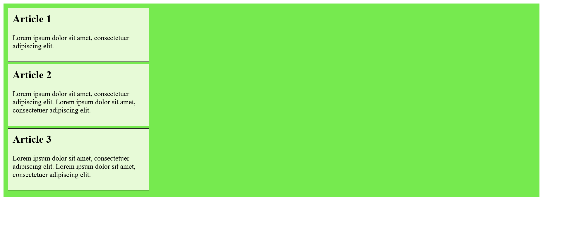
For the CSS properties flex-direction, the values row-reverse and column-reverse can be used, with which the elements are sorted and displayed in reverse order.
Wrap elements in a flexbox with flex-wrap
The unpleasant thing about flex-direction: row; is that it doesn't look nice above a certain window width.
If you want the elements to wrap to the next row, the flexbox model provides the CSS property flex-wrap. The default value nowrap prevents the elements in the flexbox from wrapping. If the wrap value is used, the elements wrap into a new row. There is also the value wrap-reverse, which wraps the flexible elements to the top.
Complete Code - Examples/Part_14/...
 <main class="mymain">
     <article class="myarticle">
         <h1>Article 1</h1>
         <p>Lorem ipsum dolor sit amet, consectetuer adipiscing elit. </p>
     </article>
     <article class="myarticle">
         <h1>Article 2</h1>
         <p>Lorem ipsum dolor sit amet, consectetuer adipiscing elit. Lorem ipsum dolor sit amet, consectetuer adipiscing elit.</p>
     </article>
     <article class="myarticle">
         <h1>Article 3</h1>
         <p>Lorem ipsum dolor sit amet, consectetuer adipiscing elit. Lorem ipsum dolor sit amet, consectetuer adipiscing elit. </p>
     </article>
 </main>
 .myarticle {
     width: 300px;
     padding: 10px;
     margin: 0px 5px 5px 0px;
     border: 1px solid black;
     background-color: #e7fad7;
 }

 .mymain {
     width: 95%;
     padding: 10px;
     background-color: #76ea4f;
     display: flex;
     flex-direction: row;
     flex-wrap: wrap;
 }
The shorthand notation for flex-direction and flex-wrap is possible with flex-flow, e.g : flex-flow: row-wrap; is equivalent to the notation:
 flex-direction: row;
 flex-wrap: wrap;
Arrange elements along the main axis with justify-content
The CSS property justify-content can be used to arrange the individual elements along the main axis. Possible values for this are center, flex-start, flex-end, space-between and space-around.
- center : This will place the elements in the center.
Complete Code - Examples/Part_15/style1...
 <main class="mymain">
     <article class="myarticle">
         <h1>Article 1</h1>
         <p>Lorem ipsum dolor sit amet, consectetuer adipiscing elit. </p>
     </article>
     <article class="myarticle">
         <h1>Article 2</h1>
         <p>Lorem ipsum dolor sit amet, consectetuer adipiscing elit. Lorem ipsum dolor sit amet, consectetuer adipiscing elit.</p>
     </article>
     <article class="myarticle">
         <h1>Article 3</h1>
         <p>Lorem ipsum dolor sit amet, consectetuer adipiscing elit. Lorem ipsum dolor sit amet, consectetuer adipiscing elit. </p>
     </article>
 </main>
 .myarticle {
     width: 300px;
     padding: 10px;
     margin: 0px 5px 5px 0px;
     border: 1px solid black;
     background-color: lightgreen;
 }

 .mymain {
     width: 98%;
     padding: 10px;
     background-color: green;
     display: flex;
     justify-content: center;
 }
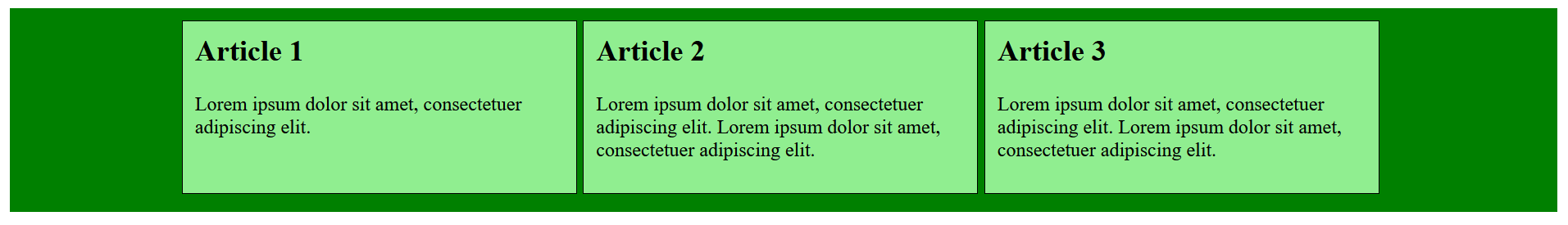
- flex-start : This will align the elements left.
Complete Code - Examples/Part_15/style2...
 .myarticle {
     width: 300px;
     padding: 10px;
     margin: 0px 5px 5px 0px;
     border: 1px solid black;
     background-color: lightgreen;
 }

 .mymain {
     width: 98%;
     padding: 10px;
     background-color: green;
     display: flex;
     justify-content: flex-start;
 }
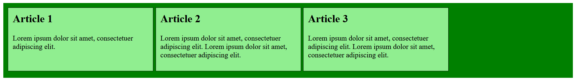
- flex-end : This will align the elements right.
Complete Code - Examples/Part_15/style3...
 .myarticle {
     width: 300px;
     padding: 10px;
     margin: 0px 5px 5px 0px;
     border: 1px solid black;
     background-color: lightgreen;
 }

 .mymain {
     width: 98%;
     padding: 10px;
     background-color: green;
     display: flex;
     justify-content: flex-end;
 }
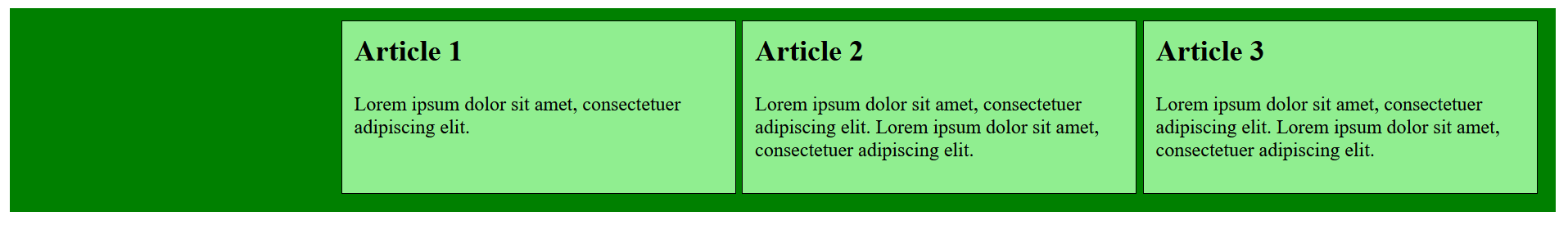
- space-between : This distributes the elements evenly. The first and the last element touches at the beginning or at the end.
Complete Code - Examples/Part_15/style4...
 .myarticle {
     width: 300px;
     padding: 10px;
     margin: 0px 5px 5px 0px;
     border: 1px solid black;
     background-color: lightgreen;
 }

 .mymain {
     width: 98%;
     padding: 10px;
     background-color: green;
     display: flex;
     justify-content: space-between;
 }
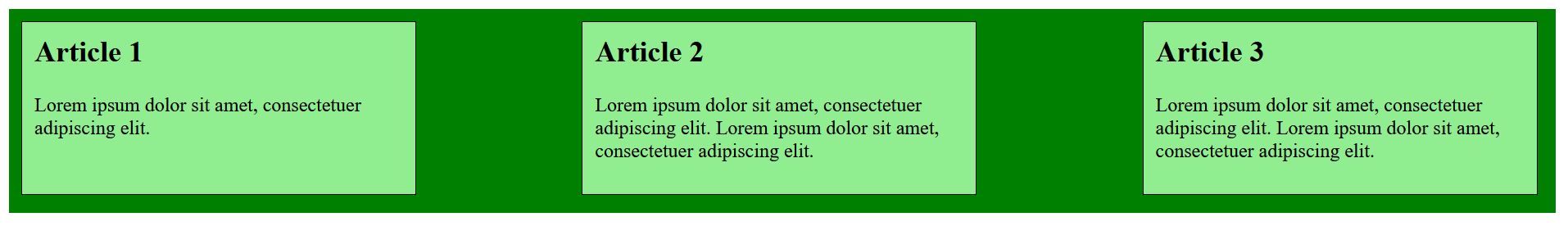
- space-around : This distributes all elements evenly.
Complete Code - Examples/Part_15/style5...
 .myarticle {
     width: 300px;
     padding: 10px;
     margin: 0px 5px 5px 0px;
     border: 1px solid black;
     background-color: lightgreen;
 }

 .mymain {
     width: 98%;
     padding: 10px;
     background-color: green;
     display: flex;
     justify-content: space-around;
 }
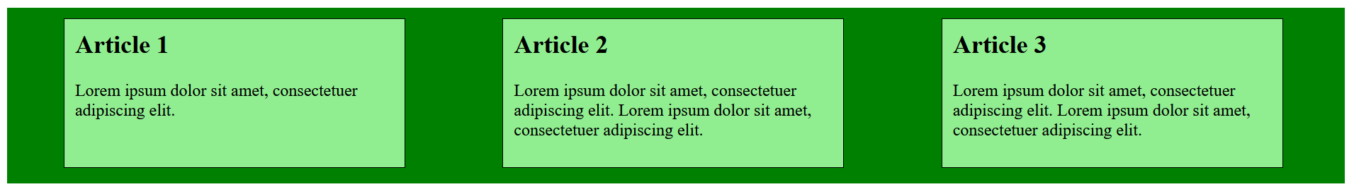
Arrange elements along the cross axis with align-content
If the elements are to be arranged along the cross axis, the CSS property align-content is used. The default value is stretch, which distributes all elements evenly. Other values are center, flex-start, flex-end, space-between and space-around.
Complete Code - Examples/Part_16/style1...
 <main class="mymain">
     <article class="myarticle">
         <h1>Article 1</h1>
         <p>Lorem ipsum dolor sit amet, consectetuer adipiscing elit. </p>
     </article>
     <article class="myarticle">
         <h1>Article 2</h1>
         <p>Lorem ipsum dolor sit amet, consectetuer adipiscing elit.</p>
     </article>
     <article class="myarticle">
         <h1>Article 3</h1>
         <p>Lorem ipsum dolor sit amet, consectetuer adipiscing elit.</p>
     </article>
 </main>
 .myarticle {
     width: 500px;
     padding: 10px;
     margin: 0px 5px 5px 0px;
     border: 1px solid black;
     background-color: lightgreen;
 }

 .mymain {
     width: 95%;
     height: 400px;
     padding: 10px;
     background-color: green;
     display: flex;
     flex-wrap: wrap;
     align-content: center;
 }
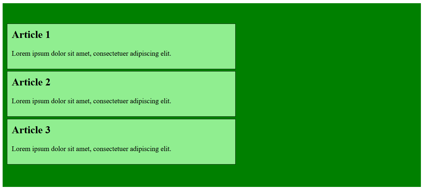
Complete Code - Examples/Part_16/style2...
 .myarticle {
     width: 500px;
     padding: 10px;
     margin: 0px 5px 5px 0px;
     border: 1px solid black;
     background-color: lightgreen;
 }

 .mymain {
     width: 95%;
     height: 400px;
     padding: 10px;
     background-color: green;
     display: flex;
     flex-wrap: wrap;
     align-content: flex-start;
 }
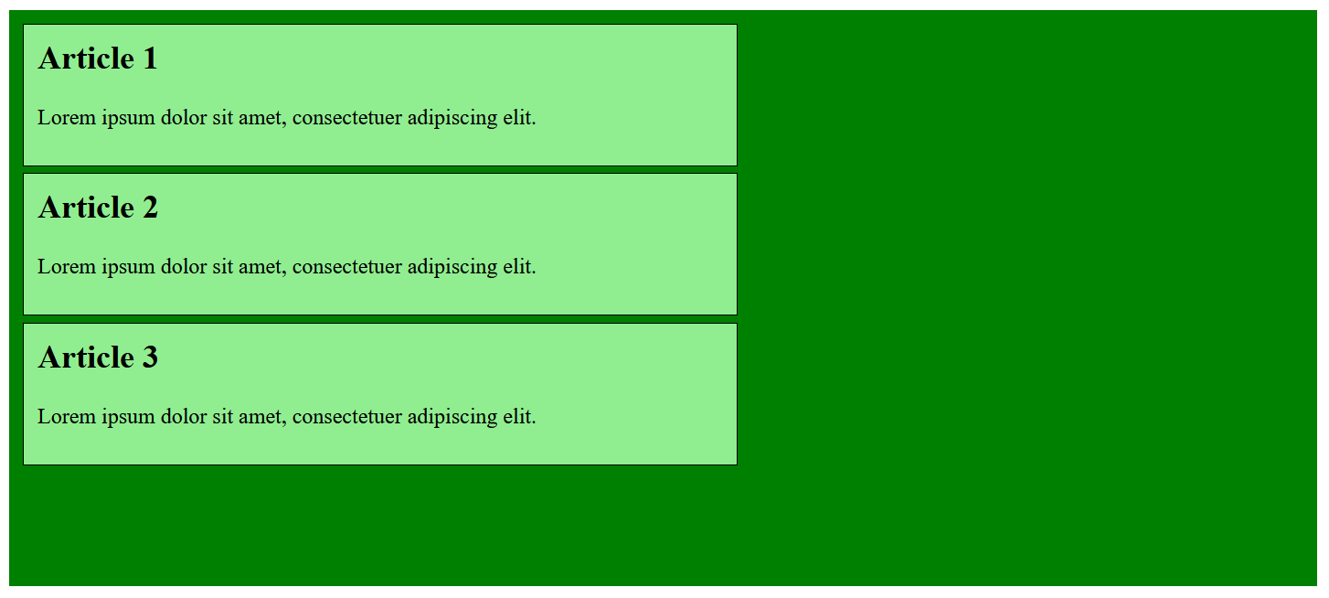
Complete Code - Examples/Part_16/style3...
 .myarticle {
     width: 500px;
     padding: 10px;
     margin: 0px 5px 5px 0px;
     border: 1px solid black;
     background-color: lightgreen;
 }

 .mymain {
     width: 95%;
     height: 400px;
     padding: 10px;
     background-color: green;
     display: flex;
     flex-wrap: wrap;
     align-content: flex-end;
 }
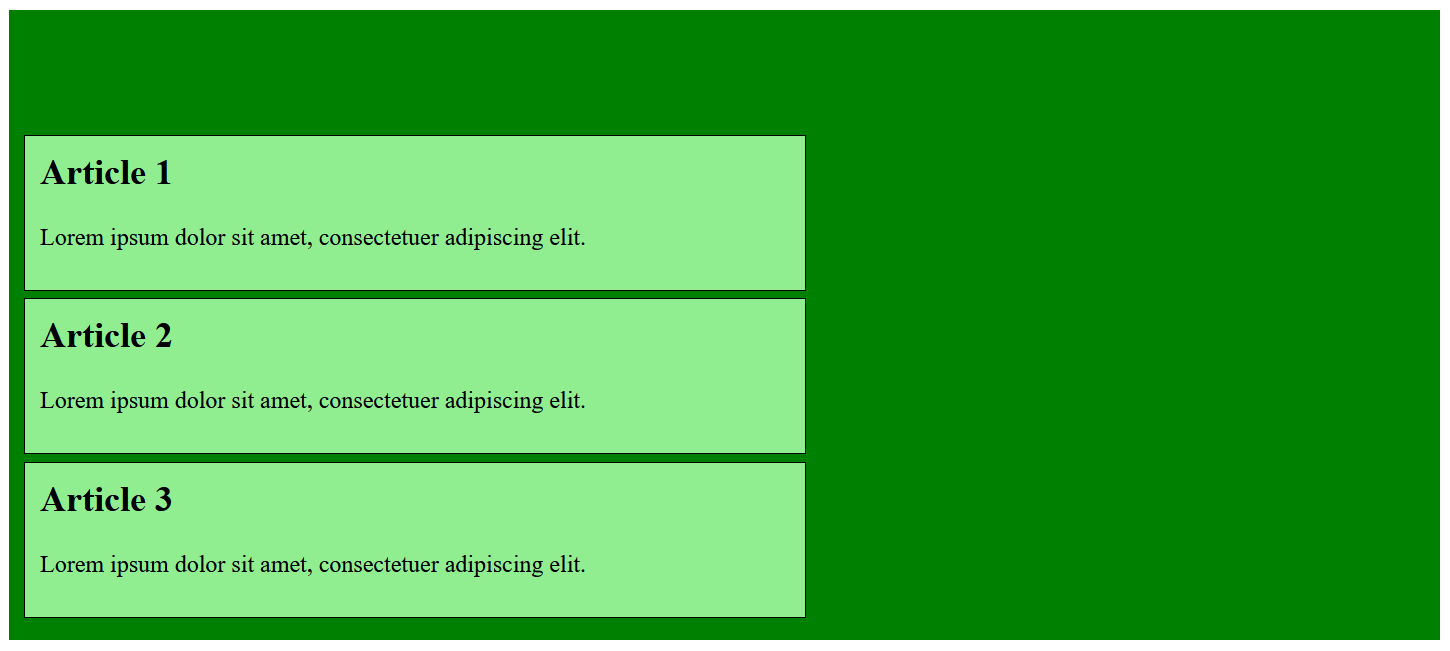
Complete Code - Examples/Part_16/style4...
 .myarticle {
     width: 500px;
     padding: 10px;
     margin: 0px 5px 5px 0px;
     border: 1px solid black;
     background-color: lightgreen;
 }

 .mymain {
     width: 95%;
     height: 400px;
     padding: 10px;
     background-color: green;
     display: flex;
     flex-wrap: wrap;
     align-content: space-between;
 }
Complete Code - Examples/Part_16/style5...
 .myarticle {
     width: 500px;
     padding: 10px;
     margin: 0px 5px 5px 0px;
     border: 1px solid black;
     background-color: lightgreen;
 }

 .mymain {
     width: 95%;
     height: 400px;
     padding: 10px;
     background-color: green;
     display: flex;
     flex-wrap: wrap;
     align-content: space-around;
 }
Arrange elements with align-self
If individual elements in the arrangement of flexible elements are to be assigned a different property than that specified in the parent element, the CSS property align-self can be used. The default value is the value of the parent element. Other possible values are stretch, center, flex-start, flex-end and baseline (which aligns an element to the baseline).
Complete Code - Examples/Part_17/style1...
 <main class="mymain">
     <article class="myarticle">
         <h1>Article 1</h1>
         <p>Lorem ipsum dolor sit amet, consectetuer adipiscing elit. </p>
     </article>
     <article class="myarticle down">
         <h1>Article 2</h1>
         <p>Lorem ipsum dolor sit amet, consectetuer adipiscing elit. Lorem ipsum dolor sit amet, consectetuer adipiscing elit.</p>
     </article>
     <article class="myarticle">
         <h1>Article 3</h1>
         <p>Lorem ipsum dolor sit amet, consectetuer adipiscing elit. Lorem ipsum dolor sit amet, consectetuer adipiscing elit. </p>
     </article>
 </main>
 .myarticle {
     width: 200px;
     height: 200px;
     padding: 10px;
     margin: 0px 5px 5px 0px;
     border: 1px solid black;
     background-color: lightgreen;
 }

 .mymain {
     width: 98%;
     height: 400px;
     padding: 10px;
     background-color: green;
     display: flex;
     flex-wrap: wrap;
     justify-content: flex-start;
 }

 .down {
     align-self: stretch;
 }

Complete Code - Examples/Part_17/style2...
 .myarticle {
     width: 200px;
     height: 200px;
     padding: 10px;
     margin: 0px 5px 5px 0px;
     border: 1px solid black;
     background-color: lightgreen;
 }

 .mymain {
     width: 98%;
     height: 400px;
     padding: 10px;
     background-color: green;
     display: flex;
     flex-wrap: wrap;
     justify-content: flex-start;
 }

 .down {
     align-self: center;
 }
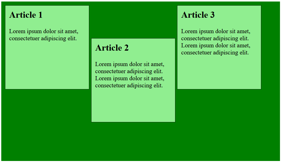
Complete Code - Examples/Part_17/style3...
 .myarticle {
     width: 200px;
     height: 200px;
     padding: 10px;
     margin: 0px 5px 5px 0px;
     border: 1px solid black;
     background-color: lightgreen;
 }

 .mymain {
     width: 98%;
     height: 400px;
     padding: 10px;
     background-color: green;
     display: flex;
     flex-wrap: wrap;
     justify-content: flex-start;
 }

 .down {
     align-self: flex-start;
 }
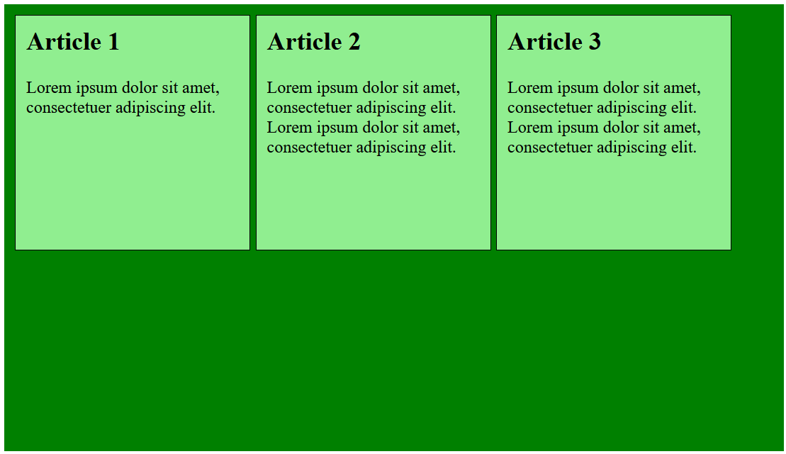
Complete Code - Examples/Part_17/style4...
 .myarticle {
     width: 200px;
     height: 200px;
     padding: 10px;
     margin: 0px 5px 5px 0px;
     border: 1px solid black;
     background-color: lightgreen;
 }

 .mymain {
     width: 98%;
     height: 400px;
     padding: 10px;
     background-color: green;
     display: flex;
     flex-wrap: wrap;
     justify-content: flex-start;
 }

 .down {
     align-self: flex-end;
 }
Complete Code - Examples/Part_17/style5...
 .myarticle {
     width: 200px;
     height: 200px;
     padding: 10px;
     margin: 0px 5px 5px 0px;
     border: 1px solid black;
     background-color: lightgreen;
 }

 .mymain {
     width: 98%;
     height: 400px;
     padding: 10px;
     background-color: green;
     display: flex;
     flex-wrap: wrap;
     justify-content: flex-start;
 }

 .down {
     align-self: baseline;
 }

Set flexibility of the flexbox
To set the flexibility of the corresponding elements within the flexbox, the CSS property flex is used. The property requires a numerical value. The numerical values behave relatively, meaning that an element with the specification flex: 4; is four times as flexible as an element with the property flex: 1;.
flex-grow controls how flexibly the element grows relative to the rest of the elements. How far the element shrinks relative to the other elements is specified with flex-shrink. The base width for the element is specified with flex-basis. In addition to percentages, px or em can also be specified. The default value for flex-basis is auto. The default value of flex in general is flex: 0 1 auto;.
The CSS property flex is a shorthand notation for existing CSS properties of flexboxes flex-grow, flex-shrink and flex-base. The flex: 2; is the shorthand notation for flex-grow: 2;.
The whole shorthand notation is for example: flex: 2 1 30%; This means:
 flex-grow: 2;
 flex-shrink: 1;
 flex-base: 30%;
Complete Code - Examples/Part_18/...
 <main class="mymain">
     <article class="myarticle article01">
         <h1>flex: 0 0 200px;</h1>
         <p>Lorem ipsum dolor sit amet, consectetuer adipiscing elit. </p>
     </article>
     <article class="myarticle article02">
         <h1>flex: 4 1 auto;</h1>
         <p>Lorem ipsum dolor sit amet, consectetuer adipiscing elit. Lorem ipsum dolor sit amet, consectetuer adipiscing elit.</p>
     </article>
     <article class="myarticle article03">
         <h1>flex: 1 3 150px;</h1>
         <p>Lorem ipsum dolor sit amet, consectetuer adipiscing elit. Lorem ipsum dolor sit amet, consectetuer adipiscing elit. </p>
     </article>
 </main>
 .myarticle {
     width: 300px;
     padding: 10px;
     margin: 0px 5px 5px 0px;
     border: 1px solid black;
     background-color: lightgreen;
 }

 .mymain {
     width: 90%;
     /* height: 200px; */
     padding: 10px;
     background-color: green;
     display: flex;
 }

 .article01 {
     flex: 0 0 200px;
 }

 .article02 {
     flex: 4 1 auto;
 }

 .article03 {
     flex: 1 3 150px;
 }
The peculiarity of flex-grow at line break
Complete Code - Examples/Part_19/...
 <main class="mymain">
     <article class="myarticle">
         <h1>Article 1</h1>
         <p>Lorem ipsum dolor sit amet, consectetuer adipiscing elit. </p>
     </article>
     <article class="myarticle">
         <h1>Article 2</h1>
         <p>Lorem ipsum dolor sit amet, consectetuer adipiscing elit. Lorem ipsum dolor sit amet, consectetuer adipiscing elit.</p>
     </article>
     <article class="myarticle">
         <h1>Article 3</h1>
         <p>Lorem ipsum dolor sit amet, consectetuer adipiscing elit. Lorem ipsum dolor sit amet, consectetuer adipiscing elit. </p>
     </article>
 </main>
 .myarticle {
     width: 300px;
     padding: 10px;
     margin: 0px 5px 5px 0px;
     border: 1px solid black;
     background-color: lightgreen;
     flex-grow: 1;
 }

 .mymain {
     width: 95%;
     padding: 10px;
     background-color: green;
     display: flex;
     flex-direction: row;
     flex-wrap: wrap;
 }
When the viewport is reduced, the elements are automatically arranged differently.
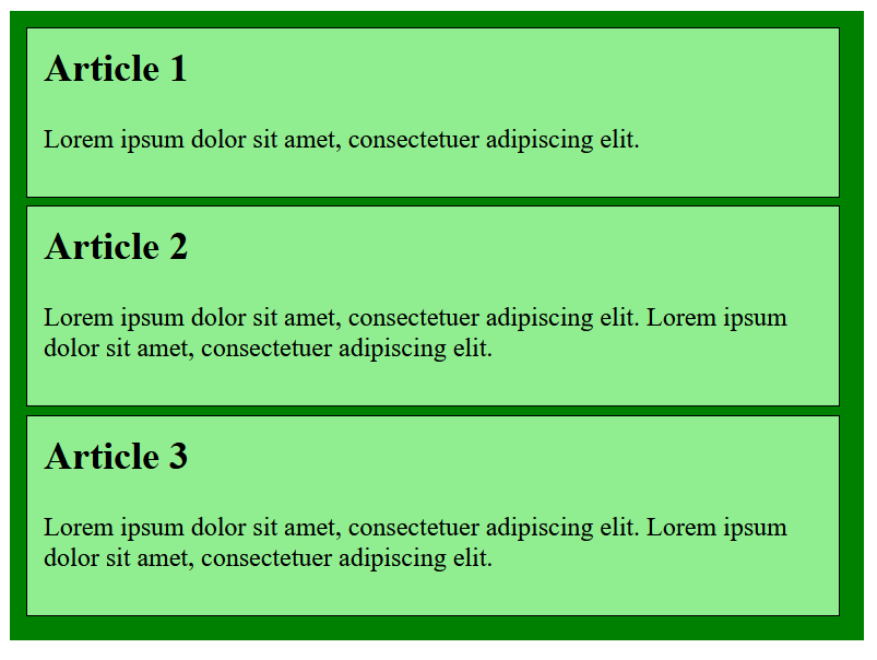
Determine the order of the boxes
With the CSS property order the order itself can be set, also here a numerical value is used.
Complete Code - Examples/Part_20/...
 <main class="mymain">
   <article class="myarticle article01">
     <h1>Article 1</h1>
     <p>Lorem ipsum dolor sit amet, consectetuer adipiscing elit. </p>
   </article>
   <article class="myarticle article02">
     <h1>Article 2</h1>
     <p>Lorem ipsum dolor sit amet, consectetuer adipiscing elit. Lorem ipsum dolor sit amet, consectetuer adipiscing elit.</p>
   </article>
   <article class="myarticle article03">
     <h1>Article 3</h1>
     <p>Lorem ipsum dolor sit amet, consectetuer adipiscing elit. Lorem ipsum dolor sit amet, consectetuer adipiscing elit. </p>
   </article>
 </main>
 .myarticle {
     width: 300px;
     padding: 10px;
     margin: 0px 5px 5px 0px;
     border: 1px solid black;
     background-color: lightgreen;
 }

 .mymain {
     width: 90%;
     padding: 10px;
     background-color: green;
     display: flex;
 }

 .article01 {
     order: 2;
 }

 .article02 {
     order: 3;
 }

 .article03 {
     order: 1;
 }
Simple examples for testing and studying CSS flexboxes can be found on the website Quackit.
6. Responsive layouts with CSS
Today, responsive layouts are used to display a suitable web page for the user for any device width.
6.1. Theoretical basic knowledge about responsive web design
The way the Internet is accessed today has become very versatile. Where a few years ago a website was only viewed with a desktop PC or laptop, today many other devices such as tablets, smartphones, e-book readers, game consoles or TVs have joined the mix. The challenge here is to respond to the screen size and screen resolution of each device with a suitable layout.
Statistics confirm the trend that mobile devices are now the most used devices when visitors are on the web.
The most common standard sizes:
- Smartphone: 320 to 480 pixels
- Tablets: 768 to 1024 pixels
- Desktop PCs: 1024 pixels and above
Instead of creating and maintaining countless layout versions for the same website, responsive web design is used. In this technique, the characteristics of the device are taken into account to adapt the website to achieve an optimal and custom display for the device. The main criterion for such a layout is the screen size of the device and the available input method, e.g. mouse or touch screen.
The use of specific media types
Using the link element, CSS instructions are provided for the screen (media="screen") and a special version for the printer (media="print"). If the media type is not defined, then the CSS instructions automatically apply to all output types (media="all").
Complete Code - Examples/Part_1/...
media="screen"
media="print"
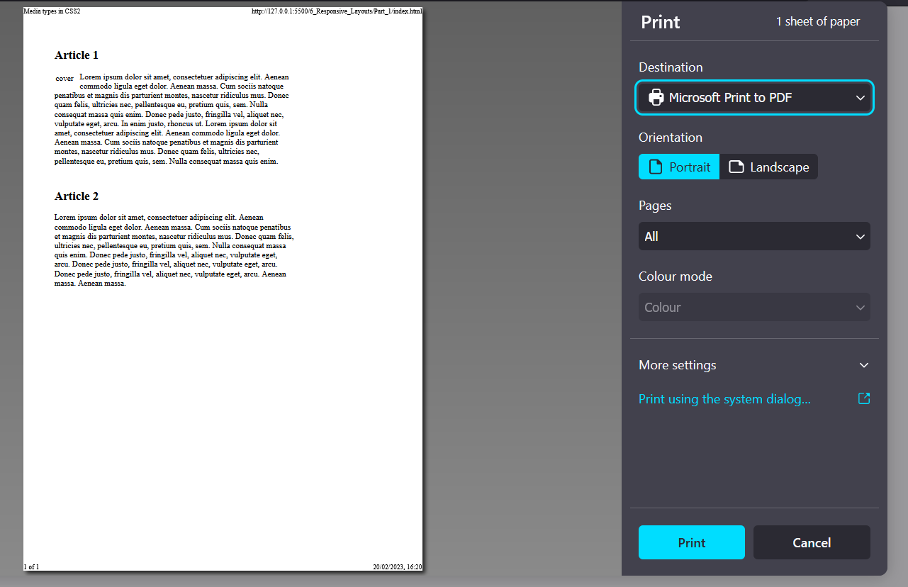
The media queries for media features
• The media features can be included and used in various ways. The use of such a media query in HTML can be noted as follows:
 ...
 <head>
     <link href="styles/style.css" rel="stylesheet" />
     <link href="styles/mobile.css" rel="stylesheet" media="screen and (max-width: 480px)" />
 </head>
 ...
mobile.css is used only if the maximum screen width of 480 pixels is not exceeded. For devices with a higher resolution, only style.css is used.
• Including queries in the <style> tag is possible as follows:
 ...
 <style type="text/css" media="screen and (max-width: 480px)">
     /* CSS statement for screen up to max. 480 pixel */
 </style>
 ...
• Embedding directly into the stylesheet with @media:
 ...
 .main {
     background-color: blue;
 }

 @media screen and (max-width: 480px) {
     .main {
     background-color: yellow;
     }
 }
 ...
If the maximum screen size of 480 pixels is not exceeded, the background is displayed in yellow.
• Use media features with the @import rule as follows:
@import url('styles/mobile_480.css') screen and (max-width: 480px);
Thus, querying media features can be used in HTML with the link element or in the style element and in CSS with the @media or @import rule.
Basic structure of a media features query
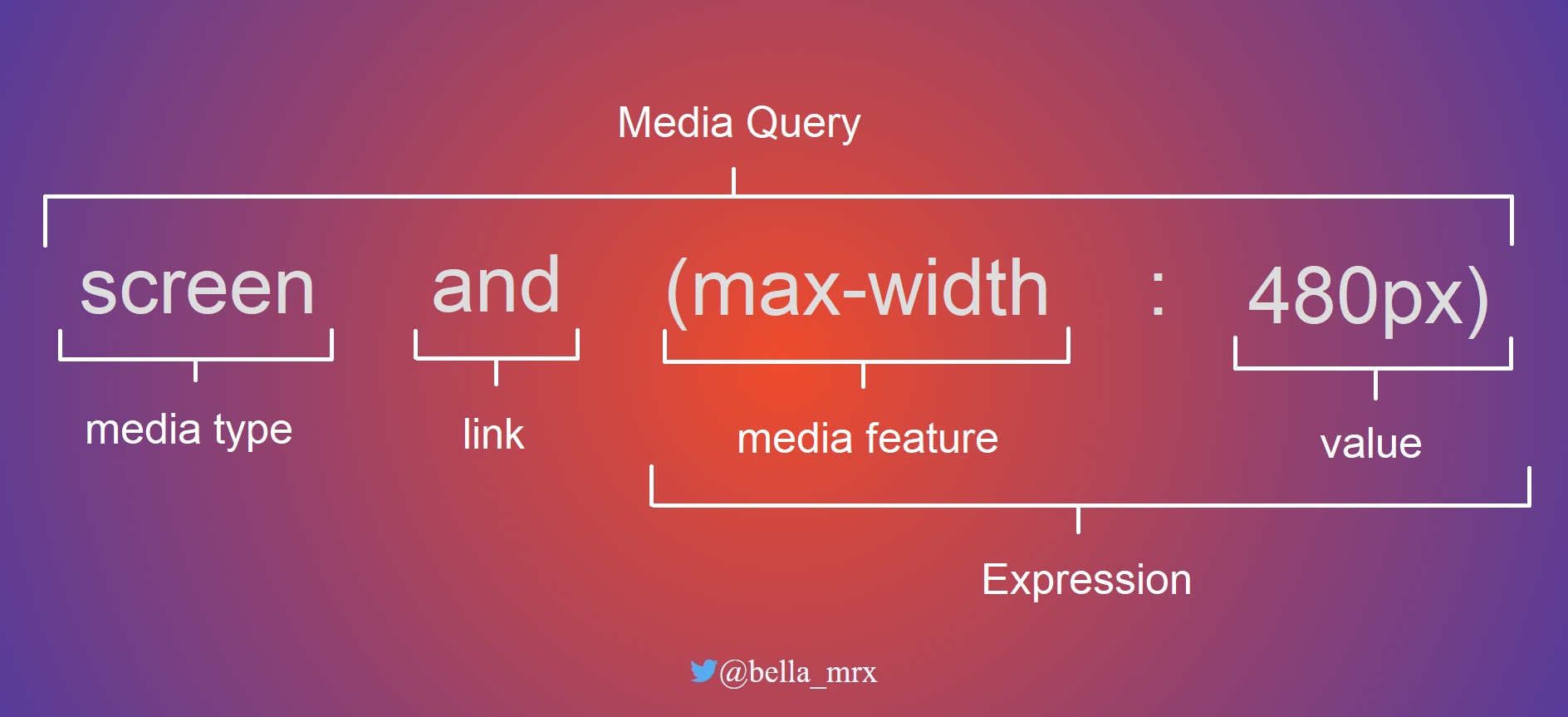
Link the media features
The media features is linked with the keyword and. Several and characteristics can be linked and processed. The link can be made with or without a media type.
For example:
 @media screen and (min-width: 960px) {
     /* CSS statement for desktop */
 }
@media screen and (min-width: 768px) and (max-width: 960px) {
/* CSS statement for tablets and netbooks */
}
@media screen and (max-width: 480px) {
/* CSS statement for smartphones */
}
If only one media type is to be used, a specification can be made in front of the media type with only.
@media only screen and (max-width: 480px) {
/* CSS statement for smartphones */
}
A media query can also be negated with not.
Which media features can be queried?
The various output devices have many different features. The most common feature that is queried is the minimum and maximum width of the display area.
| Media features | Meaning | Values |
| width, min-width, max-width |
Width of the display area (viewport) of the web browser. Possible values are positive length values e.g. min-width: 480px. |
px, %, em |
| height, min-height, max-height |
Height of the display width of the web browser. Possible values are positive length values e.g. max-height: 720px. |
px, %, em |
| orientation |
This sets the orientation of the device from. The orientation can be portrait or landscape e.g. orientation: landscape. |
portrait, landscape |
| aspect-ration, min-aspect-ration, max-aspect-ration |
Specifies the aspect ratio of width and height to each other. A value of 1280 x 720 corresponds to an aspect ratio of 16:9. |
width/height e.g. 16/9, 1280/720 |
| color, min-color/max-color |
Query the color depth of the device. For black and white devices the value for color is 0 |
Integer value |
| color-index, min-color-index, max-color-index |
Checks the use of indexed colors of the output device |
Integer value |
| monochrome, min-monochrome, max-monochrome |
Checks if the output device is monochrome. |
Integer value |
| resolution, min-resolution, max-resolution |
Query the pixel density of the device, e.g. resolution: 720dpi. |
dpi, dcm |
| pointer, any-pointer |
Tests if the output device provides a mouse as an input device. |
none, coarse, fine |
| hover, any-hover |
Checks if the output device provides hover effects at the primary input device. |
none, hover |
An overview of all media features can be found at WC3 - Media Queries.
The viewport for mobile devices
The viewport plays an essential role in terms of querying media features on mobile devices. The viewport on desktop computers and the viewport on mobile devices often causes a bit of confusion. High-resolution displays make it even more complicated, as a pixel is suddenly no longer a pixel. A collection of the many different sizes of displays on different devices can be found at Screensiz.es.
In terms of desktop computers, the viewport is the inner area of the browser window without the borders. When the browser window is reduced or enlarged, the viewport is also reduced or enlarged. This visual viewport can be addressed with the media features width and height. On mobile devices like a smartphone, the screens are much smaller than on a desktop computer, but the viewport there is still often larger than on desktop screens. Without special adjustments to the viewport for mobile devices, therefore, the web page on these devices would often be called a layout viewport.
The problem with mobile devices can be easily solved with the meta-tag viewport or CSS rule @viewport.
• The metatag viewport is added in the head area of the HTML document:
<meta name="viewport" content="width=device-width, initial-scale=1.0">
The width=device-width sets the width of the layout viewport to the width of the visual viewport. With this line all different layout viewports from different devices are normalized and adjusted to the current display size. Besides width there is the counterpart with height=device-height for the height, but this is rarely needed in practice.
With initial-scale=1.0 the initial zoom value is set to 100% or 1:1. In addition to initial-scale there are further viewport features with minimum-scale or maximum-scale, with which the minimum and maximum zoom level can be set. With user-scaleable=no zooming can be blocked completely.
• The @viewport rule
@viewport {
width: device-width;
zoom: 1;
}
In the future the CSS rule @viewport will probably replace the metatag. But not all browsers support this method yet. The advantage of the CSS rule is, that theoretically more is possible, because different media queries can be declared with different information.
Once the viewport has been adjusted, the web page must also be optimized using media queries. The setting of the viewport alone only ensures that the automatic scaling of the web browser has been switched off.
Use em instead of px for a layout wrap (breakpoints)
Performing the media query with the unit em is quite helpful, since the screen is measured in pixels. The advantage is that the media query then works correctly even if the font size is changed. This ensures that when the fonts are displayed larger, the next layout level is really triggered and the layout does not collapse.
@media screen and (min-width: 640px) {
/* CSS statement for for screens from 640px width */
}
A breakpoint has been set up here for screens 640 pixels and larger. All CSS statements between the curly brackets are thus only executed from a screen width of 640 pixels. Referring to the recommendation to use the unit em for such breakpoints, the screen size only has to be divided by 16. 16 pixels is usually the browser base font size. 640 pixels divided by 16px is 40em.
This means then:
/* 640px / 16px = 40em */
@media screen and (min-width: 40em) {
/* CSS statement for for screens from 640px width */
}
Breakpoints
The layout is changed during these wraps. In practice, different layouts for different resolutions are provided here, which can be controlled with media queries.
/* CSS statement for for screens from 640px width */
/* 640px / 16px = 40em */
@media screen and (min-width: 40em) {
/* CSS statement for for screens from 640px width */
}
/* 1024px / 16px = 64em */
@media screen and (min-width: 64em) {
/* CSS statement for for screens from 1024px width */
}
/* 1280px / 16px = 80em */
@media screen and (min-width: 80em) {
/* CSS statement for for screens from 1280px width */
}
Here three common breakpoints have been defined with media queries. The statements are definitely executed before the first breakpoint. Here, in addition to the basic CSS properties, the mobile layout for smartphones can also be defined right away. Subsequently is still for the screen widths 640 pixels (tablets), 1024 pixels (desktop) and 1280 pixels (extra large desktop).
box-sizing: border-box;
By using the box model with border-box, you do not need to calculate with width, padding and border. This CSS statement should be set right at the beginning.
html {
box-sizing: border-box;
}
*, *::before, *::after {
box-sizing: inherit;
}
Media queries are now understood by all major web browsers. Browsers that cannot handle media queries, the browser uses the base version of the website that was defined before the first breakpoint with a media query. Therefore, it is always recommended to create a base version before the media queries.
6.2. Create a responsive layout
Whether a website is first created as a desktop version or as a mobile version, everyone should decide for themselves and also depends on how the page is used. But today it is recommended to start with the mobile version first, because most users consider the mobile version first.
Here is the mobile version first:
Complete Code - Examples/Part_2/...
<!DOCTYPE html>
<html lang="en">
<head>
<meta charset="utf-8">
<title>mobile version</title>
<meta name="viewport" content="width=device-width, initial-scale=1">
<link rel="stylesheet" href="styles/layout.css">
</head>
<body>
<div class="wrapper">
<header class="header">
Responsive web design - Logo
</header>
<nav>
<ul class="nav-ul">
<li class="nav-li"><a href="#" title="dummy" class="nav-li-a">Home</a></li>
<li class="nav-li"><a href="#" title="dummy" class="nav-li-a">Portfolio</a></li>
<li class="nav-li nav-active"><strong class="nav-li-a">Blog</strong></li>
<li class="nav-li"><a href="#" title="dummy" class="nav-li-a">Contact</a></li>
<li class="nav-li"><a href="#" title="dummy" class="nav-li-a">Legal Notice</a></li>
</ul>
</nav>
<div class="container">
<main class="content">
<article class="article">
<h2>Article 1</h2>
<p>Lorem ipsum ... </p>
</article>
<article class="article">
<h2>Article 2</h2>
<p>Phasellus viverra ...</p>
</article>
<article class="article clear">
<h2>Article 3</h2>
<p>Donec pede ...</p>
</article>
<article class="article">
<h2>Article 4</h2>
<p>Lorem ipsum ...</p>
</article>
</main>
<aside class="aside">
<h3>About the author</h3>
<p>Lorem ipsum ... </p>
<p>Cras dapibus... </p>
</aside>
</div>
<footer class="footer">
Footer - © 2023
</footer>
</div>
</body>
</html>
@charset "UTF-8";
/* --------------------------------------------------
General basic settings
----------------------------------------------------*/
html {
box-sizing: border-box;
}
*, *::before, *::after {
box-sizing: inherit;
}
body {
color: #1d2731;
background-color: #efefef;
font-family: Georgia;
}
ul {
padding: 0;
}
.wrapper {
background-color: #ff383f;
}
/* ------------------------------------------------------------------
CSS properties for mobile devices (smaller than 640 px)
+ Arrange everything in one column below each other
-------------------------------------------------------------------- */
.header {
text-align: center;
padding: 1em ;
background-color: #55b079;
color: #efefef;
border-bottom: 1px solid #efefef;
}
.aside {
border-top: 1px solid #a9a9a9;
padding-top: 0.5em;
}
.footer {
background-color: #a9a9a9;
color: #efefef;
padding: 1em;
text-align: center;
border-top: 1px solid #efefef;
}
.nav-ul {
background-color: #ff383f;
margin:0;
}
.nav-li {
list-style: none;
margin-left: 0;
border-bottom: 1px solid #efefef;
}
.nav-li-a {
padding: 0.6em 2rem;
display: block;
}
.nav-ul a:link {
text-decoration: none;
}
.nav-ul a:link, .nav-ul a:visited {
color: #fff;
}
.nav-ul a:hover, .nav-ul a:focus, .nav-ul a:active {
background-color: #000;
color: #efefef;
}
.nav-active {
color: #000;
background-color: #fff;
}
.container {
background-color: #fff;
padding: 2em 2rem;
}
Mobile view:

Desktop view:
Here is the mobile version + desktop version:
Complete Code - Examples/Part_3/...
@charset "UTF-8";
/* --------------------------------------------------
General basic settings
----------------------------------------------------*/
...
/* ------------------------------------------------------------------
CSS properties for mobile devices (smaller than 640 px)
+ Arrange everything in one column below each other
-------------------------------------------------------------------- */
...
/*-----------------------------------------------------
Tablet version from 640 pixel
640px / 16px/em = 40em
+ 2 columns
- Header and navigation on top below each other
- Main content and sidebar next to each other
- Footer bar below
------------------------------------------------------*/
@media screen and (min-width: 40em) {
.header {
padding: 1.5em;
text-align: left;
}
.container {
padding: 3rem 0;
display: block;
overflow: auto;
}
.content {
display: block;
float: left;
width: 65%;
padding: 0 1rem 0 2rem;
}
.aside {
display: block;
margin: 0 0 0 65%;
width: 35%;
padding: 0 2rem 0 2rem;
border-top: none;
}
.nav-ul {
padding: 0 2rem;
overflow: hidden;
}
.nav-li {
float: left;
display: inline-block;
border: none;
width: auto;
}
.nav-li-a{
padding: 0.7em 1.2rem;
display: inline-block;
}
}
Desktop version:
Smartphone version:
Here you can see that the view automatically adapts to the screen, i.e. smartphone or desktop.
More examples:
Complete Code - Examples/Part_4/...
Extra Large Desktop Version:
Complete Code - Examples/Part_5/...
The examples created in this way now flexibly adapt to the layout breaks with the media queries to the user's devices.
Relative font sizes
Relative specifications should always be used instead of pixels for font sizes. On screens with a higher pixel density, fonts that are specified with pixels are displayed relatively small. It is possible to zoom in on them later, but a website should be rendered legibly immediately after loading. Therefore, pixels should be avoided and relative specifications such as em, rem or percent should be used.
6.3. Responsive layouts with images
With a fixed image size, the text can slip away towards the bottom, and individual words can be left at the top if there is not enough space. This text wrapping can be avoided by setting the maximum width of the image with the CSS property max-width accordingly in percent. With max-width the maximum width of an element can be determined.
Complete Code - Examples/Part_6/...
...
.img-art {
float: left;
margin: 0 1em 0.2em 0;
max-width: 40%;
height: auto;
}
.img-side {
float: left;
margin: 0.1em 1em 0.2em 0.2em;
max-width: 40%;
height: auto;
}
...
Flexible images in maximum possible width
If images should always be expanded over the full width regardless of the device and still remain responsive, max-width can be set to 100%. This also depends on where the image is placed. Setting an image to 100% means that an image will not be responsive until the column it is defined in is smaller than the image. It also depends on the context in which the image is used.
Complete Code - Examples/Part_6/index.html...
...
<header class="header">
<img src="images/logo.jpg" alt="Logo" class="img-logo">
</header>
...
Complete Code - Examples/Part_6/styles/layout.css...
...
.img-logo {
max-width: 100%;
height: auto;
}
...
With <video> it works the same way as with images.
Hide images
To hide images in a certain version, here for example for smartphones you can set display to none. On the desktop screen, the logo remains visible. For the other layout wraps you have to make the header visible again with display: block;.
Complete Code - Examples/Part_7/...
...
.img-logo {
display: none;
}
...
/*-----------------------------------------------------
Tablet version from 640 pixel
------------------------------------------------------*/
.img-logo {
display: block;
max-width: 100%;
height: auto;
}
...
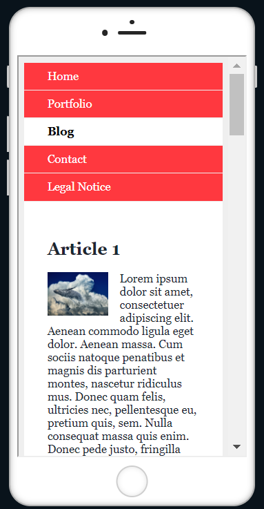
Load pictures matching the screen width with <picture>
The disadvantage of max-width is that with small displays often large files must be loaded, this is bad for the Performence and the pictures must be scaled down, which affects the picture quality negatively. The <picture> element, serves as a container element for multiple image sources. The individual image sources are specified with source.
Complete Code - Examples/Part_8/...
...
<header class="header">
<picture class="img-logo">
<source media="(min-width: 1023px)" srcset="images/logo-desktop.jpg 1x,images/logo-desktop-HD.jpg 2x">
<source media="(min-width: 639px)" srcset="images/logo-tablet.jpg 1x,images/logo-tablet-HD.jpg 2x">
<source srcset="images/logo-smartphone.jpg 1x,images/logo-smartphone-HD.jpg 2x">
<!-- Fallback for browsers that can't do <picture> -->
<img src="images/logo.jpg" alt="Logo" class="img-logo">
</picture>
</header>
...
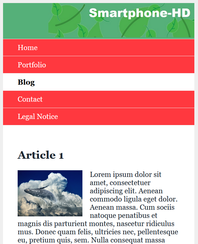
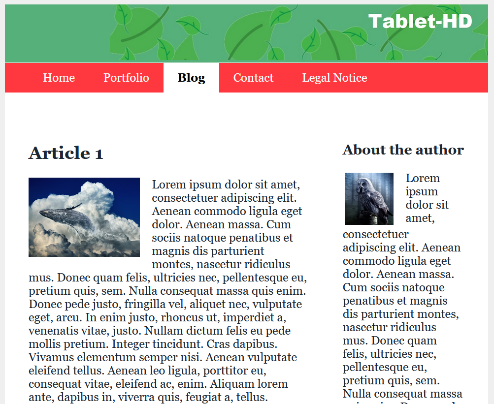
Use area covering images
When a background image is inserted with background-image, the height and width can be adjusted with the CSS property background-size.
Complete Code - Examples/Part_9/style/layout.css...
...
.img-background {
background-size: cover;
background-image: url("../images/background.jpg");
background-repeat: no-repeat;
}
...
6.4. The CSS Grid Layout
In the previous examples, it is quite time-consuming to realize a more complex layout or to redesign it. For such purposes the grid layout is a good choice. CSS offers real design grids with CSS grid layouts.
Creating a grid for content
The principle of a CSS grid is based on creating a grid in a parent element and positioning the child elements within it. To do this, assign the value grid to the CSS property display in the parent element and then use the properties grid-template-columns and grid-template-rows to define the individual grid lines.
grid {
display: grid;
grid-template-rows: 150px auto auto 100px;
grid-template-columns: 20% 20% 20% 20% 20%;
}
This creates a CSS grid with four rows and five columns. The first row is 150 pixels high and the last 100 pixels high. The middle two rows are still adjusted with auto according to the content. All five columns are 20% wide. Besides the units percent or pixel, you can also use em or fr(e.g. 1fr or 2fr). The unit fr means flexible fragment (fractional part).
The grid can be adjusted as desired.
grid {
display: grid;
grid-template-rows: 150px auto auto auto 100px;
grid-template-columns: repeat (10, 10%);
}
This defines a grid layout with five rows and ten columns. The header area is specified with a height of 150 pixels and the footer area with 100 pixels. The three rows in between automatically adjust to the content. repeat (10, 10%) means 10% 10% 10% 10% 10% 10% 10% 10% 10% 10%.
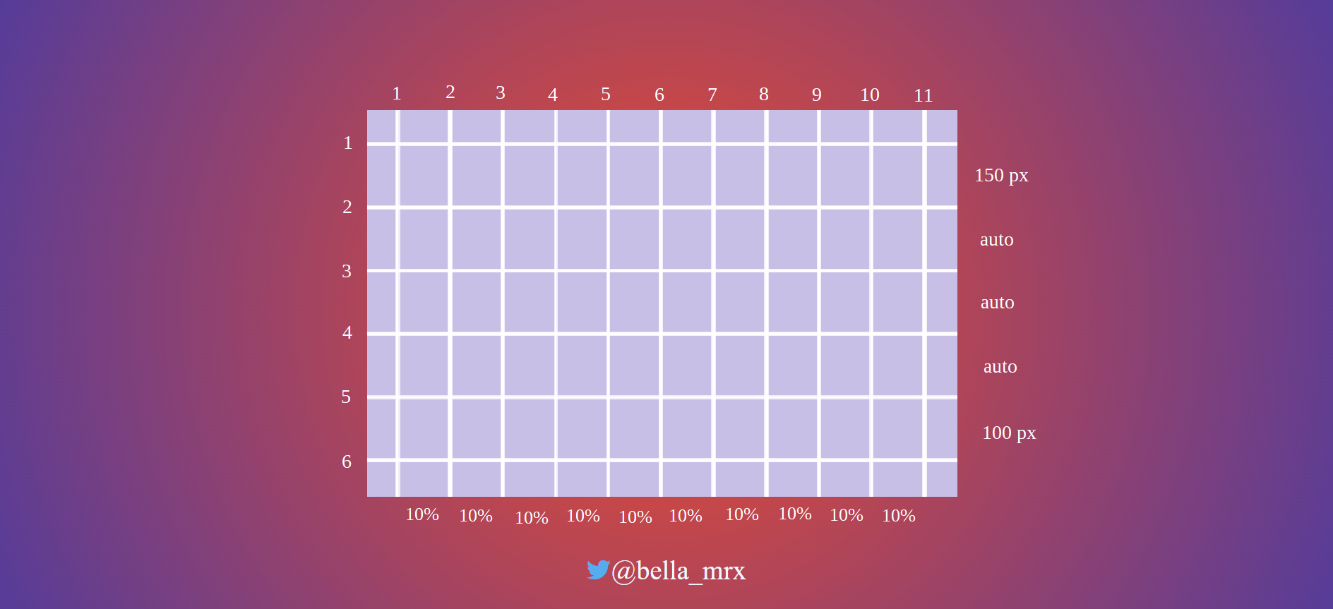
To use the grid layout, the class selector .grid must be used in the parent element, whose child elements are positioned in this grid. Inside the div parent element the child elements are placed (<header>, <nav>, <main>, <aside>, <footer>).
Complete Code - Examples/Part_10/...
<body>
<div class="grid">
<header class="header">
...
</header>
<nav class="nav">
...
</nav>
<main class="content">
...
</main>
<aside class="aside">
...
</aside>
<footer class="footer">
...
</footer>
</div>
</body>
Place elements in the grid
With grid-row-start and grid-row-end or grid-column-start and grid-column-end you can specify where the HTML elements should be placed in the grid.
Complete Code - Examples/Part_10/...
.header {
grid-column-start: 1;
grid-column-end: 11;
grid-row-start: 1;
grid-row-end: 2;
text-align: right;
background-color: #55b079;
color: #efefef;
border-bottom: 1px solid #efefef;
}
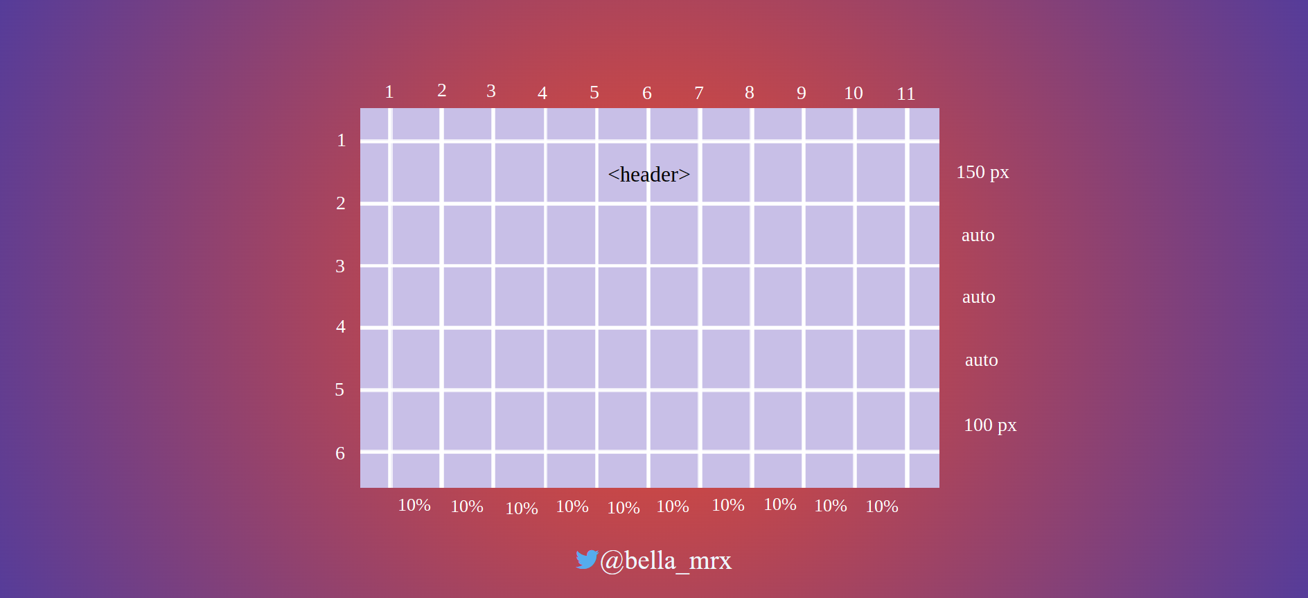
.nav {
grid-column-start: 1;
grid-column-end: 11;
grid-row-start: 2;
grid-row-end: 3;
}
.content {
grid-column-start: 1;
grid-column-end: 11;
grid-row-start: 3;
grid-row-end: 4;
}
.aside {
grid-column-start: 1;
grid-column-end: 11;
grid-row-start: 4;
grid-row-end: 5;
}
.footer {
grid-column-start: 1;
grid-column-end: 11;
grid-row-start: 5;
grid-row-end: 6;
}
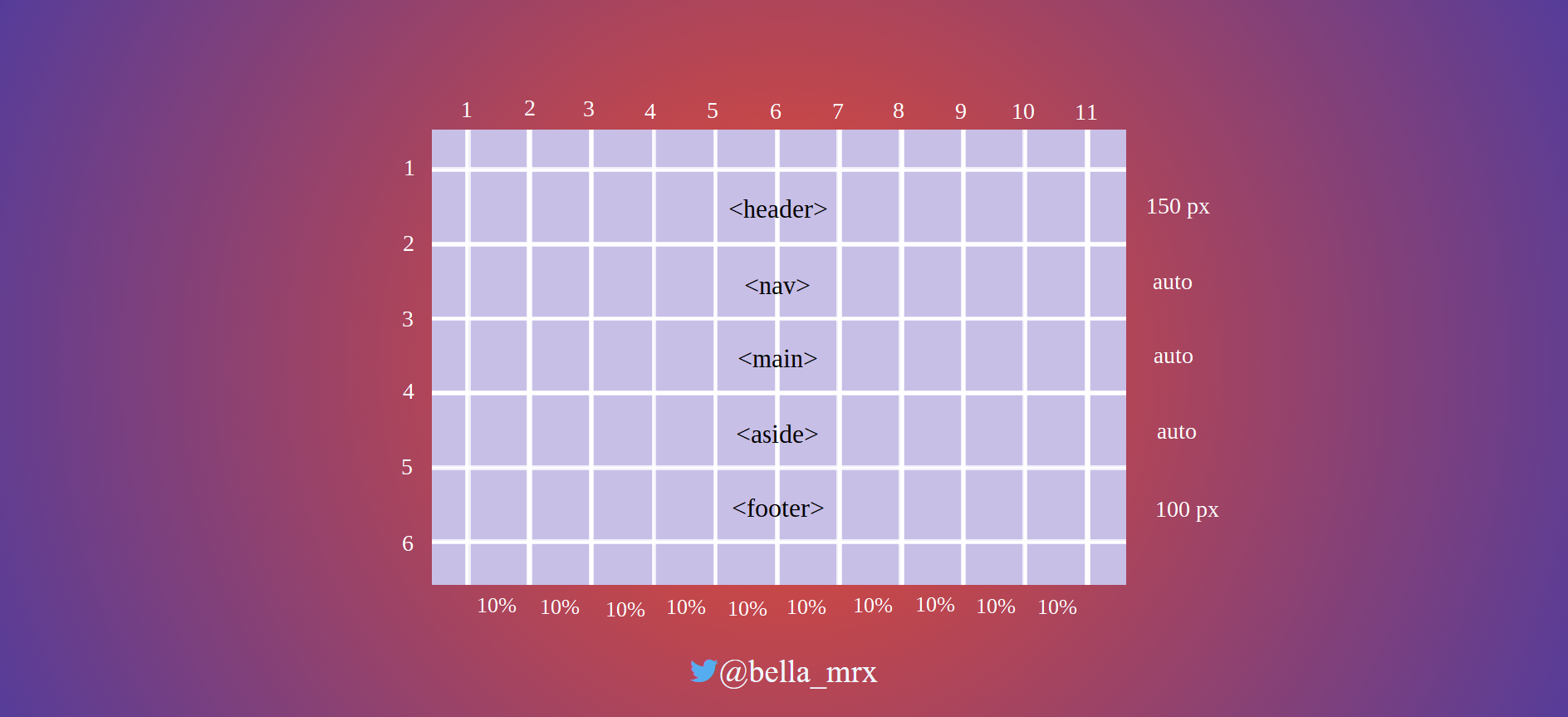
Shorthand
.aside {
grid-column: 1 / 11;
grid-row: 4 / 5;
}
means:
.aside {
grid-column-start: 1;
grid-column-end: 11;
grid-row-start: 4;
grid-row-end: 5;
}
There is another shorter variant, with the grid-area property, the order is as follows:
grid-area: row-start / column-start / row-end / column-end;
.aside {
grid-area: 4 / 1 / 5 / 11;
}
Place elements in next layout wrap
Starting from the basic mobile layout version, little work is now needed to respond to the next layout change for the tablet version.
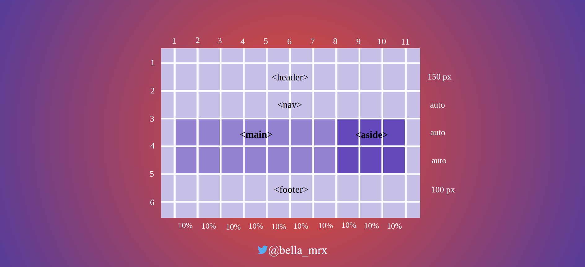
Complete Code - Examples/Part_10/...
@media screen and (min-width: 40em) {
.content {
grid-column: 1 / 8;
grid-row: 3 / 4;
padding: 0 1rem 0 2rem;
}
.aside {
grid-column: 8 / 11;
grid-row: 3 / 4;
padding: 0 2rem 0 2rem;
border-top: none;
}
...
}
Tablet-Version:
And yet another version for the desktop:
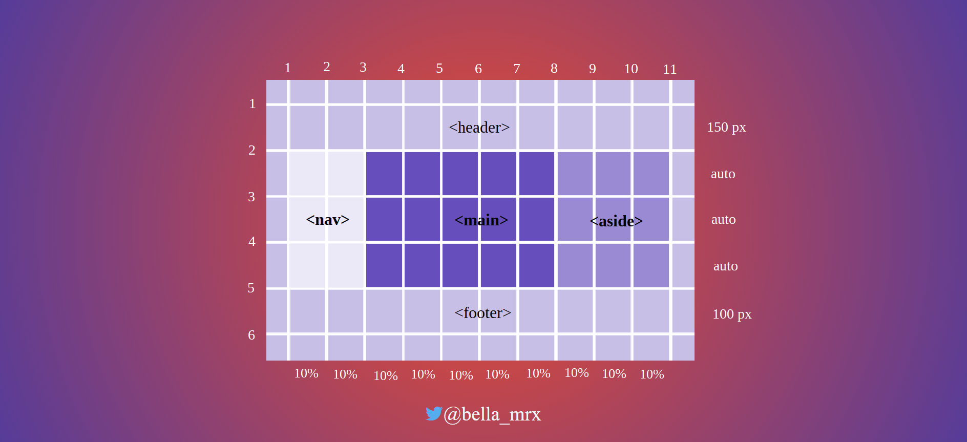
Complete Code - Examples/Part_10/...
@media screen and (min-width: 64em) {
.content {
grid-column: 3 / 8;
grid-row: 2 / 4;
padding: 1em 1.5em;
}
.aside {
grid-column: 8 / 11;
grid-row: 2 / 4;
padding: 1em 1.5em;
}
.nav {
grid-column: 1 / 3;
grid-row: 2 / 4;
background-color: #ff383f;
}
...
}
Desktop-Version:
Layout modification
Because the elements in the grid are freely positionable, it is easy to redesign the layout now. For this, only the positions of the cells and columns in the grid have to be adjusted. To change the desktop version from the previous example, you can simply change the values for grid-column as follows:
Complete Code - Examples/Part_11/...
@media screen and (min-width: 64em) {
.content {
grid-column: 4 / 9;
grid-row: 2 / 4;
padding: 1em 1.5em;
}
.aside {
grid-column: 1 / 4;
grid-row: 2 / 4;
padding: 1em 1.5em;
}
.nav {
grid-column: 9 / 11;
grid-row: 2 / 4;
background-color: #ff383f;
}
...
}
Desktop-Version:
So the navigation is now on the right side.
The spacing between grid lines
If spacing between columns or rows should be added, this can be done with grid-column-gap or grid-row-gap. The spaces are only created between the columns. No spacing is added at the beginning and end of the column.
for example:
grid {
display: grid;
grid-template-rows: 150px auto auto auto 100px;
grid-template-columns: repeat (10, 10%);
grid-row-gap: 15px;
grid-column-gap: 10px;
}
the shorthand is: grid-gap: 15px 10px;
Align elements in CSS grid
Also the horizontal and vertical alignment of the parent elements can be set with the CSS property align-items for vertical and with justify-items for horizontal behavior. The values start, end, stretch and center are available. For an individual alignment of a single raster cell, align-self and justify-self are available. Here, too, the values start, end, stretch and center are available.
6.5. Change the behavior of HTML elements with display
The CSS property display can be used to change the behavior of an HTML element when it is displayed in the web browser. The HTML element has a fixed box that describes the behavior of the element. Thus, the behavior of an HTML element such as <p> can be changed with display: inline; and thus no more line breaks are executed. On the other hand, the behavior of an element like <a> can be changed with display: block; so that it performs a line break. With display: none; an element can be hidden so that it no longer takes up space in the HTML document.
block, inline and inline-block
p {
display: block;
width: 150px;
border: 1px solid black;
background-color: white;
padding: 1em;
}
In this example, display: block; can also be omitted, since the <p> element is a block element anyway, so a line break is automatically created.
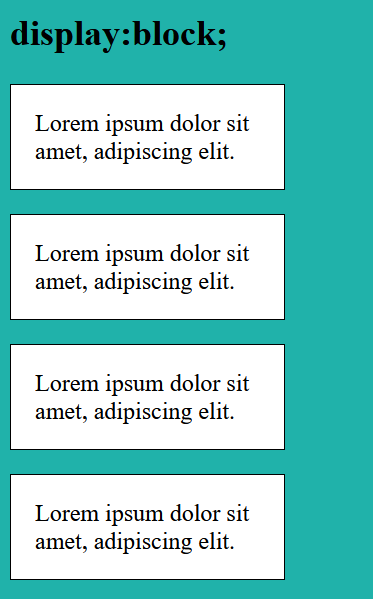
p {
display: inline;
width: 150px;
border: 1px solid black;
background-color: white;
padding: 1em;
}
The specification of width is ignored and thus has no effect. Although the inner and outer margins and borders can be specified as usual, these specifications also have no effect on the line height. Thus, an inline box only occupies the width that the content requires. And may not look very nice, as in this example.
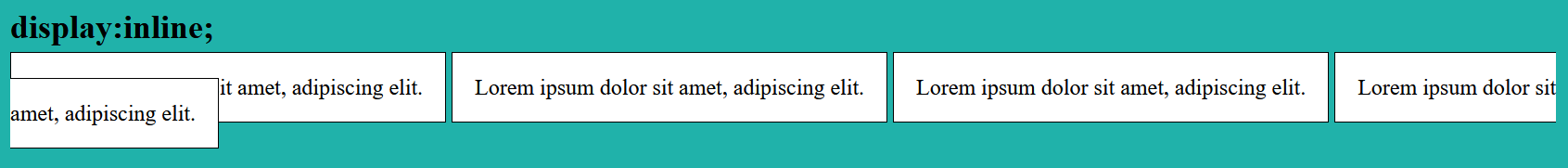
p {
display: inline-block;
width: 150px;
border: 1px solid black;
background-color: white;
padding: 1em;
}
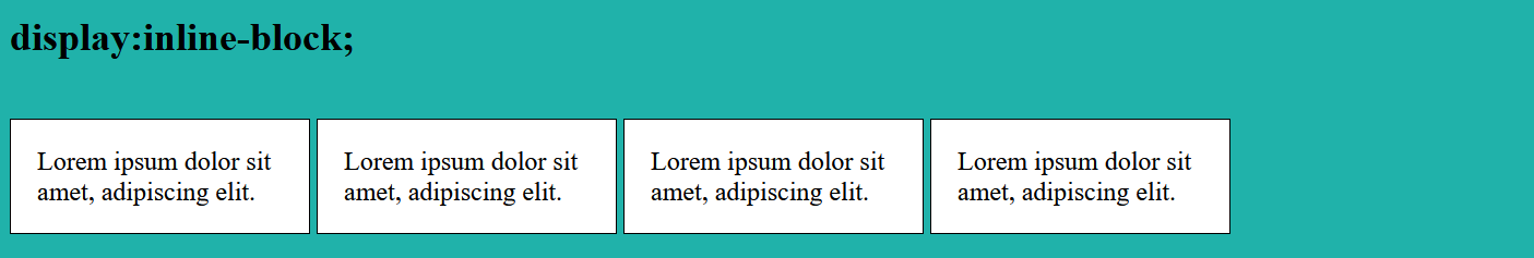
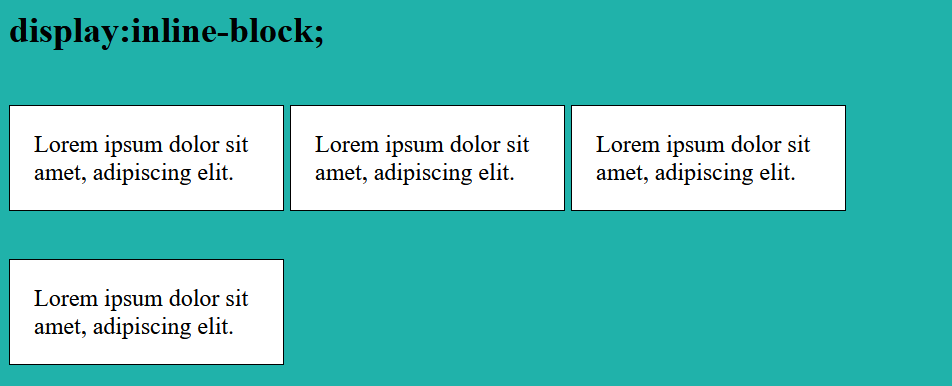
An inline-block -box initially behaves like an inline -box and runs over one line. But an inline-block -box is moved to the next cell when the box no longer fits in the screen width.
p {
display: none;
width: 150px;
border: 1px solid black;
background-color: white;
padding: 1em;
}
With display: none; elements can be hidden, the web browser does not create a box for this. It is also possible to hide elements with visibility: hidden;, but the box remains, and the element becomes only transparent. Hidden or transparent elements are used, for example, to show buttons only in the smartphone version but not in the desktop version.
Further values for display
Besides display: grid; and display: flex; (which I have already discussed here), another form is display: table;. With this, elements can be arranged like in a table and in practice, theoretically, a layout for a web page can be created. But for that display: grid; is the better alternative. Then there is also display: list-item;, which displays the element as a list. This creates two boxes for an element. One box is used for the list item and the other box for the list element. There are other values for display, but they are rarely used. An overview of the existing values can be found at MDN - display.
Complete Code - Examples/Part_12/indexD.html...
.table {
display: table;
}
.row {
display: table-row;
}
.article {
border: 1px solid black;
padding: 1em;
width: 33.3333%;
background-color: LightSeaGreen;
display: table-cell;
}
.bottom {
vertical-align: bottom;
}
.middle {
vertical-align: middle;
}
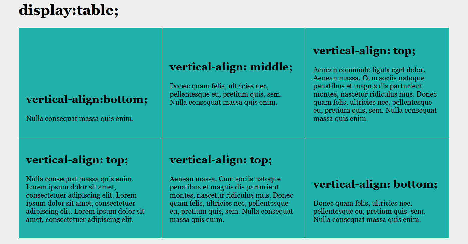
6.6. Calculation with CSS and the calc() function
Sometimes it is helpful to calculate and display individual values. This is possible with the calc() function, with which the basic arithmetic operations addition(+), subtraction(-), multiplication(*) and division(/) can be carried out. It is important that with the addition and subtraction, before and after a blank character must stand. This is not necessary for multiplication and division.
Complete Code - Examples/Part_13/...
.column {
float: left;
padding: 10px;
width: 90%;
width: calc(100% / 4);
}
@media screen and (max-width: 40em) {
.column {
width: calc(100% / 2);
}
}
@media screen and (max-width: 30em) {
.column {
width: 100%;
}
}
Desktop-Version:
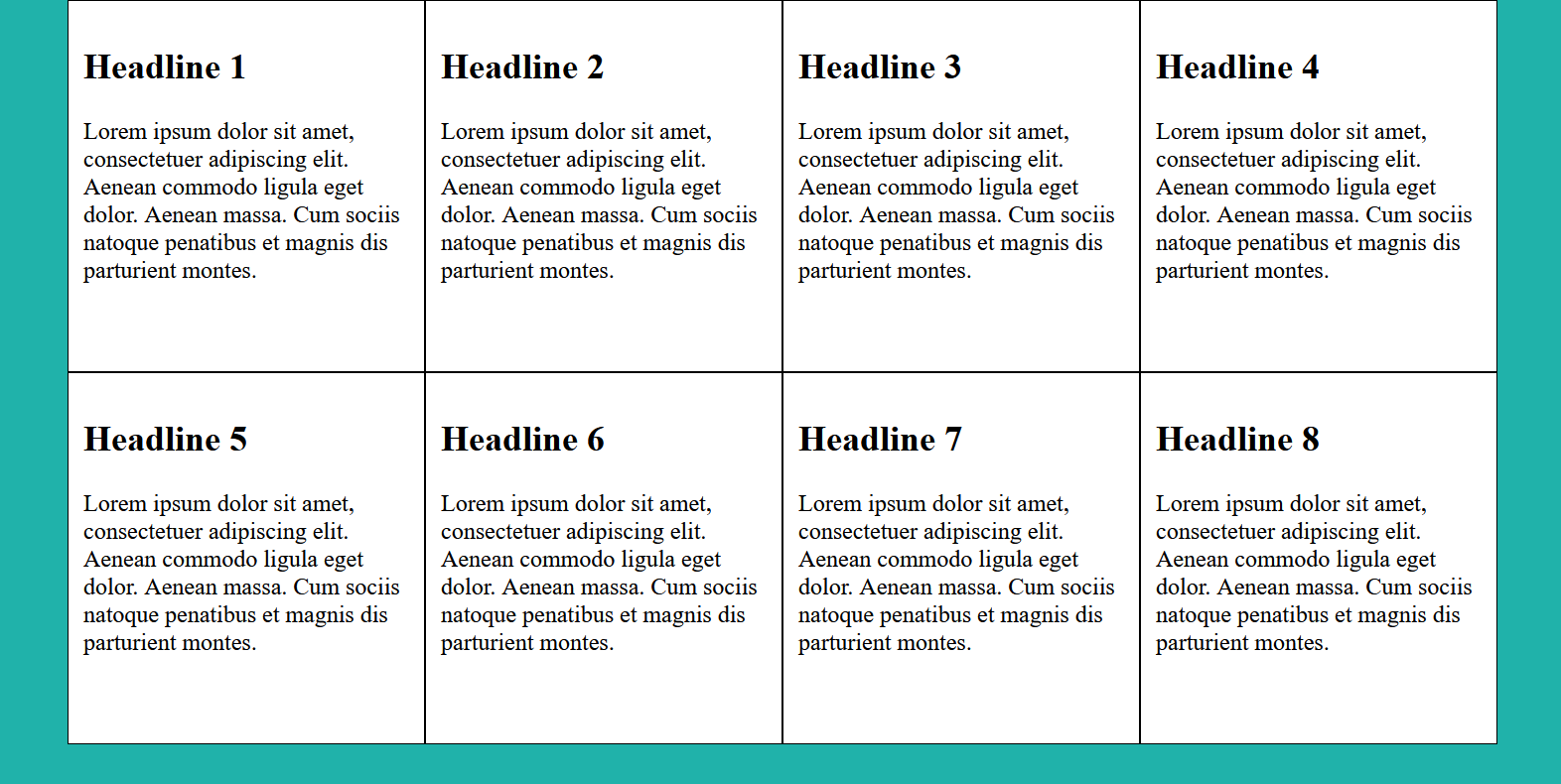
Tablet-Version:
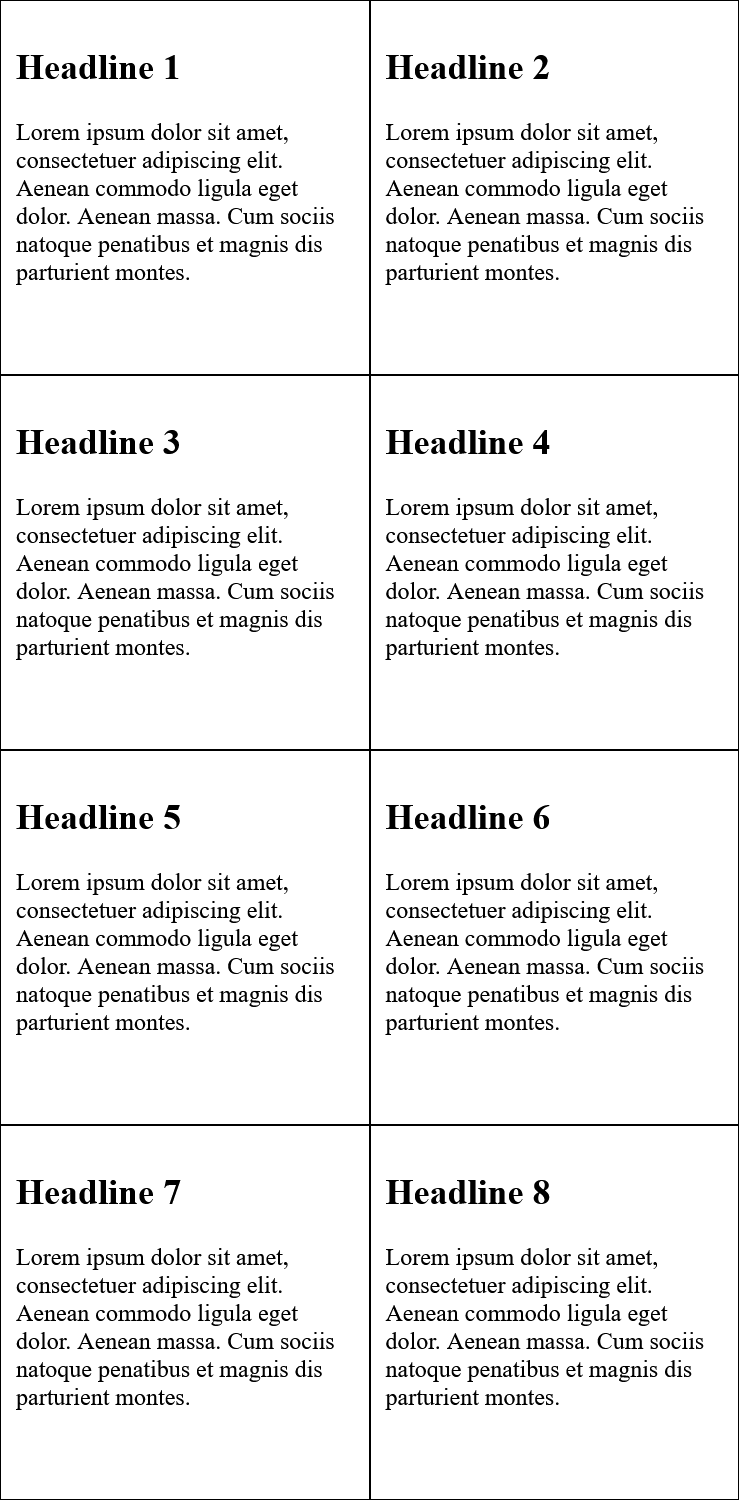
7. Styling with CSS
Here you can find some more examples to make websites more beautiful or readable.
7.1. Text design with CSS
CSS offers a lot of features to design and customize text for websites.
Select fonts with font-family
body { font-family: Arial;}
This puts the Arial font between <body> and </body>. I.e. the whole HTML document uses the font Arial. In order to be able to use this font, it must be installed locally on the visitor's system (Arial is installed on most computers). However, it is also possible to offer alternative fonts, separated by a comma (font-stack).
body { font-family: Arial, Calibri, sans-serif; }
If no font is installed on the computer, the default font of the web browser is used. If a font contains a space, then it must be indicated by quotation marks e.g. "Courier New". To be on the safe side, it is recommended to specify a generic font (e.g. sans-serif) at the end.
Overview of generic fonts:
| Font Class | Meaning | Examples |
| serif |
here are small fine lines or ticks at the end of the letter stroke across the basic direction |
Times, Times New Roman, Georgia, Bookman |
| sans-serif |
are sans serif fonts, with a straight line at the end of the stroke |
Arial, Helvetica, Lucida, Verdana |
| monospace |
are fonts with a fixed width, where all letters have the same width |
Andale Mono, Courier, Courier New, Fixed |
| cursive |
this font is intended to give the impression of a cursive script |
Comic Sans MS, Florence, Parkavenue, Monotype Corsiva |
| fantasy |
are often decorative ornamental fonts that can be used for creative purposes |
Brushstroke, Impact, Haettenschweiler, Oldtown |
Complete Code - Examples/Part_1/...
body {
font-family: Arial, Verdana, Helvetica, sans-serif;
}
.footer, .header {
background-color: lightyellow;
border: 1px solid black;
padding: 2% 2%;
text-align: center;
font-family: cursive;
}
.article {
font-family: Georgia, Times, serif;
}
Analyze font in web browser
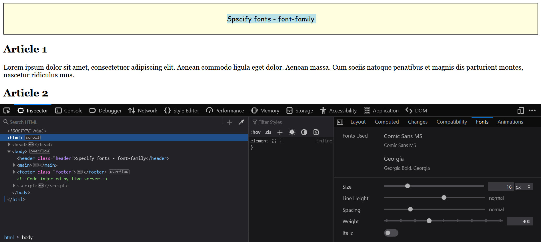
Display fonts with web fonts @font-face
With @font-face it is possible to use fonts that are not installed on the user's computer. The disadvantage is that the loading time is extended.
@font-face {
font-family: Arial;
src: url('path/to/font.ttf') format('truetype');
}
Embed license-free fonts from Google into the website
The fonts from Google Fonts can be found at Google Fonts.
Complete Code - Examples/Part_2/...
@import url('https://fonts.googleapis.com/css2?family=Roboto:ital,wght@0,400;0,700;1,400&display=swap');
body {
font-family: 'Roboto', sans-serif;
}
Other license-free and commercial providers of web fonts:
Use symbols with icon fonts
There are several providers of icon fonts, one of the most popular is Font Awesome. There you can find a lot of icons that are needed for a website.
First, the CSS file must be included in the HTML document.
<link href="styles/all.css" rel="stylesheet">
Now the font symbols from Font Awesome can be used in the HTML document with the tag <i>.
<i class="fas fa-home"></i>
The font size can be adjusted with font-size.
<i class="fas fa-home" style="font-size:3em;"></i>
Colors can be changed with color.
<i class="fas fa-home" style="color:blue;"></i>
Font Awesome's font icons have special classes that can be used to adjust the icon size with fa-2x, fa-3x, fa-4x and fa-5x relative to their container.
<i class="fas fa-home fa-2x"></i>
An overview of Font Awesome's symbols can be found at Font Awesome - Gallery. Other interesting information about Font Awesome can be found here Font Awesome - How to use.
Complete Code - Examples/Part_3/...
There are other providers besides Font Awesome:
!Note!: Many of these icons and fonts are free, but still have some kind of license , which should be read through before using them on the website.
Set font size with font-size
Keywords for font size
CSS provides predefined font size keywords such as small, x-small, xx-small, medium (base font size), large, x-large and xx-large. These are absolute values. There are also the keywords smaller and larger, which are relative values (relative to the parent element). They are rarely used, because the actual font size can only be controlled to a limited extent.
Relative font sizes with em.
An easy way to adjust the font size for the whole document is to set font-size for the body element. If font-size: 1em; (1em = 100%) is set, the default value of the web browser is used. The fact that a relative font size of the body element controls the font size for the elements of the web page through inheritance, this option is popular in practice. But it is exactly this inheritance that can make adjusting font sizes a bit more complex if not taken care of.
Complete Code - Examples/Part_4/styleA.css...
body {
font-family: Arial, Verdana, Helvetica, sans-serif;
font-size: 0.95em;
/* or 95% */
}
footer, header {
background-color: palegreen;
border: 1px solid black;
padding: 2% 2%;
text-align: center;
}
article {
font-family: Georgia, Times, serif;
font-size: 0.8em;
/* or 80% */
}
p {
font-size: 0.8em;
/* or 80% */
}
Set font size with rem
The problem with inheritance of relative values that have with font size with em no longer occurs with rem (=root em). Since it inherits to the highest root element <html> instead of the font size of the corresponding parent element.
Complete Code - Examples/Part_4/styleB.css...
html {
font-size: 100%;
}
body {
font-family: Arial, Verdana, Helvetica, sans-serif;
font-size: 0.9375rem;
}
footer, header {
background-color: palegreen;
border: 1px solid black;
padding: 2% 2%;
text-align:center;
}
article {
font-family: Georgia, Times, serif;
font-size: 0.8125rem;
}
p {
font-size: 0.8125rem;
}
Fixed values with px and pt
With px (pixel) you have full control over the text size. Due to the different screen sizes and resolutions, however, e.g. 16px do not look the same everywhere. I.e. with a higher pixel density on an inch the pixels inevitably becomes smaller. The unit pt (point) is more suitable for printing, if a print version is created with CSS.
The responsive units vw and vh
The viewport units with vw (view width) and vh (view height), are relative to the screen dimensions. This assigns a size to an element, which is calculated in relation to the width and height of the viewport. 1vw corresponds to 1% of the width of the viewport, exactly the same applies to vh (corresponds to 1% of the height of the viewport). Additionally there are the units vmin and vmax, which refer to the height or width and use the smaller or larger value.
Complete Code - Examples/Part_4/styleD.css...
html {
font-size: calc(100% + 0.5vw);
}
Italic and bold fonts with font-style and font-weight
An italic font can be rendered with the CSS property font-style and the value italic. If a font does not have an italic cut, the web browser will try to italicize it with oblique. The default value is normal.
The CSS property font-weight can be used to define the thickness of the font. The bold value defines a bold font style. The default value is normal. Besides bold there are also the values bolder and lighter, as well as the numeric values 100, 200 to 900 (in steps of 100). 400 stands for normal and 700 for bold.
Complete Code - Examples/Part_5/...
.italic {
font-style: italic;
}
.oblique {
font-style: oblique;
}
.normal {
font-style: normal;
}
.weight-normal {
font-weight: normal;
}
.weight-bold {
font-weight: bold;
}
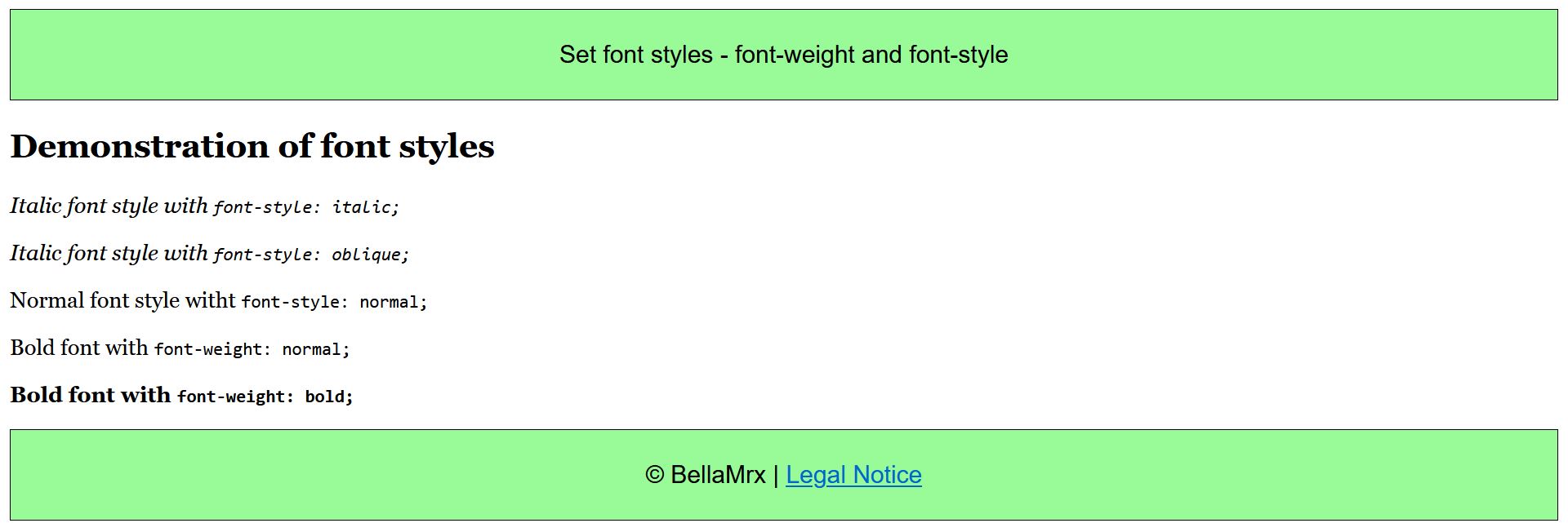
Create small caps with font-variant
With font-variant and the value small-caps the text will be converted to all uppercase, keeping the size of the lowercase letters.
Complete Code - Examples/Part_6/...
.cap {
font-variant:small-caps;
}
.vers {
text-transform:uppercase;
}
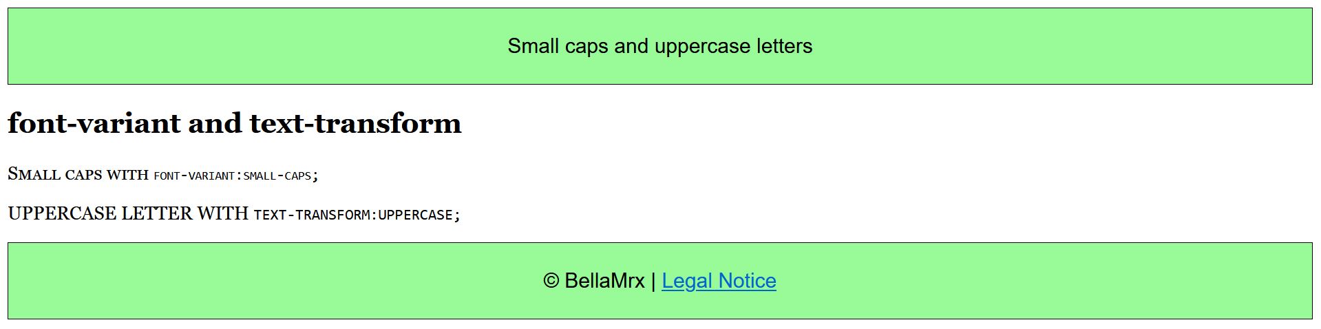
Line spacing with line-height
The line spacing defines the distance from baseline to baseline and can be set with the CSS property line-height. The line spacing is important for the readability of longer text passages.
Complete Code - Examples/Part_7/...
.p-75 {
line-height: 75%;
}
.p-100 {
line-height: 100%;
}
.p-150 {
line-height: 150%;
}
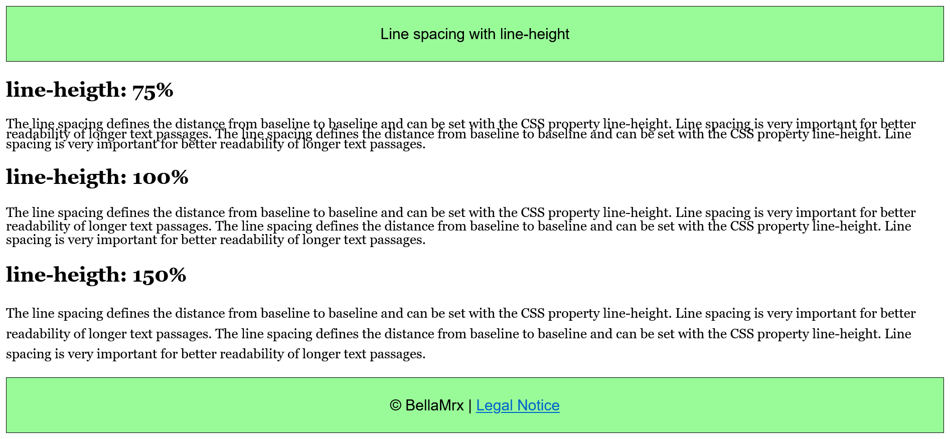
The shorthand with font
The CSS property font is a shorthand notation for the properties in that order font-style, font-weight, font-size/line-height, and font-family.
p {
font: italic normal bold 1.2em/120% Georgia, Times, serif;
}
Letter and word spacing with letter-spacing and word-spacing
If the spacing between the individual letters is to be changed, this can be done with the CSS property letter-spacing. This is not suitable for normal continuous text, because it can worsen the readability. It makes more sense for headlines or texts with capital letters only. With word-spacing you can control the spacing between words. By default the spacing is 0.25em, but this also depends on the web browser.
Complete Code - Examples/Part_8/...
.letterspace {
letter-spacing: 0.2em;
}
.wordspace {
word-spacing: 0.9em;
}
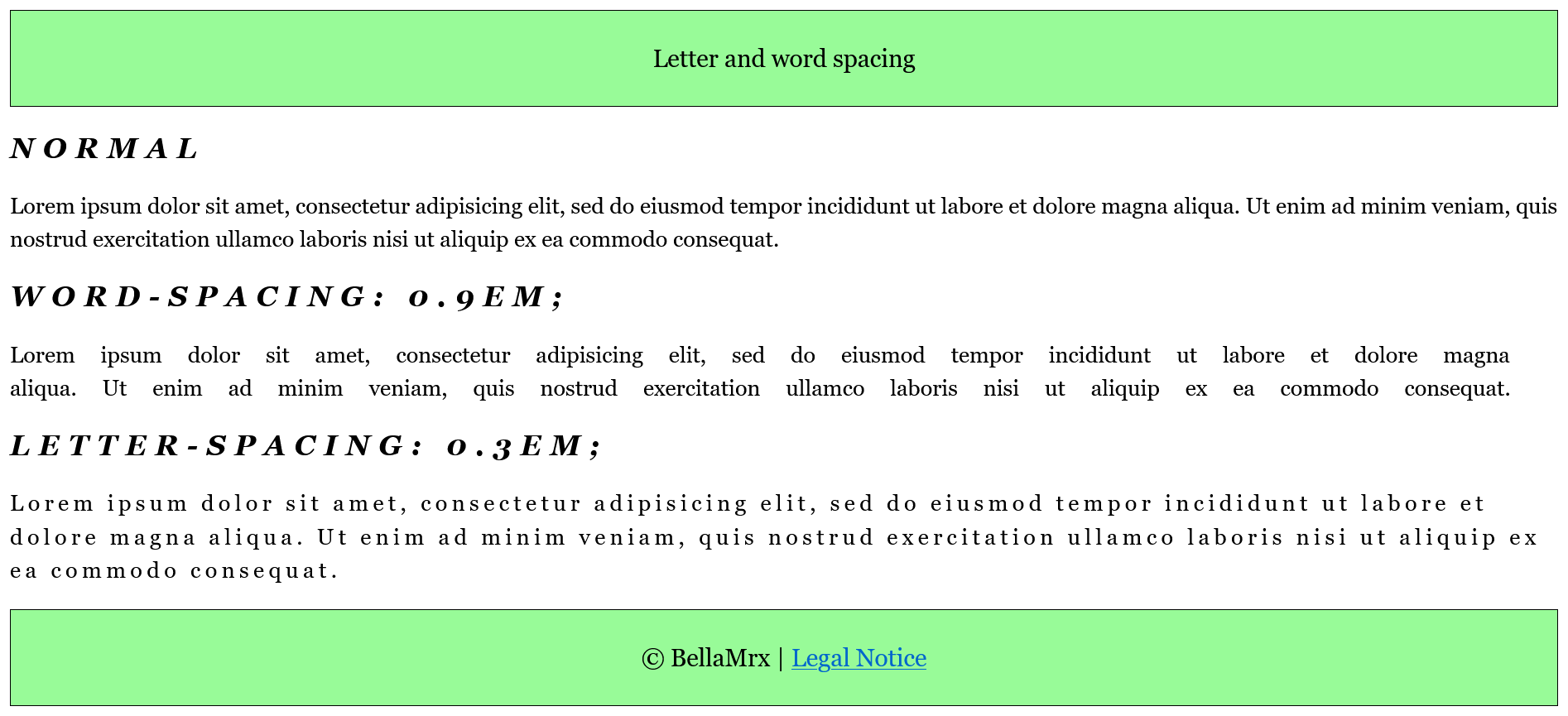
Text alignment with text-align
Important for a good reading flow of texts is the alignment, which can be controlled with the CSS property text-align. There are four values for this:
left: This aligns the text left, which is usually the default alignment of the web browser.
right: This aligns the text to the right.
center: This will center the text, this is good for headings, poems or short texts.
justify: This aligns the text in justified text, where the individual lines are of equal width and flush left and right.
Complete Code - Examples/Part_9/...
.left {
text-align: left;
}
.right {
text-align: right;
}
.center {
text-align: center;
}
.justify {
text-align: justify;
}
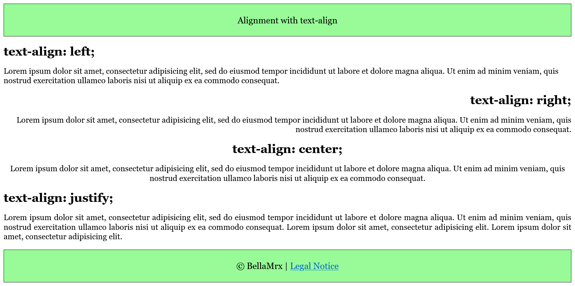
Vertical alignment with vertical-align
The CSS property vertical-align is used for vertical alignment of inline elements and is not suitable for block elements.
Complete Code - Examples/Part_10/...
.vtop {
vertical-align: top;
}
.vmiddle {
vertical-align: middle;
}
.vbottom {
vertical-align: bottom;
}
.vsuper {
vertical-align: super;
}
.vsub {
vertical-align: sub;
}
.vsub-05em {
vertical-align: -0.5em;
}
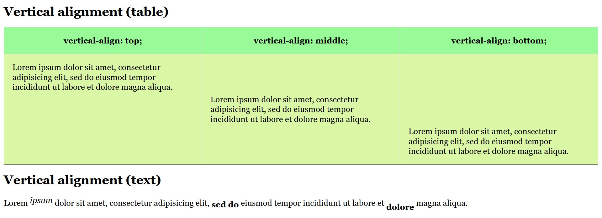
Indent text with text-indent
With the CSS property text-indent the first line of text can be indented with a positive value or pulled out with a negative value to maintain the reading flow. This is usually used for books and magazines, but not so much for web pages.
Complete Code - Examples/Part_11/...
.p-ident {
font-size: 1em;
text-indent: 1.3em;
}
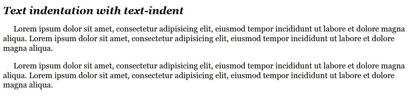
Underline and line-through text with text-decoration
Complete Code - Examples/Part_12/...
.underline { text-decoration: underline; }
.a-no-underline { text-decoration: none; }
.line-through { text-decoration: line-through; }
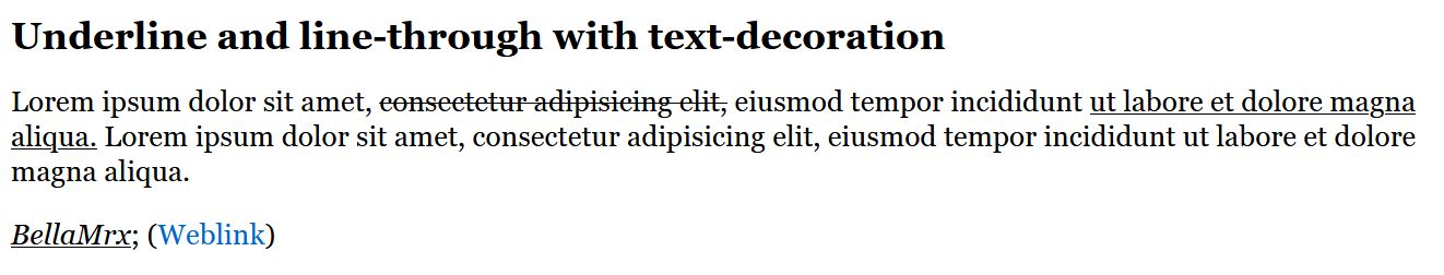
Case sensitive text with text-transform
With the CSS property text-transform and the value uppercase the text is displayed in upper case and with lowercase in lower case. With capitalize only the first letter is displayed as uppercase.
Complete Code - Examples/Part_13/...
.uppercase { text-transform: uppercase; }
.lowercase { text-transform: lowercase; }
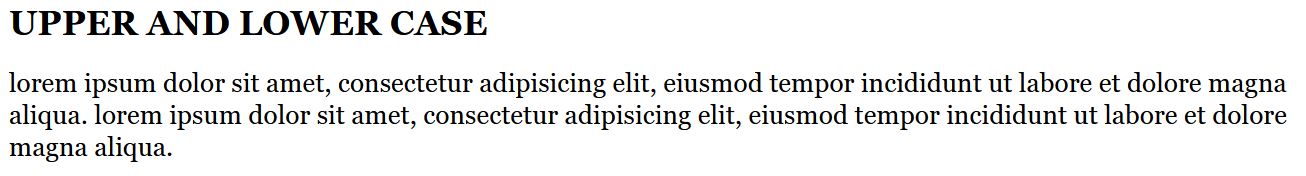
Add a shadow to the text with text-shadow
text-shadow: 5px /* Horizontal offset */
5px /* Vertical offset */
5px /* Shadow gradient radius */
gray; /* Shadow color */
Complete Code - Examples/Part_14/...
.shadow-one {
text-shadow: 3px 3px 5px gray;
}
.shadow-two {
color: lightgray;
text-shadow: 0px -2px 1px black;
}
.shadow-three {
color: #ff0000b3;
text-shadow:
15px -15px 5px yellow,
-5px 15px 8px orange;
}
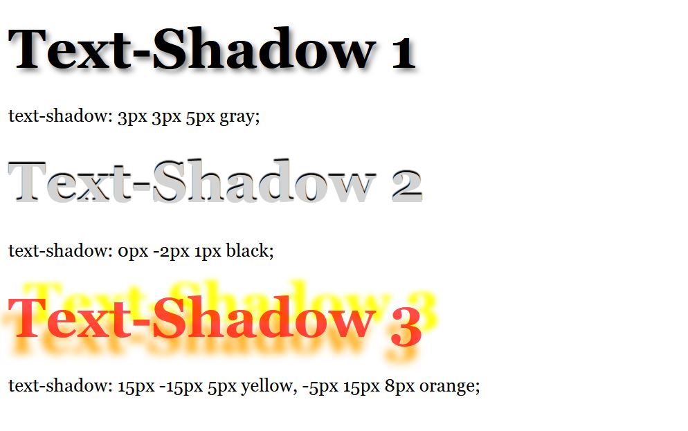
Split text with column-count into several columns
With the CSS property column-count it is possible to split a text automatically into a multi-column set. Is very useful for wide screens, and increases the readability of the text. With column-gap the gap between the columns is controlled.
Complete Code - Examples/Part_1/...
.column {
column-count: 2;
column-gap: 1.5rem;
}
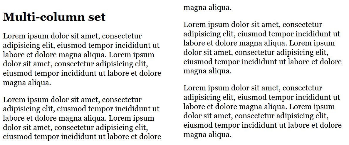
Instead of column-count also column-width can be used. This will automatically create as many columns depending on this width as they have space in the viewport of the web browser. With the CSS property columns there is also a shorthand notation for the two properties column-width and column-count.
.column {
/*columns: 20em 2;*/
columns-width: 250px;
column-gap: 1.5rem;
}
7.2. Design lists with CSS
Bullets with list-style-type
For ordered lists with <ul> the following values are available:
- none: no bullets
- disc: filled circle, default
- circle: empty circle
- square : square character
For ordered lists with <ol> the following values are available:
- none: no numbering
- decimal: numbering like 1., 2,. 3. ...
- decimal-leading-zero: numbering like 01., 02., 03. ...
- lower-alpha and lower-latin: numbering like a., b., c. ...
- upper-alpha and upper-latin: numbering like A., B., C. ...
- lower-roman: numbering like i., ii., iii., iv. ...
- upper-roman: numbering like I., II., III., IV. ...
Complete Code - Examples/Part_16/...
ul { list-style-type: square; }
ol { list-style-type: upper-roman; }
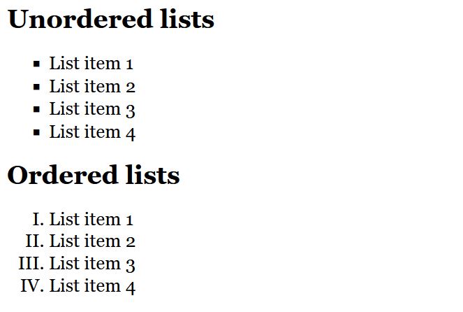
Images as bullets with list-style-image
With the CSS property list-style-image an image can be used as a bullet.
Complete Code - Examples/Part_17/...
ul { list-style-image: url("../images/star.png"); }
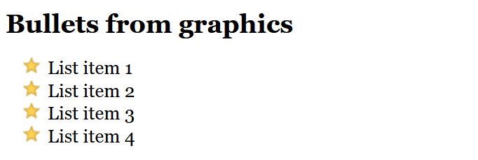
Instead of an image, a special character can also be used. For this purpose list-style-type is set to none. And using li:before and content a special character is used as list symbols.
Complete Code - Examples/Part_18/...
.specialul {
list-style-type: none;
}
.specialul li:before {
content: '\2023'; color: red;
font-size: 20px;
}
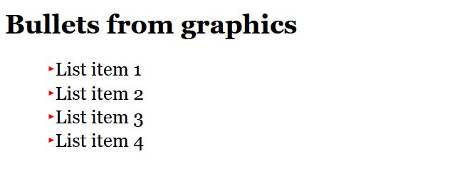
You can find this special character here HTML Symbols - U2023. And more you can find here HTML Symbols.
Position bulleted list with list-style-position
With the CSS property list-style-position the bullet point can be positioned inside or outside. The default behavior is set with the value outside, so the bullet point is located to the left of the text block. With the value inside the bullet point is inside the text block.
Complete Code - Examples/Part_19/...
.out { list-style-position: outside; }
.in { list-style-position: inside; }
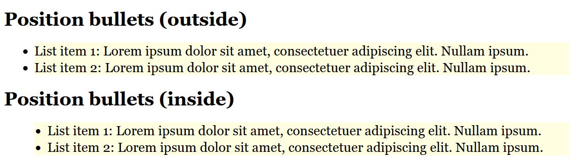
Create navigation and menus with lists
The expandable menu for the mobile version was created here with jQuery. This is also possible with JavaScript.
Complete Code - Examples/Part_20/...
Desktop-Version:
Mobile-Version:
7.3. Tables with CSS
Complete Code - Examples/Part_21/...
table {
width: 700px;
}
th {
padding: 0.5em;
text-transform: uppercase;
border-top: 1px solid black;
border-bottom: 1px solid black;
text-align: left;
}
tr:nth-child(even) { background: lightgray; }
td:nth-child(1) {
font-weight: bold;
width: 100px;
}
td { padding: 0.5em; }
tr:hover {
background: darkblue;
color: white;
}
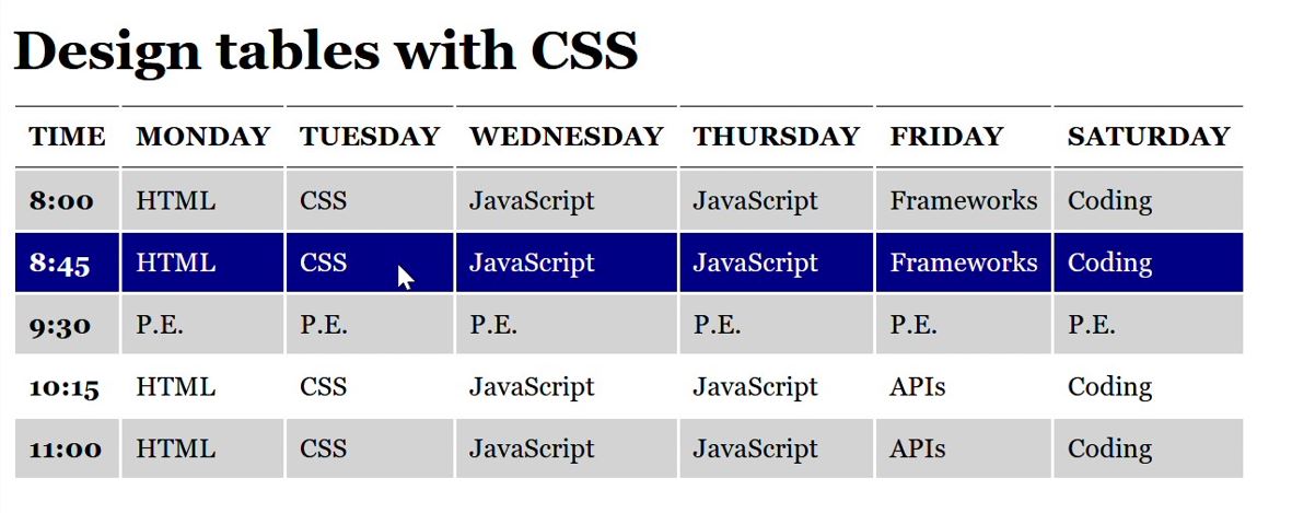
Collapsing borders for table cells with border-collapse
The CSS property border-collapse can be used to specify whether the borders of the individual cells are displayed separately (border-collapse: seperate;) or collapsed (border-collapse: collapse;).
Complete Code - Examples/Part_22/...
...
table {
width: 700px;
border: 1px solid black;
border-collapse: separate;
}
...
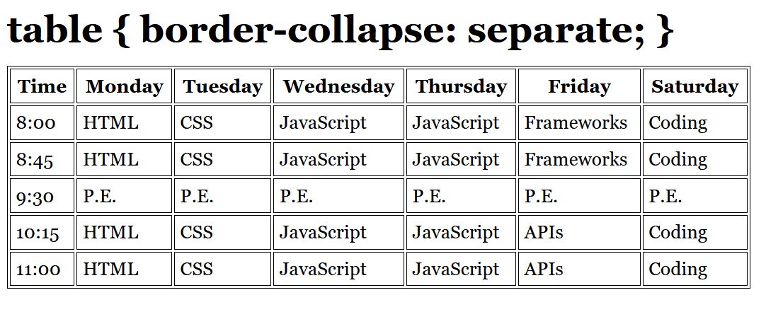
Spacing between cells with border-spacing
Complete Code - Examples/Part_23/...
...
table {
width: 700px;
border: 1px solid black;
border-spacing: 5px 10px;
}
...
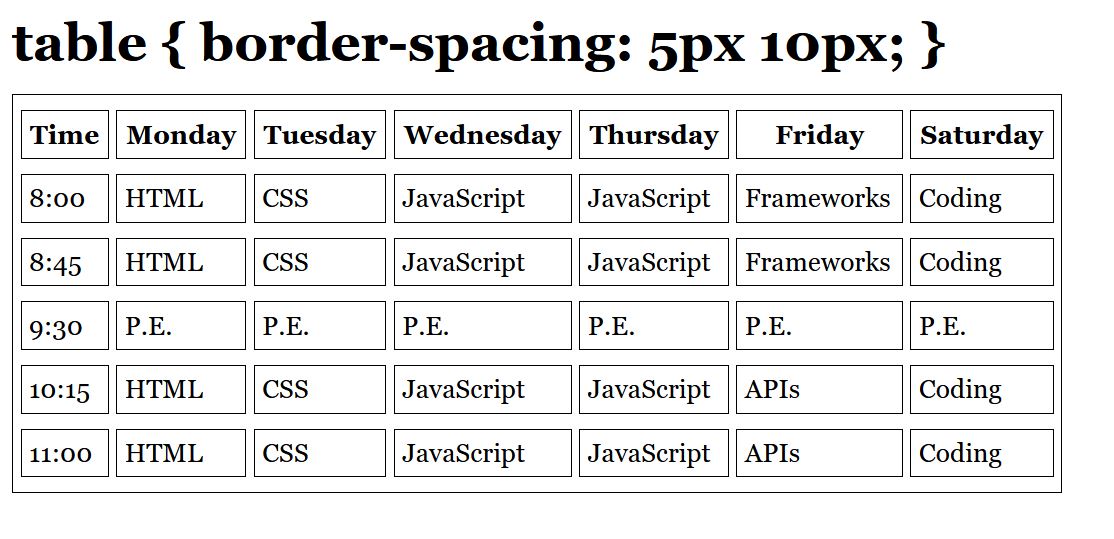
Position table caption with caption-side
With empty-cells: hide; the frame can be hidden if there is no content. The default value would be empty-cells: show;, then the frame is displayed without any content.
Complete Code - Examples/Part_24/...
...
table {
width: 700px;
empty-cells: hide;
caption-side: bottom;
background: lightgray;
}
...
caption { font-style: italic; text-align: left; padding-top: 5px; }
...
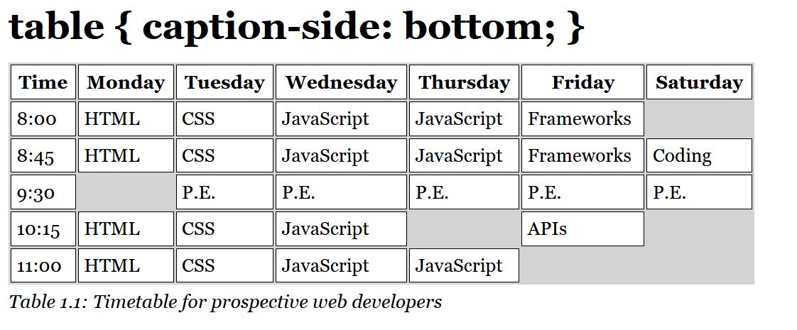
7.4. Images and graphics with width and height
The size of the images can be set with the CSS properties width and height. It is possible to display one and the same image in different sizes. If each <img>- tag is assigned a class, it is ralatively easy to display them in different sizes.
Complete Code - Examples/Part_25/...
.large {
width: 225px;
height: 250px;
}
.medium {
width: 150px;
height: 175px;
}
.small {
width: 75px;
height: 100px;
}
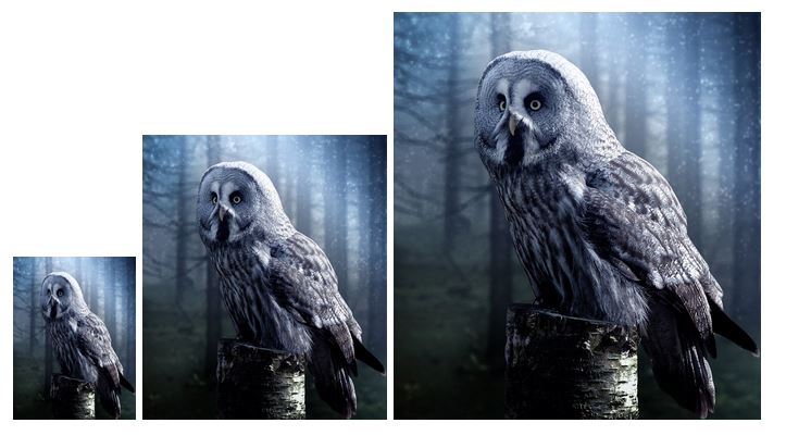
Thus, it is also possible to position the images easily. By adding to the classes, more.
Complete Code - Examples/Part_26/...
...
<p>
<img src="images/image.jpg" alt="Owl" class="align-left medium" />Lorem ipsum ...
</p>
...
...
.medium {
width: 150px;
height: 175px;
}
...
.align-left {
float: left;
margin: 0 0.6em 0.3em 0;
}
...
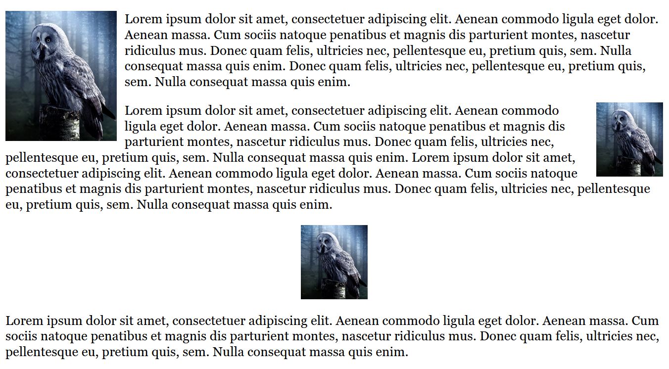
7.5. Transfom elements
With the help of the CSS property transform it is possible to change the position of HTML elements. Possible are: a movement with translate(), an enlargement or reduction with scale(), a rotation with rotate(), tilting of elements with skew() and a distortion with matrix().
transform: scale();
Complete Code - Examples/Part_27/index.html...
...
<ul>
<li>
<img src="images/image1.jpg" alt="Pexels photography" loading="lazy">
</li>
<li>
<img src="images/image2.jpg" alt="Pexels photography" loading="lazy">
</li>
...
</ul>
...
Complete Code - Examples/Part_27/styleA.css...
...
img:hover {
transform: scale(1.25);
border: 4px white solid;
}
...
In this example with scale(1.25), the images are enlarged by a factor of 1.25 as soon as the mouse pointer passes over them (hover). The factor scale(1.0) would have no effect.

transform: rotate();
With rotate() the element is rotated by a specified number of degrees. With transform: rotate(15deg); the element is rotated by 15 degrees, clockwise. A negative value rotates the element counterclockwise.
Complete Code - Examples/Part_27/styleB.css...
...
img:hover {
transform: rotate(15deg);
border: 4px white solid;
}
...

transform: skew();
The skew() function can be used to tilt an HTML element around the x and y axis. Here two values are given in degrees. The first value gives the tilt around the x-axis and the second gives the tilt around the y-axis.
Complete Code - Examples/Part_27/styleC.css...
...
img:hover {
transform: skew(5deg, 10deg);
border: 4px white solid;
}
...

If an HTML element should only be tilted around the x or y axis, this can be done with skewX() or skewY().
transform: translate();
With the function translate() HTML elements can be moved. Here also two values are needed to want to move the element along the x- and y-axis.
Complete Code - Examples/Part_27/styleD.css...
...
img:hover {
transform: translate(30px, 20px);
border: 4px white solid;
}
...

Combination of transformations
It is possible to combine several functions with each other. For this purpose, the functions must only be separated from each other with a space.
...
img:hover {
transform: scale(1.25) rotate(10deg);
}
...
Transitions with CSS
When using transform the transition can be a bit unattractive, because the e.g. the graphic is immediately scaled large and rotated. This abrupt transition can be softened with the CSS property transition.
Complete Code - Examples/Part_27/styleE.css...
...
img {
max-height: 100%;
min-width: 100%;
object-fit: cover;
vertical-align: bottom;
transition: all 1s ease;
}
img:hover {
transform: scale(1.25) rotate(10deg);
border: 4px white solid;
transition: all 1s ease;
}
...
transition is a shorthand notation, from the following properties:
- transition-property: This specifies the property to animate during the transition. all specifies that all properties will be animated. There you can also use e.g. background to animate.
- transition-duration: This specifies the duration of the transition in seconds e.g. 1s.
- transition-timing-function: This specification is a kind of temporal course of the transition. For example, ease means that the transition starts slowly, speeds up in the middle and ends slowly again. Other time courses are: linear, ease-in, ease-out, ease-in-out.
Some demonstrations and examples of transition can be found on this website CSS Transitions.
Transform other HTML elements
The transform functions are not limited to images or graphics, it is also possible to use them for other HTML elements.
Complete Code - Examples/Part_28/index.html...
...
<article class="trans1">
<h1>Transform elements with CSS</h1>
<p>Lorem ipsum dolor ...</p>
</article>
...
Complete Code - Examples/Part_28/style.css...
...
.trans1 {
transform: skew(5deg, -4deg);
border: 0.5em solid blue;
font-family: Courier;
}
.trans2 {
transform: skew(-4deg, 3deg);
border: 0.5em solid green;
font-family: Times;
z-index: 1;
}
.trans3 {
transform: rotate(180deg) skew(4deg, -2deg);
border: 0.5em solid red;
font-family: Arial;
}
7.6. Style HTML forms with CSS
CSS now offers many possibilities for designing forms. Despite the many possibilities should be aware that a form is real functional elements of a website, and when designing it should be careful to keep these elements recognizable as what it is (less is more). A form is usually used to submit entered data to the web server via a web browser.
Complete Code - Examples/Part_29/index.html...
...
<h1>Contact form</h1>
<form id="myForm" method="post">
<fieldset>
<div>
<label for="name">Last name:</label>
<input type="text" name="name" id="name" placeholder="Your last name">
</div>
<div>
<label for="fname">First name:</label>
<input type="text" name="fname" id="fname" placeholder="Your first name">
</div>
<div>
<label for="mail">E-Mail:</label>
<input type="email" name="mail" id="mail" placeholder="Email address" required>
<label for="mail"></label>
</div>
<div>
<label for="born">Year of birth:</label>
<input type="number" name="born" id="born" min="1920" max="2023" value="1980">
</div>
<div class="form_radio">
<label>Sex:</label>
<input type="radio" name="sex" id="male" value="male" class="nobreak">
<label for="male" class="nobreak">Male</label>
<input type="radio" name="sex" id="female" value="female" class="nobreak">
<label for="female" class="nobreak">Female</label>
</div>
<div>
<label for="message">Your message:</label>
<textarea name="message" id="message" placeholder="Enter message here..." rows="8" required></textarea>
<label for="message"></label>
</div>
<div>
<input type="checkbox" name="reply" id="reply" value="reply" class="nobreak" required>
<label for="reply" class="nobreak">GDPR consent (<a href="#">Privacy policy</a>)</label>
</div>
<div>
<input name="submit" type="submit" value="Submit" class="nobreak">
<input name="Reset" type="reset" value="Reset" class="nobreak">
</div>
<p>(⨉) = Input required</p>
</fieldset>
</form>
...
Complete Code - Examples/Part_29/style.css...
...
/* Styling */
fieldset {
width: 90%;
padding-top: 1.5em;
padding-left: 1.5em;
background: #f0f0f0;
}
input:hover, textarea:hover {
background: #fffff0;
border: 2px solid #73e4d5;
box-shadow: 0 0 10px #00000033;
}
input[type="submit"]:hover, input[type="reset"]:hover {
background: #c9c9c9;
border: 2px solid #6c6c6c;
}
input[type="submit"]:active, input[type="reset"]:active {
background: #8f8f8f;
}
input:required+label::after {
color: red;
content: " ⨉";
}
textarea:required+label::after {
color: red;
content: " ⨉";
}
input[type='email']:valid+label::after {
color: green;
content: " ✓";
}
textarea:valid+label::after {
color: green;
content: " ✓";
}
input[type='checkbox']:valid+label::after {
color: green;
content: " ✓";
}
/* Single column wrap at 640 pixels */
@media screen and (max-width: 40em) {
label:not(.nobreak) {
display: block;
}
label {
padding-bottom: 0.4em;
}
input:not(.nobreak) {
display: block;
}
input[type="checkbox"],
input[type="submit"],
input[type="radio"] {
margin-left: 0;
}
}
The indication of the privacy policy is mandatory in EU countries.
8. Testing and organizing
CSS and HTML are in constant development, and not every web browser can handle all new features right away. And since there are more and more different devices and therefore different screen sizes, testing created websites is worthwhile.
8.1 Validate HTML and CSS
The first in testing should be validation. Many web browsers, editors and development environments already offer functions or plug-ins that take care of validation. Otherwise, the W3C with its online validator for HTML W3C - Markup Validation Service and for CSS W3C - CSS Validation Service can be used.
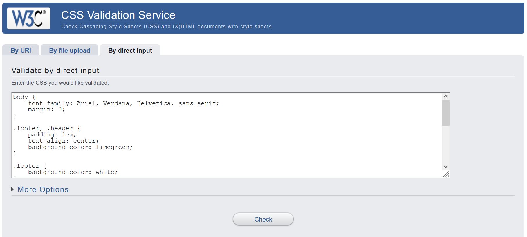
However, a valid website does not mean that it is perfect at the same time. It does not improve reliability, speed and operation, but it is a tool for quality assurance.
Most used web browsers
When testing, you should also ask yourself which web browsers are most used to test the website. It is possible to look at statistics, which browser is used more or less. An overview of this can be found on the websites W3Counter, statcounter or statista.
Such statistics should not be generalized too much, because e.g. articles for Apple are mainly used with Safari.
CSS web browser test
There are various test systems on the web for testing the capabilities of the web browser for CSS. The advantage is that already during the development of the website it can be weighed up whether a new CSS feature should be used in the website at all or whether a fallback must be set up for certain web browsers. A special test for CSS properties can be performed on the website The CSS3 Test. The current web browsers currently manage something like 50% to 67%, which is not bad. The results for the individual areas are listed there.
HTML5 web browser test
To check what the web browser can do regarding HTML, it is possible to test here HTML5 Test.
Use it or not?
It is not easy to keep track of the different web technologies and what can be used with which web browser. That's what the web database Can I Use is for. There you can check the latest CSS and HTML features.
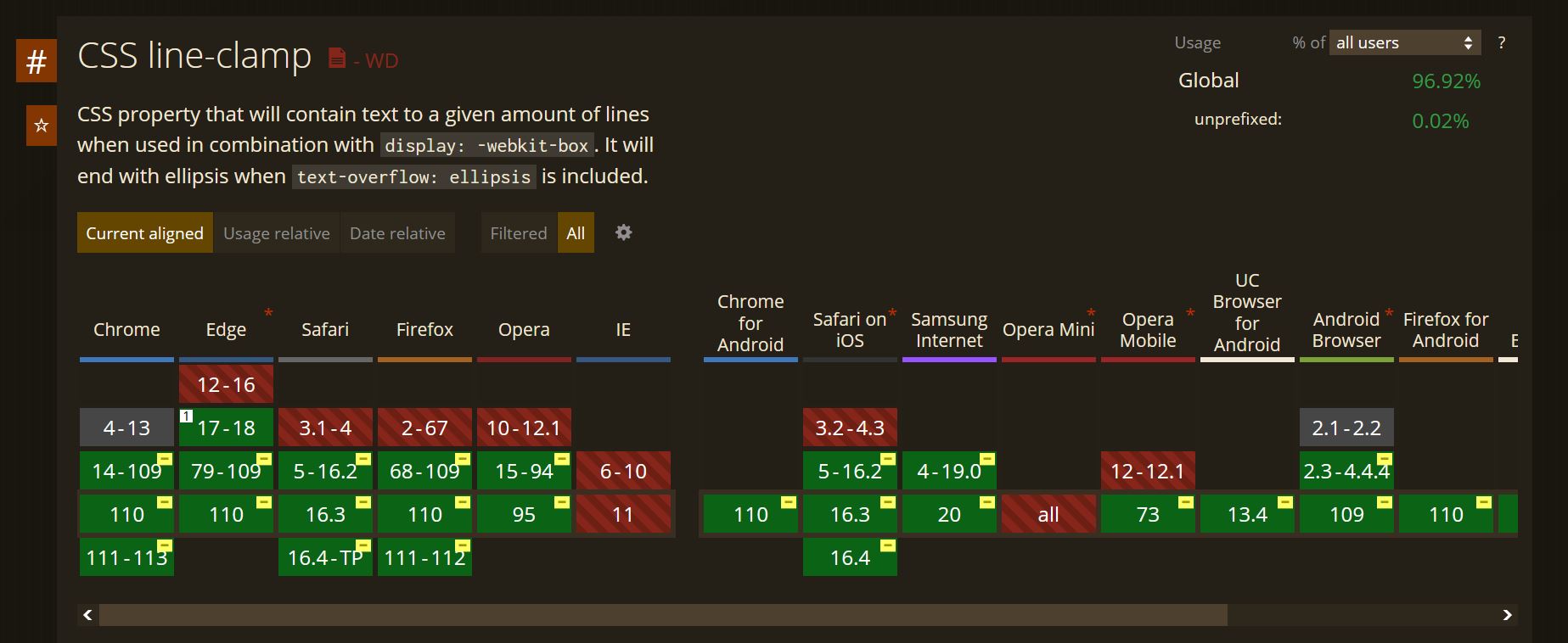
Function query with the @supports rule
Whether a certain CSS property is supported by a web browser can also be checked with the CSS rule @supports (CSS Feature Queries).
An example:
...
@supports ( hyphens: auto) {
p {
text-align: justify;
hyphens: auto;
}
}
...
Here @supports is used to check whether the web browser understands the hyphens: auto; property (hyphens = automatic hyphenation of the web browser). If this is the case, then the text in the p elements is justified with justify and the CSS property is set to auto.
8.2. View websites in different sizes
For viewing websites in different sizes there are a lot of online tools, the web browser itself offers this or also plug-ins from development environments. There are also websites that offer this, e.g. the Viewport Resizer or Blisk.
Viewport Resizer:
8.3. Set up central stylesheet
If websites are very large, it is recommended to use several style sheets when developing the website e.g. one stylesheet for the layout and one for the navigation and more. This is clearer during the development of the website. So a central stylesheet is used, which is included as usual with the link -element in the HTML document. However, this centarle stylesheet does not contain any ordinary CSS content, but only loads the other CSS files using the @import rule.
An example:
/* Basic design */
@import url("layout.css");
/* Navigation */
@import url("navi.css");
/* Print version */
@import url("print.css");
In practice, it is recommended to put the CSS files in an extra directory, e.g. "styles", for clarity on large websites.
After the development of the website, the CSS files should be merged again. Because the disadvantage of multiple individual CSS files is that multiple server requests are necessary, which can significantly increase the loading time of the website.
To reduce the file size of the CSS file even more and thus improve the loading time, all unnecessary lines of code with spaces, line breaks and comments can be removed. Also for this there are online tools like CSS Compressor or YUI Compressor. A backup should be made beforehand, because after CSS compression the CSS file is no longer pleasant to read or edit.
There are also development tools with which such an effort can be avoided e.g. Grunt or Gulp.
CSS Guide - The End
This is the end of CSS Guide. This guide is an overview that a web developer should know. There is much more to know about CSS and always new things to learn.
Sass and SCSS - An introduction to the CSS preprocessor Sass
Read more on GitHub